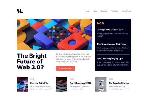
Vanilla HTML, CSS, JS - Flexbox and Grid - Accessible News homepage

Solution retrospective
- Solution URL: Github repo
- Live Site URL: News homepage
Built with
- Vanilla HTML, CSS, and JS
- Semantic HTML5 markup
- BEM naming convention
- CSS custom properties
- Flexbox
- CSS Grid
- Accessibility
- Mobile-first workflow (except for the menu)
- Progressive enhancement
What I learned
I used semantic HTML elements to implement the different components:
- I used
<article>elements for the article cards, as I considered them as independent content that could be displayed or reused elsewhere. - To contain the different categories of articles, I used
<section>elements.
I structured the page with appropriate heading levels, some of them are accessible to screen reader only. Every <section> has a heading.
I tried to make the components as independent as possible. For that, I used the BEM naming convention and divided the CSS and JS into multiple files, one for each component (with some exceptions).
To change the paddings, sizing, and other properties depending on viewport I didn't apply a different value for the property but changed a css custom property.
:root {
    --logo-width: 3rem;
}

@media (min-width: 48rem) {
    :root {
        --logo-width: 4rem;
    }
}

.logo {
    width: var(--logo-width);
}
For accessibility:
- I implemented a skip-to-main link
- used aria-label for image only links and buttons
- used aria-label for the "read more" link
- implemented an accessible hamburger menu
- styled hover, active, and focus states to make visible
- kept a logical and natural tab order
I used JS to make the whole cards clickable while keeping the content selectable.
const cards = document.querySelectorAll(".card");
cards.forEach(card => {
    card.addEventListener("click", () => {
        const mainLink = card.querySelector(".card__main-link");
        const isTextSelected = window.getSelection().toString();
        if (!isTextSelected && mainLink) {
            mainLink.click();
        }
    });
});
The main navigation panel can be closed with the button, by pressing the ESC key, and when clicking the overlay. The focus returns to the hamburger menu.
Continued development
If I had more time to dedicate to this project
- I would refactor the CSS and make a better (and cleaner) use of the variables
- Try to find a solution to make the whole clickable cards more accessible to keyboard users and add an active state
- Change the colors to fix contrast issues.
Useful resources
- To learn how to implement an accessible clickable card.
- To make an accessible "Read more" link.
- To make image only links and buttons accessible. For accessible icon buttons.
- For accessible SVGs.
- Various resources to implement an accessible skip-to-main link, make the skip-to-main invisible by default, skip-to-main on web.dev, and skip-to-main on css-tricks.
- How to make a component accessible to screen readers only.
- Inspiration for making a button controlled navigation menu.
- Resources used for the css reset.
Feel free to share any feedback
Please log in to post a comment
Log in with GitHubCommunity feedback
No feedback yet. Be the first to give feedback on Anar's solution.
Join our Discord community
Join thousands of Frontend Mentor community members taking the challenges, sharing resources, helping each other, and chatting about all things front-end!
Join our Discord