Vanilla JS and SASS

Solution retrospective
Hi!
I addressed some of the adjusts mentioned in the messages
Please log in to post a comment
Log in with GitHubCommunity feedback
- Account deleted
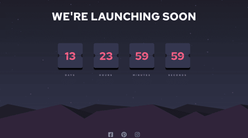
good effort i have some suggestions for you,
the heading part is to big maybe something like from 1.3 to 2 em is good, and the header section try to give it some padding maybe something like 100px it will be better and the card font size i think it needs to be more bigger and the body background color i think it sholud be more darker like this: #1e1f29
and finaly thanks for read my comment and iam if my english is bad
- @bagggary
REALLY COOL ! JUST TRY TO CHANGE THE FONT SIZE MAKE IT LITTLE BIGGER , AND ALSO SOCIAL ICONS LITTLE UP. KEEP THE GOOD WORK 😃

Join our Discord community
Join thousands of Frontend Mentor community members taking the challenges, sharing resources, helping each other, and chatting about all things front-end!
Join our Discord