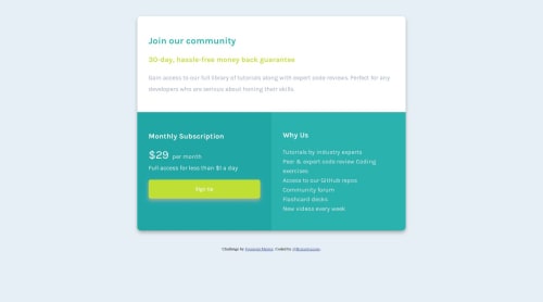
Very first page with responsive!

Solution retrospective
Like i said, this is my very first page with responsive, so I accept any suggestions and recommendations on changes thanks!
Please log in to post a comment
Log in with GitHubCommunity feedback
- @chri55
Hey Braian, very nice!
Between about 850px and 640px, the text in the bottom columns tends to get a bit cramped. When this happens, but I still want the page to be in "desktop" mode more than "mobile" mode, I let the outermost container take up some more space. I'd recommend using a short media query of max-width 850px to make
.principal-containera bit wider and you will see the space of the bottom columns free up a bit and look nicer.Well done on the responsiveness, it looks good in both modes!

Join our Discord community
Join thousands of Frontend Mentor community members taking the challenges, sharing resources, helping each other, and chatting about all things front-end!
Join our Discord