Vite App with styled components, Redux, and React-Dropdown component

Solution retrospective
How to improve accessibility with React?
Please log in to post a comment
Log in with GitHubCommunity feedback
- @pikapikamart
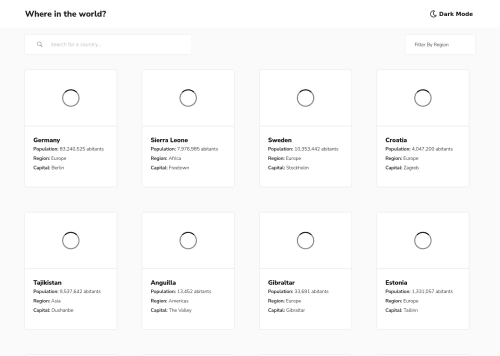
Hey, awesome work on this one. The desktop layout looks great, but on my end, I only get a 3 country card per row. I am using a 1366x768 monitor, also you can make the country cards be justified at center so that when another country card needs to be wrapped in another row, the remaining will be centered something like instead of being left on the left-side like when you go to 106px. The mobile state looks great though.
Some other suggestions on the site would be:
- I am getting some logs so maybe checking if you have left some
console.logon your code. - Always have a
mainelement to wrap the main content of the site. For this usemaintag on the.homepageselector. - The theme toggle works but the markup could be improved on that one. When you are building out a theme toggle in general, it will be better to use radio-buttons since a theme toggle is a selection and radio-buttons are intended for those. The radio-buttons will be placed insidea
fieldsetalong with alegendtag that will describe what is the purpose of thoseinputtags. You can have a look at my solution on this same challenge. Inspect the markup on how it is made and let me know if you have queries about this one. - Do not remove the
outlinestyling. If you did, always include a visual-indicator on the:focus-visiblefor those interactive elements like thebuttonatag and others. - Also, you don't use
spaninside ansvg. Another one, thesvgfor the theme toggle is just a decorativesvgso adding anaria-hidden="true"attribute on it would be really great. - The search-icon on the search-bar as well is decorative so hide it using the method above.
- Your search-bar
inputright now currently lacks associatedlabelto it or anaria-labelto which will define the purpose of theinputelement. Always include it so that user will know what they need to give on eachinput. It could be something likearia-label="country name". - Also, when you are typing out the country name, since you are adding like a
:hoverand bringing up a clear-button, it would be really great to just place thebuttondirectly on the markup so that user could toggle it even without using mouse. Making inclusive components should be prioritize when building it. - For the filter-bar, currently it is only limited for mouse clicks since you are not using an interactive element on it. Remember that interactive components needs to use interactive elements. For this one, you could use
selecttag, though it can't be styled. Another approach would be to userole="listbox", you can see that on my solution since I implemented that one. - For each of the country card, the
atag should not be nesting all of those components since it will be an invalid markup. You could use theatag to wrap theimgand maybe just use theatag's::afterto occupy the full height and width of the single-country-card so that the whole can be toggled. - Those 3 information about the country card could use a
ultag since those are "list" of informations.
VISITING A COUNTRY (on your app) :
- Don't wrap an
atag inside of abuttonor the other way around. Use onlyatag on thego backlink. - The country name could be an
h1because remember that every page of a site needs to have anh1, so for this, use theh1on the name since it is all about the country on the single page. - Again, those 8 information could use a
ultag since they are "list" of information. Also, it would be really nice to add some paddings on those orgapbecause right now, every text are almost touching each other. - For the
borderultag, using any other element exceptlitag as the direct child ofulis invalid. Change theptag on that one or maybe just use like:
div.border__holder
  h2.Border
  ul
    >li
A markup of something like that would be fine.
- Lastly, change each border-countries to using only
atag.atag inside abuttonor vice-versa just adds an extra tab when navigating.
Aside from those, great job again on this one.
Marked as helpful - I am getting some logs so maybe checking if you have left some

Join our Discord community
Join thousands of Frontend Mentor community members taking the challenges, sharing resources, helping each other, and chatting about all things front-end!
Join our Discord