Please log in to post a comment
Log in with GitHubCommunity feedback
- P@monika-webdeveloper
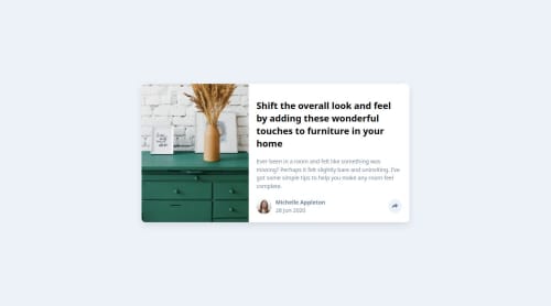
Good job! Your HTML code looks OK. But I think there are some problems with CSS. First of all the hight of the card is too big. The colour of the main heading is too dark. Also the active image is too small. There should be a padding added on both sides.It also doesn't look good on smaller screens so I don't think it's responsive.
Join our Discord community
Join thousands of Frontend Mentor community members taking the challenges, sharing resources, helping each other, and chatting about all things front-end!
Join our Discord