Skip to content
  • Unlock Pro
  • Log in with GitHub
Solution
Submitted almost 2 years ago

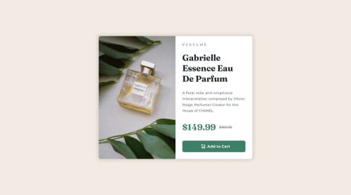
VS Code, No Figma, Single Product Image, CSS Background, Responsive

Matthew Reed•160
@mreed4
A solution to the Product preview card component challenge
View live sitePreview (opens in new tab)View codeCode (opens in new tab)

Solution retrospective


I tried to use an img tag with classes mobile and desktop that when combined with media queries would show either (a) the mobile image, or (b) the desktop image, but I was not successful. I was more successful in using CSS' background-image with background-size, such that I really only had to use one image, where the CSS magic would make the same image appear as it does in the images provided by the Challenge. The CSS magic was unintentional, so I'm lucky it worked out. Should I be using img tags, or does my solution (w/ background-image and background-size) work? Is it better to serve only a single image? If not, why not?

Code
Couldn’t fetch repository

Please log in to post a comment

Log in with GitHub

Community feedback

  • Nohelynaid•180
    @Nohelynaid
    Posted almost 2 years ago

    I think i'm getting what you were trying to do with the img, however as far a I know whatever img you put in the img tag will display by default meaning if you put both mobile and desktop images will display at the same time therefor in that case you would only have to set display none to the mobile one and in the media query, you would only need to reverse it, i mean set display none to the desktop and display block to the mobile in order for the latter to be displayed when the screen size is a mobile size.

    this was the first challenge I did and it wasn't that good with responsive layout, but recently I have done another one that has both mobile and desktop img and it was a pretty good challenge.

    Anyway, I hope it helps you!

  • MaximilianoDanielGarcia•1,980
    @MaximilianoDanielGarcia
    Posted almost 2 years ago

    Hi Matthew, great job!

    Yeah, It exists the picture tag for contain multiple source for an img tag. Also, you can define the condition setting the media attribute. Here an example:

    <picture>
      <source media="(width <= 465px)" srcset="./images/image-product-mobile.jpg">
      <img src="./images/image-product-desktop.jpg" alt="Product desktop image">
    </picture>
    
    
  • Hayat Uddin•0
    @hayat139
    Posted almost 2 years ago

    Hi, dear, it's a great piece of nicely written work. I can't write like you either. But you missed the hover effect on the button. I believe this happened without your knowledge. I hope you improve your learning and writing skills. Good luck to you

Join our Discord community

Join thousands of Frontend Mentor community members taking the challenges, sharing resources, helping each other, and chatting about all things front-end!

Join our Discord

Stay up to datewith new challenges, featured solutions, selected articles, and our latest news

Frontend Mentor

  • Unlock Pro
  • Contact us
  • FAQs
  • Become a partner

Explore

  • Learning paths
  • Challenges
  • Solutions
  • Articles

Community

  • Discord
  • Guidelines

For companies

  • Hire developers
  • Train developers
© Frontend Mentor 2019 - 2025
  • Terms
  • Cookie Policy
  • Privacy Policy
  • License

Oops! 😬

You need to be logged in before you can do that.

Log in with GitHub

Oops! 😬

You need to be logged in before you can do that.

Log in with GitHub

How does the accessibility report work?

When a solution is submitted, we use axe-core to run an automated audit of your code.

This picks out common accessibility issues like not using semantic HTML and not having proper heading hierarchies, among others.

This automated audit is fairly surface level, so we encourage to you review the project and code in more detail with accessibility best practices in mind.

How does the CSS report work?

When a solution is submitted, we use stylelint to run an automated check on the CSS code.

We've added some of our own linting rules based on recommended best practices. These rules are prefixed with frontend-mentor/ which you'll see at the top of each issue in the report.

The report will audit all CSS, SCSS and Less files in your repository.

How does the HTML validation report work?

When a solution is submitted, we use html-validate to run an automated check on the HTML code.

The report picks out common HTML issues such as not using headings within section elements and incorrect nesting of elements, among others.

Note that the report can pick up “invalid” attributes, which some frameworks automatically add to the HTML. These attributes are crucial for how the frameworks function, although they’re technically not valid HTML. As such, some projects can show up with many HTML validation errors, which are benign and are a necessary part of the framework.

How does the JavaScript validation report work?

When a solution is submitted, we use eslint to run an automated check on the JavaScript code.

The report picks out common JavaScript issues such as not using semicolons and using var instead of let or const, among others.

The report will audit all JS and JSX files in your repository. We currently do not support Typescript or other frontend frameworks.

Oops! 😬

You need to be logged in before you can do that.

Log in with GitHub

Oops! 😬

You need to be logged in before you can do that.

Log in with GitHub

Oops! 😬

You need to be logged in before you can do that.

Log in with GitHub