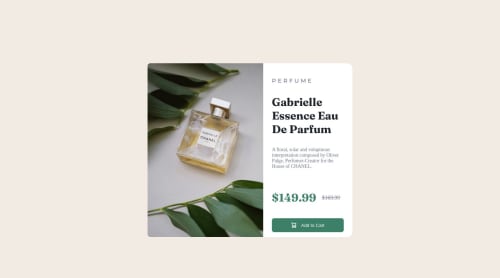
WCSM | Product preview card component

Solution retrospective
I had a little of difficult in css media query to set this website responsive, but in desktop version i had no difficulties
Please log in to post a comment
Log in with GitHubCommunity feedback
- @pradeeps4ini
Hi, Wallace. How are you?
I have some suggestions, i'd like to give.
-
Media query for "max-width:425px" is scaling down your card. You should remove it and change the value of other media query from 375px to 425px.
-
Use semantic markup for your HTML. You can wrap your card/main content in a <main> element and footer in <footer> element.
-
Make your CSS less repetitive using utility classes and custom variables. For example, you're using "display: flex;" on multiple elements. You can create a css declaration ".flex" and assign it to elements.
.flex { display: flex; }Custom properties (CSS Variables) will help you to write a robust CSS. Suppose you are using a value on multiple properties. And in future you'll want to change the value. With variables, you'll have to change the value on the variable property only and not on all the other properties.
-
For different size of same image, you can use <picture> element. With it, you can change the size of image respective to the viewport width.
-
In the .price section. You're using <span> for the prices. <span> is used when we don't have a semantic element for a text. But here you could have used <p>.
-
In the CSS some selectors are too long, which increases the specificity of the selector.
.main_container .main_content .info_section .purchase {}Here, you simply could've used ".purchase{}". And we still would've known that you're targeting an element with .purchase class. If you also want to convey the section of the element, then keep the CSS of each section together. And use comment to tell where the section style starts and ends.
Marked as helpful -
- @Ezefran20
Hello, U see u code, and see all well... U can try delete the width: 100% of your - .main_container - and add : height:100vh; margin: 1.25rem; margin-top: 2rem;
in your - .info_section - add position: relative;
this to center your content in mobile and destkop
(Sorry if my english bad, I speak spanish)
Marked as helpful - @shin-bot87
Hello Wallace!
-
I have downloaded your code and in my computer i can see it well, however in the miniature it's see the content out of the page. I have tested it with differents resolutions (1440px, 768px and 320px) and it's works well.
-
You got a little typo in your code. At the 16 line you have a div container named "main_container" wich doesn't have closed tag. Also you have a next div named "main_content" so it doesn't make sense surround twice the same content with two divs.
-
The title (where P E R F U M E it is) you have separated with white space in the HTML document. A good practise would be use letter-spacing in your CSS styles.
-
You have abuse of the specifity in your css stylesheet. For examplo, if you hava a class called "title" you can just use it like this in your css instead of ".main_container .main_content .info_section .title"
The final result it's quite good =D it's really likes the original one.
Everything wrote above was with all my best intention to help others to improve and get good practise and i never pretended to offend.
I hope to helped you!
Regards.
Marked as helpful -


Join our Discord community
Join thousands of Frontend Mentor community members taking the challenges, sharing resources, helping each other, and chatting about all things front-end!
Join our Discord