Not Found
Not Found
Not Found
Not Found
Not Found
Not Found
Not Found
Not Found
Not Found
Not Found
Not Found
Not Found
Not Found
Not Found
Not Found
Not Found
Not Found
Not Found
Not Found
Not Found

Submitted

Website using bootstrap

#bootstrap

@NikhilKumarSingh4002

Desktop design screenshot for the Product preview card component coding challenge

This is a solution for...

  • HTML
  • CSS
1newbie
View challenge

Design comparison


SolutionDesign

Solution retrospective


I tried to make this website responsive when viewed in mobile. But the lower card breaks in mobile. What can be the error?

Community feedback

Nneoma Njoku 1,210

@SatellitePeace

Posted

Hello @NikhilKumarSingh4002 I commend you for trying to put your knowledge to the test for it is the best way to learn

  • as to why your card is not responsive I think there are a couple of reasons,

  • the margin and paddings are unnecessary

  • the card already has a fixed width of 18rem which can affect responsiveness on different screen sizes

  • Checkout the code below

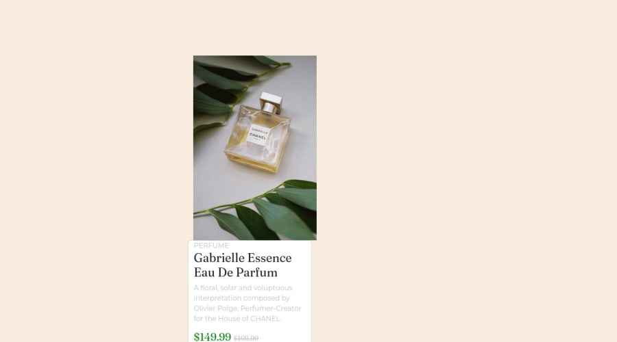
 <main class="card mb-3" style="max-width: 540px; min-width:340px;">
      <div class="row g-0">
        <div class="col-md-6">
          <img "images/image-product-desktop.jpg" class="img-fluid rounded-start" alt="...">
   
        </div>
        <div class="col-md-6">
          <div class="card-body">
            <p  class="card-text"><small class="text-muted">PERFUME</small></p>
            <h1 class="card-title">Gabrielle<br /> Essence Eau<br /> De Parfum</h1>
            <p class="card-text">A floral, solar and voluptuous interpretation composed by Olivier Polge, Perfumer-Creator for the House of CHANEL.</p>
<h2 class="price" >$149.99</h2>
<p class="" >169.99</p>
<div class="d-grid gap-2">
  <button class="btn btn-success" type="button"><img src="images/icon-cart.svg" alt="cart-icon">        Add to Cart</button>
  </div>
          </div>
        </div>
      </div>
    </main>
  • i changed col-lg-6 to col-md-6
  • you will also notice that i removed the fixed width of 18rem and added a max-width and min-width
  • i added a max-width and a width
  • i removed the padding and margin
  • i changed the main container from a div tag to the main tag

NOTE you will still have to write a few custom CSS

-Study the code you and use it to make the necessary corrections in your own code

  • You can also put it in your code editor and play around with it

  • Finally for some unsolicited advice

  • I am no expert but many experts will tell you to learn CSS very well before going into CSS frameworks if you have not learned CSS properly kindly accept the advice of these experts

I HOPE THIS HELPS

1
Adriano 34,000

@AdrianoEscarabote

Posted

Hi NikhilKumarSingh4002, how are you?

I really liked the result of your project, but I have some tips that I think you will like:

1- Every page should have one main landmark <main>. So replace the div that wraps the whole content with <main> to improve the accessibility. click here

2- All page content should be contained by landmarks, you can understand better by clicking here: click here

We have to make sure that all content is contained in a reference region, designated with HTML5 reference elements or ARIA reference regions.

Example:

native HTML5 reference elements:

<body>
    <header>This is the header</header>
    <nav>This is the nav</nav>
    <main>This is the main</main>
    <footer>This is the footer</footer>
</body>

ARIA best practices call for using native HTML5 reference elements instead of ARIA functions whenever possible, but the markup in the following example works:

<body>
     <div role="banner">This is the header</div>
     <div role="navigation">This is the nav</div>
     <div role="main">This is the main</div>
     <div role="contentinfo">This is the footer</div>
</body>

It is a best practice to contain all content, except skip links, in distinct regions such as header, navigation, main, and footer.

Link to read more about: click here

2- Why it Matters

Navigating the web page is far simpler for screen reader users if all of the content splits between one or more high-level sections. Content outside of these sections is difficult to find, and its purpose may be unclear.

HTML has historically lacked some key semantic markers, such as the ability to designate sections of the page as the header, navigation, main content, and footer. Using both HTML5 elements and ARIA landmarks in the same element is considered a best practice, but the future will favor HTML regions as browser support increases.

Rule Description

It is a best practice to ensure that there is only one main landmark to navigate to the primary content of the page and that if the page contains iframe elements, each should either contain no landmarks, or just a single landmark.

Link to read more about: click here

Prefer to use rem over px to have your page working better across browsers and resizing the elements properly

The rest is great!!

Hope it helps...👍

0

Please log in to post a comment

Log in with GitHub
Discord logo

Join our Discord community

Join thousands of Frontend Mentor community members taking the challenges, sharing resources, helping each other, and chatting about all things front-end!

Join our Discord