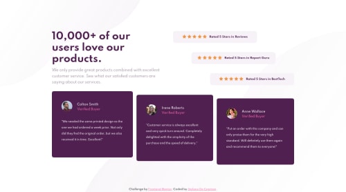
Submitted almost 4 years agoA solution to the Social proof section challenge
When you get stuck, take a break! - Social proof section - HTML & CSS

@StefanoDeCapitani
Solution retrospective
Has anyone else ever been stuck on trying to get the body size right? I did. After an hour of struggling I had to take a break not to get frustrated. All of a sudden the solution did appear magically. Well, today I learned a good lesson! Hope you're finding it interesting :) Anyway...what do you think of my solution? Let me know!
Code
Please log in to post a comment
Log in with GitHubCommunity feedback
- @vanzasetia
👋Hi Stefano!
I have some feedback on this solution:
- You don't need to specify
width: 100vwon yourbody, it's already the default behavior. - For all background images, I recommend to use CSS
background-imageandbackground-positionto position it. Put those properties on yourbody. Then change the background images to another version by using@mediaquery. - Try to do the mobile first and then use
min-widthinstead ofmax-widthfor@mediaquery. That way, the mobile user only needs to download the background images for mobile. - Also, you should increase the breakpoint,
500pxfor desktop layout is too early. I see it on my mobile phone on landscape mode, the content is overflowing. - Use
remor sometimesem.pxunit will not allow the user to control the size of your page.
That's it! Hopefully this is helpful!
Marked as helpful - You don't need to specify

Join our Discord community
Join thousands of Frontend Mentor community members taking the challenges, sharing resources, helping each other, and chatting about all things front-end!
Join our Discord