Skip to content
  • Unlock Pro
  • Log in with GitHub
Solution
Submitted over 2 years ago

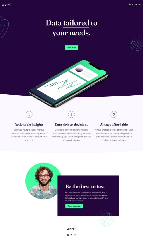
work-it responsive landing page (flex & grid)

arogersrenee•330
@arogersrenee
A solution to the Workit landing page challenge
View live sitePreview (opens in new tab)View codeCode (opens in new tab)

Solution retrospective


This was a hard challenge for me. Any feedback would be extremely helpful.

  1. How do you do curved divs? I don't think the solution I found is the best. It creates a horizontal scroll that I don't know how to fix.

  2. I also know that I need to read into positioning and how to move elements. I found a solution that I was able to play with but any advice in that area is welcome.

Was positioning the best choice to use for the phone and the bottom section with the founder image and the text-box?

Code
Couldn’t fetch repository

Please log in to post a comment

Log in with GitHub

Community feedback

  • Grace•32,130
    @grace-snow
    Posted over 2 years ago

    This looks pretty good I think.

    A few issues:

    • all the main page content needs to go inside main. The about section cannot be outside
    • If this was a real site you wouldn't want the h1 inside header. Header is meant for repeating content on every page of a site but h1 is for the individual page title. I think its fine for this because it's just a landing page but worth being aware of for future projects
    • Make sure you set a max width for the page content. Zoom right out on a desktop browser and you will see how the design breaks
    • An alternative (and arguably better) way to do those curved sections would be with absolutely positioned pseudo elements and svgs or clip path etc.
    • "Mobile phone mockup" is not a proper description of that image. If you think it's meaningful and needs a description, then it needs to be a good enough description for someone to be able to picture the image from reading it. If it's decorative, the alt can be blank
    • I recommend using an ordered list for the 3 numbered sections
    • For the numbers, they should still be in paragraphs. You could even use the css counter to display them maybe.
    • "Workit logo" is not good label for a home link. For this I think you need the alt to be WorkIt - Home and the href should be "/"
    • The social logos definitely need to be anchor links and their alt needs to only be the name of the platform (remove the word 'button')
    • ⚠️ NEVER do this: font-size: 16px; This one is really important. I wrote about why
    Marked as helpful
  • Chanda•820
    @Chanda-Abdul
    Posted over 2 years ago

    Hello 👋🏽,

    • for a curved <div> add border-radius: 32px to the css selector
    • to fix the horizontal scroll add overflow-x: hidden to the parent’s css selector. You may also want to set the width or max-width of the parent, or the entire page, to 100vw so that child elements cannot overflow the parents container.
    • for positioning look into absolute and relative positioning. Use position: relative on the parent element’s css selector and position: absolute; top:0; left: 0; on the child element’s css selector. Adjust the top , bottom , left , right values on the child element to position it relative to the parent element.
    • To position layers use z-index
    • For the numbered list, use an ordered list with list items. https://www.w3schools.com/html/html_lists_ordered.asp

    I hope that helps!

    Marked as helpful
  • Josh•400
    @burrijw
    Posted over 2 years ago

    Nice job! 👏🏻

    Here are a couple suggestions:

    • I'd make sure those social media icons at the bottom are links. Wrap the images in anchors and make sure they have accessible labels. You can hide the label with an 'sr-only' or 'visually-hidden' class.

    • The numbered sections are decorative, meaning they should also be hidden from screen readers. Consider adding an 'sr-only' class on those as well.

    • I think you can get rid of some of the hacky margin and positioning stuff if you use an SVG for the curved section backgrounds instead. Consider adding an ::after pseudo-element to those sections with a curved SVG as the content or background-image.

    • Hiding overflow on the body and/or HTML can be tricky. It won't work on mobile without some special care. I'd recommend avoiding it if you can.

    Good luck!

    Marked as helpful
  • arogersrenee•330
    @arogersrenee
    Posted over 2 years ago

    @grace-snow @Chanda-Abdul @burrijw

    Thanks for feedback. It was truly helpful! I ended up restarting and I took into account as much as I could figure out.

    I tried the svg route on one section and the clipping path on the other. I'll have to play around with them more to figure out when which is better than the other.

    I also did the same for the coils. A couple are background images and the other added to the html. Positioning these was a challenge.

    Overall, there's much more that I need to figure out. As a beginner (1 month of learning html & css) this was much harder than I thought it would be!

  • Chanda•820
    @Chanda-Abdul
    Posted over 2 years ago

    oh, and for a full curved bottom/top border on a <div> or <section> you could use clip-path or radial-gradient

Join our Discord community

Join thousands of Frontend Mentor community members taking the challenges, sharing resources, helping each other, and chatting about all things front-end!

Join our Discord

Stay up to datewith new challenges, featured solutions, selected articles, and our latest news

Frontend Mentor

  • Unlock Pro
  • Contact us
  • FAQs
  • Become a partner

Explore

  • Learning paths
  • Challenges
  • Solutions
  • Articles

Community

  • Discord
  • Guidelines

For companies

  • Hire developers
  • Train developers
© Frontend Mentor 2019 - 2025
  • Terms
  • Cookie Policy
  • Privacy Policy
  • License

Oops! 😬

You need to be logged in before you can do that.

Log in with GitHub

Oops! 😬

You need to be logged in before you can do that.

Log in with GitHub

How does the accessibility report work?

When a solution is submitted, we use axe-core to run an automated audit of your code.

This picks out common accessibility issues like not using semantic HTML and not having proper heading hierarchies, among others.

This automated audit is fairly surface level, so we encourage to you review the project and code in more detail with accessibility best practices in mind.

How does the CSS report work?

When a solution is submitted, we use stylelint to run an automated check on the CSS code.

We've added some of our own linting rules based on recommended best practices. These rules are prefixed with frontend-mentor/ which you'll see at the top of each issue in the report.

The report will audit all CSS, SCSS and Less files in your repository.

How does the HTML validation report work?

When a solution is submitted, we use html-validate to run an automated check on the HTML code.

The report picks out common HTML issues such as not using headings within section elements and incorrect nesting of elements, among others.

Note that the report can pick up “invalid” attributes, which some frameworks automatically add to the HTML. These attributes are crucial for how the frameworks function, although they’re technically not valid HTML. As such, some projects can show up with many HTML validation errors, which are benign and are a necessary part of the framework.

How does the JavaScript validation report work?

When a solution is submitted, we use eslint to run an automated check on the JavaScript code.

The report picks out common JavaScript issues such as not using semicolons and using var instead of let or const, among others.

The report will audit all JS and JSX files in your repository. We currently do not support Typescript or other frontend frameworks.

Frontend Mentor for Teams

Frontend Mentor for Teams helps companies and schools onboard and train developers through project-based learning. Our industry-standard projects give developers hands-on experience tackling real coding problems, helping them master their craft.

If you work in a company or are a student in a coding school, feel free to share Frontend Mentor for Teams with your manager or instructor, as they may use it to help with your coding education.

Learn more

Oops! 😬

You need to be logged in before you can do that.

Log in with GitHub

Oops! 😬

You need to be logged in before you can do that.

Log in with GitHub

Oops! 😬

You need to be logged in before you can do that.

Log in with GitHub