10 fundamental web accessibility tips for front-end developers
Accessibility is an often under-represented topic in web dev learning. However, building accessible UIs is critical to being a good front-end developer. Nefe offers some tips to get you started.
Table of contents
- What is web accessibility?
- Use semantic HTML elements
- Use relevant ARIA roles and attributes
- Follow color contrast guidelines
- Support keyboard navigation
- Add descriptive alt text to images
- Make SVG icons accessible
- Ensure all forms are accessible
- Use proper heading levels on every page
- Make animations accessible with prefers-reduced-motion
- Test with assistive technologies
- The importance of web accessibility
- Conclusion
As front-end developers, we often use the latest tools and technologies to build pixel-perfect, aesthetically pleasing, and fully functional websites and web applications that will leave a strong impression on web visitors.
As essential as those are, the web development process is incomplete if our websites are not accessible to all web visitors. In a world where 15% of its population, around 1 billion people, lives with some form of disability, whether physical, sensory, cognitive, or intellectual disability, we cannot afford to treat accessibility as an afterthought. Instead, it must become an integral part of our development process, and we must ensure that the websites we build are designed to be inclusive and accessible to all.
In this article, we will explore 10 tips and strategies front-end developers can and should implement to make their websites accessible. Let's dive in.
What is web accessibility?
Web accessibility is the practice and steps to ensure that websites are completely accessible to all visitors. For a long time, many looked down upon web accessibility and did not consider it worth the effort. However, those misconceptions have changed as developers increasingly realize how an accessible web helps end users get the best experience.
The Web Accessibility Initiative (WAI) of the World Wide Web Consortium (W3C) manages the web accessibility standards we must adhere to and publish them under the Web Content Accessibility Guidelines (WCAG) umbrella. The W3C is an international organization created in Switzerland. It is committed to improving the web for everyone.
Now that we know what web accessibility is, let's explore 10 things we can do to make our websites accessible.
Use semantic HTML elements
Semantic HTML elements like nav, aside, main, header, and footer are important for accessibility. They give screen readers contextual information about the different parts of a page. It gives assistive technology a better understanding of the different parts of a page.
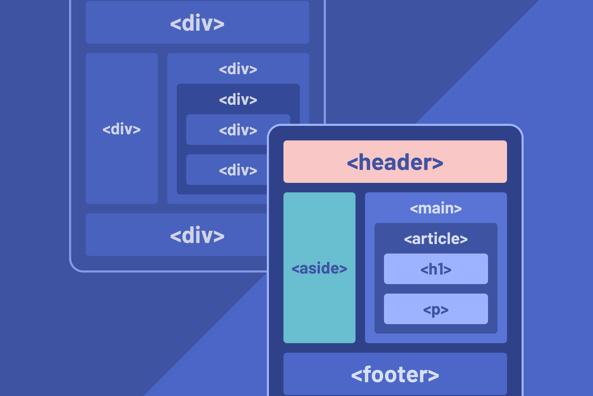
Let's explore an example. Imagine we made a website navigation with div elements:
<div class="nav">
  <div class="nav-links">
    <p><a href="#">Home</a></p>
    <p><a href="#">About us</a></p>
    <p><a href="#">Services</a></p>
  </div>
</div>
Using div elements indiscriminately, a case known as “divitis”, makes it difficult to scan an HTML document to see the different sections. It also makes styling harder because we'll need to use CSS classes to target the elements we want to style.
Besides those, using non-semantic HTML elements also leads to poor accessibility. Screen readers won't be able to tell that we have created a navigation menu because the divs don't provide semantic meaning. In fact, screen readers completely ignore div elements.
We can fix this by using the proper semantic HTML elements:
<nav>
  <ul>
    <li><a href="#">Home</a></li>
    <li><a href="#">About us</a></li>
    <li><a href="#">Services</a></li>
  </ul>
</nav>
Switching from div to nav improves accessibility as the nav element becomes a page landmark for screen readers. Using li for the link list instead of p means that screen readers will announce the links as items in a list, further boosting accessibility. Using li also eliminates the need for CSS classes since we can directly target the distinct elements themselves. This doesn't mean styling with classes is bad. However, there are cases like this where using semantic HTML elements can remove the need for unnecessary classes.
Use relevant ARIA roles and attributes
Still using the navigation menu example from earlier. While using semantic elements is the recommended way of creating an accessible menu, we can actually use a div if we attach the appropriate Accessible Rich Internet Applications (ARIA) attributes like role.
<div class="nav" role="navigation">
  <div class="nav-links">
      <!-- insert nav links -->
  </div>
</div>
Adding the role attribute helps screen readers understand that the div contains a list of navigation links. While this works, it's best not to reinvent the wheel and stick with the appropriate elements, as the MDN web docs recommend.
Follow color contrast guidelines
Poor color contrasts between background, foreground, and text colors will lead to a poor experience for many users. As front-end developers, we sometimes assume that everyone who visits our websites will be able to read the text just because we can! That's a risky assumption to make, seeing as people have varying levels of visual impairments. Instead, we must ensure that the text is legible to all readers.
The image below is an example of a poor contrast. People with good eyesight can read the text with some effort and strain. However, it would be near impossible for those with poor vision.

The WCAG set a minimum contrast ratio of 4.5:1 for normal text and 3:1 for large text. Learn more about the acceptable contrast ratios.
Here are some tools we can use to check if the contrast ratio of our website's background, foreground, and text colors meets this minimum requirement:
Support keyboard navigation
People with motor disabilities can't use their hands properly due to issues ranging from tremors to complete paralysis. They rely heavily on their keyboard for navigating websites. Besides catering to those with disabilities, others may prefer using their keyboards for website navigation.
Here are some ways we can support keyboard navigation:
1. Using semantic HTML elements
Semantic HTML elements help with keyboard accessibility because they are focusable by default. This means users can focus on and interact with these elements by pressing their tab and shift+tab keys. Focusable elements include button, a, input, select, and textarea, among others.
2. Ensuring focusable elements have focus indicators
Focus indicators are visual cues that help us know what element in a web page is currently in focus. An example is when an input field has an outline around it to show that it is active and in focus, like in the image below:

Some developers make the mistake of removing the default outline and border styles that browsers add to focusable elements because these default styles don't match their website's design, a mistake I am guilty of making in the past.
The problem is that doing this makes it impossible for those who rely on the keyboard for navigation to know what element is currently in focus. Again, we must remember that people will use different methods for navigating our pages, so our websites should be accessible to all.
Add descriptive alt text to images
Adding alt text to images is important for two reasons:
-
Assistive technologies like screen readers rely on them to let visually impaired users know what's in an image.
-
It helps those without visual disabilities receive information about an image if it doesn't load on the browser. Images can fail to load for several reasons, including server issues, CDN downtime, and inputting the wrong image sources. When that happens, the browser renders an element that shows that the image didn't load. If the image has an alt text attached, the browser will also display the alt text for the user to see.
Here's a code snippet of how an image's alt text looks:
<img src="./dogs.jpg" alt="Two dogs running through a field" />
Make SVG icons accessible
One commonly overlooked aspect of web accessibility is icons. I never even knew that we had to make icons accessible. How we treat icons depends on whether they are decorative or semantic.
Decorative icons
Screen readers don't need to announce decorative icons because they have no meaning. An envelope icon attached to a submit button is an example of a decorative icon. The best way to handle these icons is to hide them from screen readers with the aria-hidden attribute, as in the code snippet below.
Also, adding the focusable attribute ensures that the hidden icons do not receive focus in IE browsers.
<button>
  <svg class="envelope" aria-hidden="true">...</svg>
  Send message
</button>

<a href="#">
  <svg class="home" aria-hidden="true" focusable="false">...</svg>
  Home
</a>
Semantic icons
There are cases where icons convey semantic meaning. An example is an icon-only button, like the right arrow of a pagination component. In such a case, we need screen readers to describe what the icon does. We can achieve this with the title and desc elements.
title provides short alternative descriptions about an SVG element, while desc provides greater semantic information about an SVG. Let's explore how they work in practice.
<!-- title tag sample. -->
<svg class="right-arrow" role="img" aria-labelledby="arrow-title">
  <title id="arrow-title">Pagination arrow</title>
  ...
</svg>

<!-- desc tag sample. -->
<svg class="right-arrow" role="img" aria-labelledby="arrow-title" aria-describedby="arrow-desc">
  <title id="arrow-title">Pagination arrow</title>
  <desc id="arrow-desc">A pagination arrow that takes you to the next page once triggered</desc>
  ...
</svg>
In the code sample above, the aria-labelledby attribute tells the SVG that its label is attached to the title element. Likewise, the aria-describedby attribute tells the SVG that its description is tied to the desc element.
With that, the screen reader will get detailed information about the icon and convey that data to the user.
Ensure all forms are accessible
Forms are a vital part of how people interact with the web. They can submit messages, make purchases, and more with forms. Here are some ways we can make them accessible:
1. Pair input fields with a corresponding label
Adding a label to inputs improves accessibility for people with motor disabilities and visual impairments. Here's how:
-
Motor disabilities: It makes it easier for this group of users to focus on specific input fields by giving them a wider surface area to click on.
-
Visual impairments: When a label is attached to an input, screen readers will announce that label whenever the input is in focus.
However, we must first link the labels to their respective inputs for these to work. We can pair labels and inputs together by attaching the labels explicitly or implicitly.
Let's explore these linking methods in code.
<!-- implicit linking -->
<label>
  Name:
  <input type="text" name="name" />
</label>

<!-- explicit linking -->
<label for="user-name">Name: </label>
<input type="text" id="user-name" name="name" />
In the code above, we have applied the implicit and explicit linking methods. Implicit linking involves wrapping the input inside the label as the label's child. Explicit linking uses only the label's for attribute and the input's id attribute to link them together.
2. Link errors to their specific input fields
Mistakes are bound to happen when users fill out forms, so we must ensure that any error messages that appear are accessible to users with varying disabilities.
Developers, myself included, often set up error messages this way:
<label for="user-name">Name: </label>
<input type="text" id="user-name" name="name" />
<p>Error: Name is required </p>
This type of error handling is inaccessible to visually impaired users who rely on screen readers because we haven't told the screen readers that the error is linked to the input field. That means if any errors exist, the user won't know what the problem is.
We can make the error message accessible by using the following aria labels:
-
aria-describedby: allows us to describe the state of an element using another element. In this case, it helps screen readers know that the span error message is associated with the input. -
aria-live="polite": tells assistive technology to announce an update on the page, the update being that an error message has appeared for a form field.
Here's a code sample:
<label for="username">Username:</label>
<input
  type="text"
  id="username"
  name="username"
  aria-describedby="username-error"
/>
<p id="username-error" class="error-message" aria-live="polite">
  A username is required.
</p>
Note that the p with the error message should be present in the DOM but empty by default for use in real projects. This ensures assistive technologies announce the error message at the point the content is added.
3. Enable the autocomplete feature
I have encountered form fields where the developers turned off the form's autocomplete feature. It was always an unpleasant experience, particularly because I had to fill out the form again if I made an error.
Having autocomplete enabled helps people with motor disabilities fill forms faster because they won't have to manually input their information every time.
Note that the autocomplete is enabled by default, so we only need to explicitly include it to help browsers know what information an input field expects, if necessary.
Here's a code snippet of this in action:
<label for="first-name">Name: </label>
<input type="text" id="first-name" name="first name" autocomplete="given-name" />
Explore MDN to learn more about how the autocomplete attribute works.
4. Use the correct input types
There are over 20 HTML input types, and using the right one is important for accessibility, as it makes it easier for users to fill in the required information. For example, an input with a number type will bring up the number keyboard on mobile devices, making it easier to complete the fields.
5. Ensure form fields have clear focus indicators
As discussed earlier, focus indicators help users see which form field is active and currently in focus.
Use proper heading levels on every page
Headings are essential to a website's structure, accessibility, and SEO. We can use six levels of headings: h1 to h6. Not using headings properly negatively affects how assistive technology interprets the content on a website.
Imagine how difficult navigating a textbook would be if it didn't have an outline or table of contents. Similarly, screen readers use headings to generate outlines, and people then use the outlines to navigate websites. This means our websites would be inaccessible if we don't use the right headings.
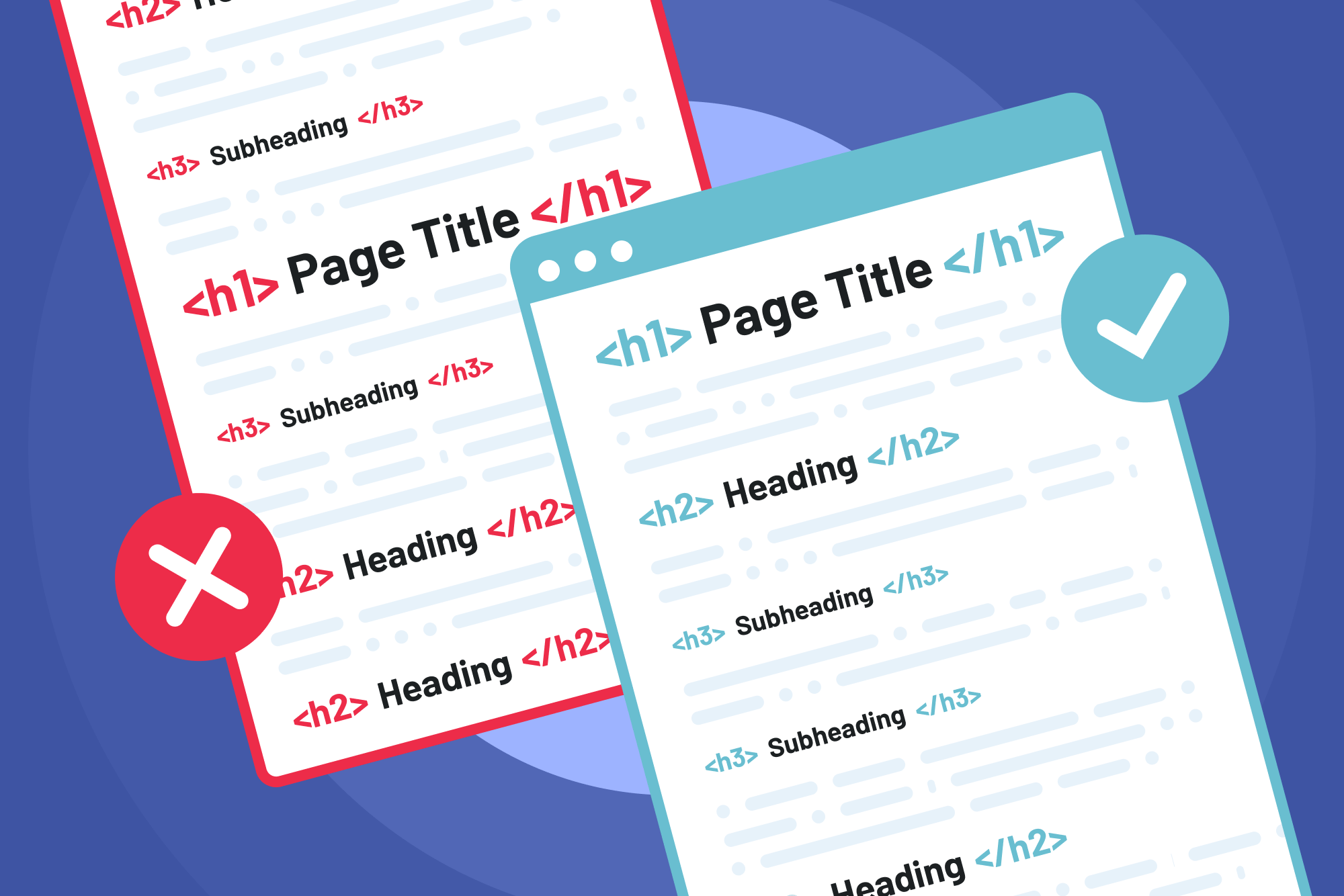
Here are some things to note when working with headings on a website:
-
Every webpage should have only one
h1heading. -
Make sure the headings on a page follow a hierarchical order. That is
h1→h2→h3and so on. -
Don't use a
h3(or any other level heading) when you need ah1because the design requires a small heading. Instead, use ah1and style it appropriately. -
Don't use a
porspanin the place of a heading. Use the proper semantic heading elements instead and style accordingly.
Make animations accessible with prefers-reduced-motion
Animations are great and, when done right, can lead to a richer user experience. However, they can also negatively affect users with attention-related disorders, certain neurocognitive conditions, and vision-related disabilities.
We can use prefers-reduced-motion to give them control over the animations on a website. The prefers-reduced-motion media query checks if a user has turned off animations on their device and allows us to apply CSS styles that fit their preference.
Let's see how this works in practice:
.cool-custom-animation {
  animation: pulse 1s linear infinite both;
  background-color: purple;
}

/* apply these styles if the user prefers reduced motion */
@media (prefers-reduced-motion) {
  .cool-custom-animation {
    animation: none;
  }
}
Instead of defining the animations first and then creating a prefers-reduced-motion fallback, we can define the animations only when the user has no motion preferences. A benefit of this approach is that it requires less code, as we only define the animations once.
Here’s the code for that:
@media (prefers-reduced-motion: no-preference) {
  .cool-custom-animation {
    animation: pulse 1s linear infinite both;
    background-color: purple;
  }
}
Test with assistive technologies
After implementing the web accessibility tips we've covered, we must test our website with screen readers and other assistive technologies to ensure it is fully accessible to users with varying disabilities.
We can perform web accessibility tests by using:
-
The default accessibility testing tools browsers provide, like Lighthouse in Chrome.
-
Just the keyboard to navigate the website and interact with all the elements. This is a quick and easy way to spot lingering accessibility issues, if any.
-
Any of the web accessibility color checkers we explored earlier.
-
Tools like axe DevTools, Accessibility Insights, and Accessibility Checker that provide free accessibility scans.
The importance of web accessibility
Here are some reasons why we need to ensure our websites are accessible:
Promotes inclusivity and equal access to information and digital services
An accessible web is an inclusive web. Just like people without disabilities browse the web to shop, sell, and communicate, those with disabilities also deserve the same level of access to information, services, and opportunities.
Not only do inaccessible websites restrict a large audience from participating in the web, but they also rob us of their contribution and creativity! As developers, we are responsible for advocating for an accessible and inclusive web in every project we undertake.
Better user experience
An inaccessible website that does not cater to people with disabilities will lead to a poor user experience. Visually impaired people, for example, will be unable to understand what an image depicts if we do not add alt texts to the images. The simple action of adding descriptive images goes a long way in improving the user experience. However, this doesn't benefit the visually impaired alone. It also helps those with slow internet connections in cases where their images fail to load.
SEO performance
Imagine visiting a website to read about responsive design tips and tricks, only to see that the words are tiny and the text contrasts poorly. I'm sure you will leave that website in minutes! Likewise, web visitors are highly likely to leave a website that is inaccessible to them. In fact, 69% of users will abandon a website due to a lack of accessibility.
Search engines like Google use web visitors' engagement metrics to determine whether a website is valuable. Once they notice a website has a high bounce rate, they will deprioritize it and drop its rankings.
Besides that, search engines also consider factors like images having alt texts and the readability of web content when calculating Search Engine Result Page (SERP) rankings. Essentially, accessible websites will have higher SEO rankings than inaccessible ones.
Greater market reach and profitability
Businesses that don't cater to people with disabilities are missing out on a largely overlooked market force. In 2021, eCommerce businesses lost $828 million in holiday sales because their websites were inaccessible. 1 billion people worldwide have a high purchasing power, and they are too large a demographic to ignore. In the United States alone, the purchasing power of disabled people is worth over $350 billion.
By making websites accessible, businesses can offer their services to a larger audience, improve their brand perception, and increase sales and customer loyalty.
Compliance with legal requirements
Ensuring our websites are accessible is not just the right thing to do. There are also laws and regulations involved. Some accessible regulations we must adhere to include the following:
-
Americans with Disabilities Act (ADA): was introduced in 1990, and under it, websites with inaccessible components can be seen as discriminatory against individuals with disabilities.
-
The European Accessibility Act (EAA): requires that products and services such as computers and operating systems, smartphones, and e-commerce platforms be compatible with assistive technologies and presented in a format appropriate for all users.
-
The UK Equality Act: protects people from unfair treatment while promoting an equal society.
-
The Rehabilitation Act of 1973: requires that every electronic and information technology the federal government develops, procures, maintains, or uses should be accessible to people with disabilities.
These laws prohibit discrimination against people with disabilities and require that businesses and organizations make reasonable accommodations for them. Failure to comply with them can lead to fines, lawsuits, and other legal issues. Brands like Target and Domino's Pizza have suffered fines and lawsuits because their websites were inaccessible.
Conclusion
Gone are the days when inaccessible websites were the norm. In this day and age, users have high expectations, and more businesses are taking web accessibility seriously. Along these lines, companies seek developers who can build accessible websites, not just highly performant ones.
I recommend implementing the accessibility practices we've covered in your next Frontend Mentor challenge.
What are the four principles of the Web Content Accessibility Guidelines?
The four principles are known as the POUR acronym, and they are:
-
Perceivable: means that users must be able to perceive website content and identity interface elements with their senses.
-
Operable: means that users must be able to interact with a website and perform varying actions like filling forms and navigating between pages.
-
Understandable: means that the information on a website must be displayed in a format that is easy to comprehend.
-
Robust: means that users must be able to access a website's content through various technologies and formats.
What is the objective of web accessibility?
The objective of web accessibility is to ensure that all visitors can access websites, web apps, and other online services without barriers or limitations. Web accessibility promotes digital inclusivity and caters to the needs of all web visitors, regardless of any disabilities they may have.
Take your skills to the next level
- AI-powered solution reviews
- 50+ portfolio-ready premium projects
- Professional Figma design files