Exploring 15 lesser-known CSS pseudo-class selectors
Pseudo-selectors offer us a range of useful ways to select elements based on state or position within the document. In this article, Sarah explores some lesser-known selectors you might find helpful.
Table of contents
In web development, Cascading Style Sheets (CSS) pseudo-classes are a familiar concept among developers. However, there are some selectors that you might not be familiar with yet. This range of selectors gives developers more options and approaches to styling elements.
In this article, we will explore 15 of these lesser-known CSS pseudo-class selectors. We will cover their purpose, syntax, usage, benefits, and browser compatibility. Let's dive in.
What are pseudo-class selectors?
Pseudo-class selectors are reserved keywords in CSS that target and style an element based on its dynamic state, position, or relation to other elements in the document.
A prefixed colon denotes each selector.
:pseudo-selector {
  /* styles to apply */
}
These special selectors extend styling possibilities beyond traditional selection methods like element name, ID, or class.
For instance, the :hover pseudo-class selector enables the targeted styling of an element when a user hovers over it:
button:hover {
  /* Styles applied when hovering over the button */
  color: #eee;
  background: #11f;
}
The above code changes the button's text and background color when a user hovers over it.
Now that we understand the basics of CSS pseudo-class selectors, let's examine some lesser-known ones.
:fullscreen
The :fullsceen pseudo-class selector targets and applies styles to elements viewed in full-screen mode, which means the element is displayed on the entire device screen. This selector differs from the fullscreen API, which is used to toggle an element into fullscreen mode.
Note that setting an element to fullscreen via the fullscreen API differs from using the standard browser keyboard shortcuts (F11 or cmd+shift+F) to toggle the entire browser to fullscreen. The API only enables an element to be viewed without the browser's UI elements in sight and lacks keyboard shortcut control.
Syntax
:fullscreen {
  /* styles to apply */
}
Example usage
Let's say we want to change the filter color of an image displayed in full-screen mode.
<!-- HTML -->

<img src="cutecat.jpg" id="cat-image" />

<button id="js-fullscreen" onclick="document.getElementById('cat-image').requestFullscreen()"> View image in full screen</button>
/** CSS **/

#cat-image {
  width: 200px;
  object-fit: contain;
  filter: grayscale(100%);
}

#cat-image:fullscreen {
  filter: grayscale(0%);
}
The code example above removes the gray filter when the #cat-image element is in fullscreen mode, making the image fully colored.
Image when not in fullscreen mode:
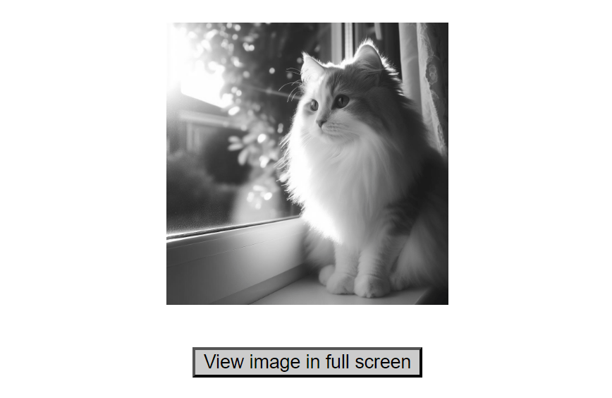
Image when in fullscreen mode:

The :fullscreen selector enables targeted styling for elements when in fullscreen mode. This precision in targeting allows you to apply styles only when necessary, avoiding unintended consequences on non-fullscreen elements. This level of control is beneficial when you want to adjust the layout or appearance of elements exclusively during fullscreen scenarios.
Browser support
The "Can I Use?" browser support table for the :fullscreen pseudo-class selector shows it is supported in most major browsers.
:indeterminate
The :indeterminate pseudo-class selector targets elements in an undetermined or intermediate state.
This selector is handy for customizing elements such as:
-
A group of radio buttons that are all unchecked.
-
Progress elements with no value attribute present.
-
Checkboxes with the
indeterminateattribute set totrue(using JavaScript), which indicates that they are neither checked nor unchecked.
Syntax
:indeterminate {
  /* styles to apply */
}
Example usage
Consider a scenario where we have a quiz form and want to visually indicate to the user which question has yet to be answered.
<!-- HTML -->

<form action="#">
  <h2>Pop Quiz</h2>
  <fieldset>
    <legend>1. What is the first month of the year</legend>
    <label>
      <input type="radio" name="question-1" value="November">
      November
    </label>

    <label>
      <input type="radio" name="question-1" value="January">
      January
    </label>

    <label>
      <input type="radio" name="question-1" value="October">
      October
    </label>
  </fieldset>

  <fieldset>
    <legend>2. What day is Christmas?</legend>
    <label>
      <input type="radio" name="question-2" value="September 15">
      15th of September
    </label>

    <label>
      <input type="radio" name="question-2" value="February 20">
      20th of February
    </label>

    <label>
      <input type="radio" name="question-2" value="December 25">
      25th of December
    </label>
  </fieldset>

  <button type="submit">Submit</button>
</form>
/** CSS **/
input[type="radio"]:indeterminate {
  outline: 2px solid gold;
}
In the code above, a gold outline is applied to each group of unchecked radio buttons in the form.
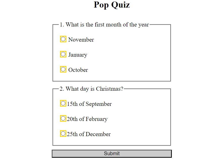
This state is removed for a group when its radio buttons are checked.
Benefit
The :indeterminate pseudo-class selector provides a mechanism for styling elements based on their dynamic states or interactions with the user. This enables you to dynamically highlight a user's current position within a form as they interact with it. This capability enhances the user experience by providing visual feedback.
Browser support
The “Can I Use?” browser support table for the :indeterminate pseudo-class selector shows it is supported in recent versions of all major browsers.
:invalid
The :invalid pseudo-class selector targets form input fields whose values are in an incorrect format to what is expected in that field.
Syntax
:invalid {
  /* styles to apply*/
}
Example usage
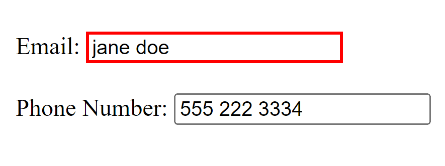
Let us take, for example, a form with two input fields. We want to provide the user with a visual cue when the value entered into the field is in an incorrect format.
<!-- HTML -->

<form action="#">
  <label>Email:
    <input type="email" placeholder="[email protected]">
  </label>

  <label>Phone Number:
    <input type="tel" placeholder="555 222 3334">
  </label>
</form>
/* CSS */

input:invalid {
  border: 2px solid red;
}
In the above code example, the border color of the input fields turns red only when the user enters data in an incorrect format.
Benefit
The :invalid pseudo-class selector allows the consistent styling of all invalid input fields in a form across different browsers. It alerts the user that the data entered into the field is incorrectly formatted, eliminating the need to style invalid input fields with JavaScript.
Browser support
The “Can I Use?” browser support table for the :invalid pseudo-class selector shows it is supported in recent versions of all major browsers.
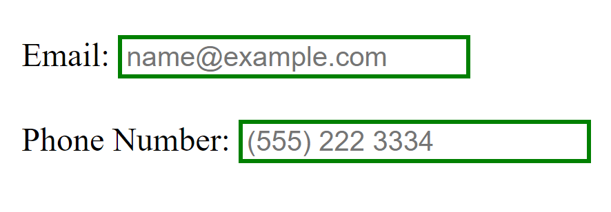
:valid
The :valid pseudo-class selector targets form input fields with values in the correct data format for that field. This selector does the opposite of the :invalid pseudo-class selector.
Syntax
:valid {
  /* styles to apply*/
}
Example usage
For example, let's take a form with two input fields. We want to give the user a visual cue when the value entered into the field is in the correct format.
<!-- HTML -->

<form action="#">
  <label>
    Email:
    <input type="email" placeholder="[email protected]">
  </label>

  <label>
    Phone Number:
    <input type="tel" placeholder="(555) 222 3334">
  </label>
</form>
/* CSS */

input:valid {
  border: 2px solid green;
}
In the above code example, the border color of the input fields would turn green when the user enters the correct data format for that field, as indicated by the placeholder values.
Benefit
The :valid pseudo-class selector allows the consistent styling of all valid input fields in a form across different browsers, serving as a visual cue to the user that their data entered into the input field is formatted correctly.
Browser support
The “Can I Use?” browser support table for the :valid pseudo-class selector shows it is supported in recent versions of all major browsers.
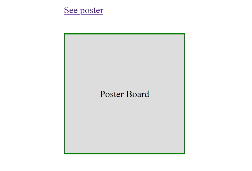
:target
The :target pseudo-class selector applies styling to the target element of an anchor link, which is referenced by the element’s id attribute.
Syntax
:target {
  /* styles to apply*/
}
Example usage
Let us take, for example, an element somewhere on the page and an anchor link to reference that element.
<!-- HTML -->

<a href="#poster-board">See poster</a>

<div id="poster-board">Poster Board</div>
/* CSS */

#poster-board{
  width: 200px;
  height: 200px;
  display: grid;
  place-items: center;
  background-color: #ddd;
}

:target {
  border: 2px solid green
}
In the code example above, the div element with the id of poster-board would have a green border color applied when navigated by clicking the “See poster” anchor link.
Benefit
The :target pseudo-class selector can apply styles to elements based on on-page interactions. For example, applying highlighted styles to article text when a heading is clicked in the table of contents.
Browser support
The “Can I Use?” browser support table for the :target pseudo-class selector shows it is supported in recent versions of all major browsers.
:default
The :default pseudo-class selector targets checkboxes and radio buttons in a related group that is checked by default, as well as <option> elements with the selected attribute in a dropdown and the default submit button of a form.
Syntax
:default {
  /* styles to apply*/
}
Example usage
Let’s say we want to provide styling to the default checkbox in a form with a fieldset of related checkboxes.
<!-- HTML -->

<form action="#">
  <fieldset>
    <legend>Primary Language</legend>
    <label>
      <input type="checkbox" name="primary-language" checked>
      English
    </label>

    <label>
      <input type="checkbox" name="primary-language">
      Spanish
    </label>

    <label>
      <input type="checkbox" name="primary-language">
      French
    </label>
  <fieldset>
</form>
/* CSS */

input:default {
  outline: 2px solid gold;
}
In the above code, the outline color of the English checkbox would be set to gold because it is the default value in the primary-language checkbox group.
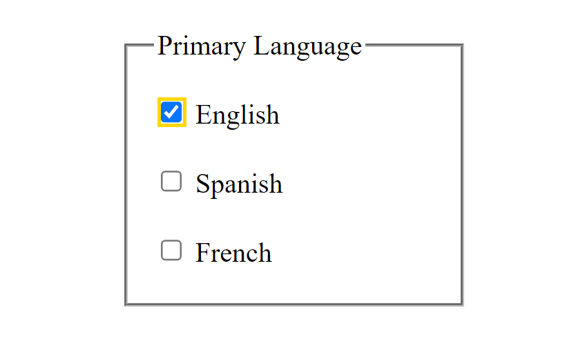
This state remains even when the user has checked a different value.
Benefit
The :default pseudo-class selector helps to provide visually distinct cues for default values of related form elements. It also helps provide consistent styling of all default form elements across different browsers.
Browser support
The “Can I Use?” browser support table for the :default pseudo-class selector shows it is supported in recent versions of all major browsers.
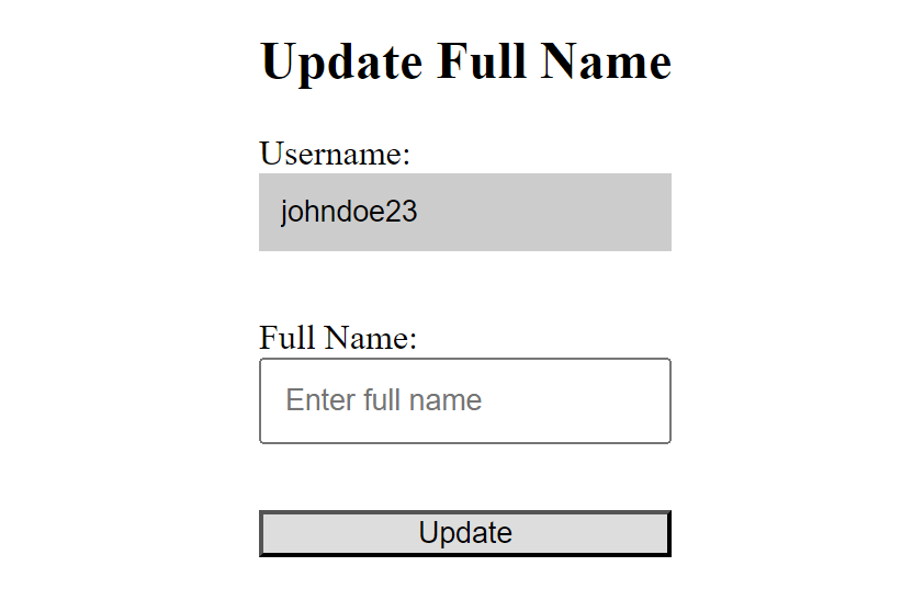
:read-only
The :read-only pseudo-class selector targets elements that are editable by default but have been made non-editable to the user by the readonly attribute.
Syntax
:read-only {
  /* styles to apply */
}
Example usage
Let’s say we have a form that allows only the user’s full name to be edited. We want to provide distinct styling for any non-editable input field in the form to serve as a visual cue to the user that the field cannot be edited.
<!-- HTML -->

<form action="#">
  <h2>Update Full Name</h2>
  <label for="username">Username:</label>
  <input type="text" id="username" name="username" value="johndoe23" readonly>

  <label for="fullname">Full Name:</label>
  <input type="text" id="fullname" name="fullname" placeholder="Enter full name">

  <button type="submit">Update </button>
</form>
/* CSS */

input:read-only {
  border: none;
  background-color: #ccc;
}
The code above removes the border and sets a gray background color to the read-only username input field in the form.
Benefit
The :read-only pseudo-class selector offers a way to provide consistent styling for non-editable content in a form across different browsers.
Browser support
The “Can I Use?” browser support table for the :read-only pseudo-class selector shows it is supported in recent versions of all major browsers.
:read-write
The :read-write pseudo-class selector targets elements that are user-editable by default and are not set to read-only or disabled, such as input fields and textarea elements or elements that have the contenteditable attribute
Syntax
:read-write {
  /* styles to apply */
}
Example usage
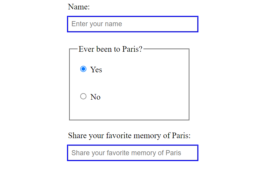
Let’s say we have a form with an input field asking the user to share a favorite memory. This field is disabled by default and will only be writable if the user clicks yes to the previous question in the form.
<!-- HTML -->

<form action="#">
  <label>
    Name:
    <input type="text" placeholder="Enter your name">
  </label>

  <fieldset>
    <legend>Ever been to Paris?</legend>

    <label>
      <input type="radio" name="paris" onclick="toggleInputState(true)">
      Yes
    </label>

    <label>
      <input type="radio" name="paris" onclick="toggleInputState(false)">
      No
    </label>
  </fieldset>

  <label>
    Share your favourite memory of Paris:
    <input type="text" placeholder="Share your favorite memory of Paris" id="memory" disabled>
  </label>
</form>
/* CSS */

input:read-write {
  outline: 2px solid blue;
}
// JavaScript

// Function to toggle the disabled state of the #memory Input field
function toggleInputState(isEnabled) {
  const memoryInput = document.getElementById('memory')
  memoryInput.disabled = !isEnabled;
}
In the above code example, the blue outline color is applied to all the writable input fields in the form. The memory input field is disabled by default but made writable only when the user clicks the Yes radio button in the previous question in the form. It is disabled if the user clicks No. This means the blue outline would only be applied to the input field when the Yes radio button is clicked, indicating it is now a writable field.
Benefit
The :read-write pseudo-class selector helps to provide distinct styling to user-editable content on the page.
Browser support
The “Can I Use?” browser support table for the :read-write pseudo-class selector shows it is supported in recent versions of all major browsers.
:autofill
The :autofill pseudo-class selector targets form input fields whose values are automatically filled in by the browser.
Syntax
:autofill {
  /* styles to apply*/
}
Example usage
Let’s say we have a form that accepts a user’s details.
<!-- HTML -->

<form action="#>
  <label>
    Name:
    <input type="text" placeholder="Enter your name">
  </label>

  <label>
    Email:
    <input type="email" placeholder="Enter your email">
  </label>

  <label>
    Phone Number:
    <input type="tel">
  </label>
</form>
/* CSS */

input:autofill {
  border: 3px solid blue;
}
In the code example above, a blue border is applied to the input fields whose values are automatically filled in by the browser. This would only work If the user has form autofill enabled in their browser. This state no longer applies once the user edits the input field.
Benefit
This helps provide distinct and consistent styling across different browsers for form input fields with values filled in by the browser.
Browser support
The “Can I Use?” browser support table for the :autofill pseudo-class selector shows it is supported in recent versions of all major browsers.
:has()
The :has() selector is a functional pseudo-class selector used to target and style elements with particular content structures or child elements.
Syntax
:has(<element selector>) {
  /* styles to apply*/
}
The :has() selector takes in an element selector within its parenthesis, indicating the content to be targeted for styling. When using this selector, you’re saying, “Apply the following styles to this particular element if it has a relation to the specified element in the parenthesis”.
Example usage
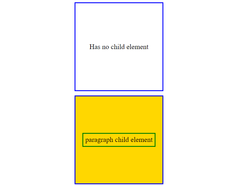
Consider a scenario where we have two div elements, one empty and one containing a child paragraph element. We want to only add a background color to the div with a child element.
<!-- HTML -->

<div>Has no child element</div>

<div>
  <p>paragraph child element</p>
</div>
/* CSS */

div {
  width: 200px;
  height: 200px;
  border: 2px solid blue;
  display: grid;
  place-items: center;
}

p {
  border: 2px solid green
}

div:has(p) {
  background-color: gold;
}
In this example, the gold background color would be applied only to the div that contains the child paragraph element.
Benefit
The :has() pseudo-class selector provides a convenient way to apply targeted styling to elements with specific content structures, allowing for more granular control over the appearance of elements based on their content.
Browser support
The browser support table below indicates that the :has() pseudo-class selector is not supported in all browsers.
The “Can I Use?” browser support table for the :has() pseudo-class selector shows the selector has good support but is lacking in some browsers at the time of writing this article. Depending on your needs, you may want to implement a fallback for visitors using unsupported browsers.
:lang()
The :lang() selector is a functional pseudo-class selector that targets text contents in the document based on the language they are specified in by the HTML lang attribute.
Syntax
:lang(<language code>) {
  /* styles to apply*/
}
The lang() selector takes in an ISO language code as an argument that tells the browser what language the document's styling should target.
Example usage
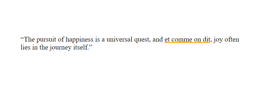
Let us take, for example, a quote written in English with a subsection written in French. We want to provide specific styling to only the French text.
<!-- HTML -->

<q>The pursuit of happiness is a universal quest, and <span lang="fr">et comme on dit</span>, joy often lies in the journey itself.</q>
/* CSS */

:lang(fr) {
  text-decoration: 2px underline orange;
}
In the code example above, the text content written in French would have an orange underline.
Benefit
The :lang() pseudo-class selector offers a way to provide distinct styling to text contents written in different languages, signaling the user to specific sections containing different language variations in the document.
Browser support
The “Can I Use?” browser support table for the :lang() pseudo-class selector shows it is supported in recent versions of all major browsers.
:placeholder-shown
The :placeholder-shown pseudo-class selector targets form elements with a visible placeholder text.
Syntax
:placeholder-shown {
  /* styles to apply*/
}
This selector differs from the ::placeholder pseudo-element selector, which is used to style the placeholder text itself in an input field.
Example usage
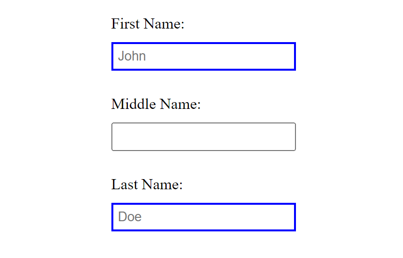
For instance, we have two form input fields with a placeholder text and one input field without a placeholder text.
<!-- HTML -->

<form action="#">
  <label>
    First Name:
    <input type="text" placeholder="John">
  </label>

  <label>
    Middle Name:
    <input type="text">
  </label>

  <label>
    Last Name:
    <input type="text" placeholder="Doe">
  </label>
</form>
/* CSS */

input:placeholder-shown {
 border: 2px solid blue;
}
In the code example above, the border color of all input fields with a placeholder value is set to blue.
This state no longer applies when content is available in the field.
Benefit
The :placeholder-shown pseudo-class selector offers a nice way to distinguish between input fields with placeholder text and empty input fields by applying custom styling.
Browser support
The “Can I Use?” browser support table for the :placeholder-shown pseudo-class selector shows it is supported in recent versions of all major browsers.
:out-of-range
The :out-of-range pseudo-class selector targets range elements whose value has gone beyond the specified range number.
Syntax
:out-of-range {
  /* styles to apply*/
}
Example usage
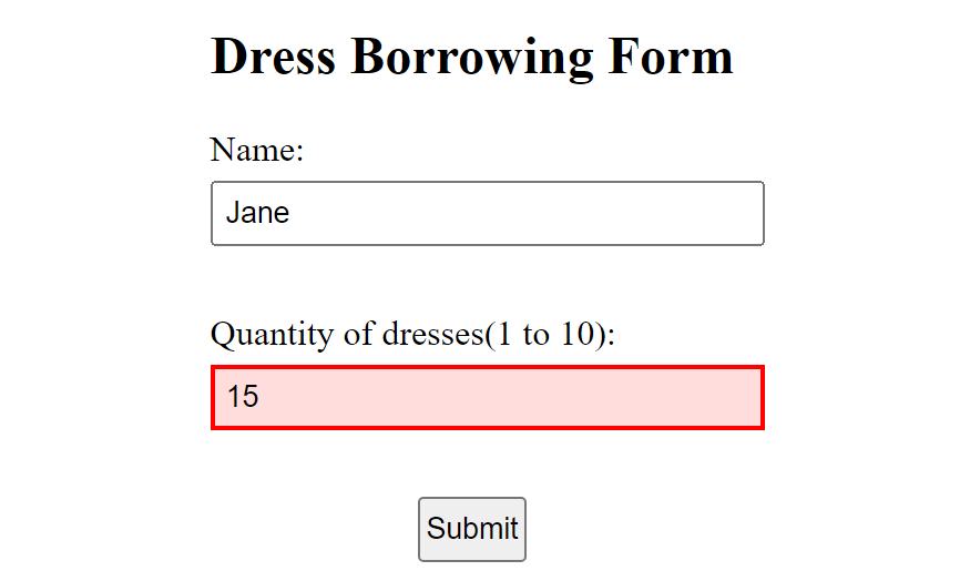
For instance, we have a dress-borrowing website on which customers must fill out a form before borrowing a dress. The form indicates that no more than 10 dresses can be borrowed at a time.
<!-- HTML -->

<form>
  <h2>Dress Borrowing Form</h2>

  <label for="name">Name:</label>
  <input type="text" id="name" placeholder="Enter your name">

  <label for=”quantity">Quantity of dresses (1 to 10):</label>
  <input type="number" id="quantity" min="1" max="10" required>

  <button>Submit</button>
</form>
/* CSS */

input:out-of-range {
  border: 2px solid red;
  background-color: #FFDDDD;
}
In this example, if the user enters a value greater than 10 into the quantity input field, a red border color, and a light red background color are applied to the input field to alert the user.
Benefit
The :out-of-range pseudo-class selector helps to provide visual warning cues when the user has surpassed the range limit in the input field.
Browser support
The “Can I Use?” browser support table for the :out-of-range pseudo-class selector shows it is supported in recent versions of all major browsers.
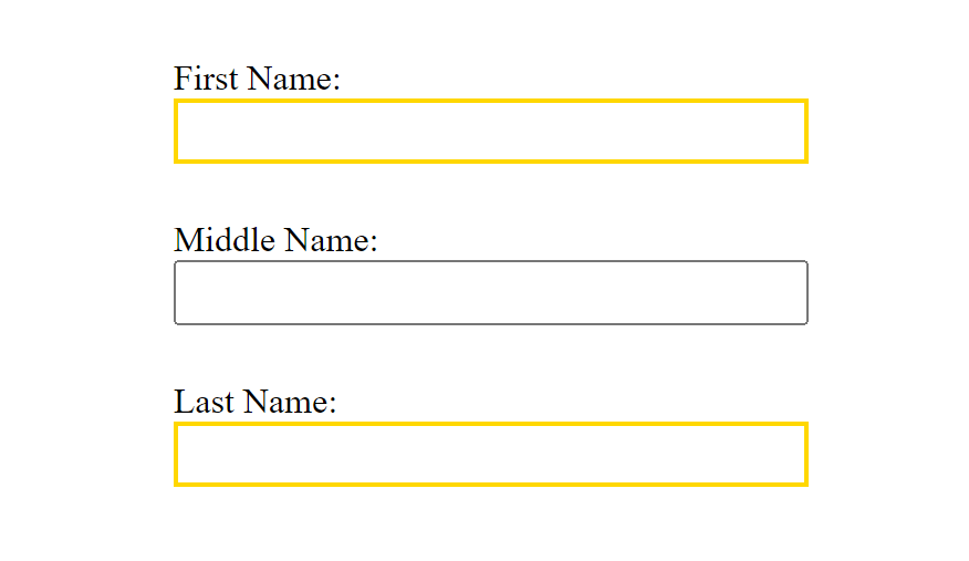
:required
The :required pseudo-class selector targets and styles form elements that have the required attribute set. Input fields with this attribute are mandatory, and the form can not be submitted until they are filled.
Syntax
:required {
  /* styles to apply*/
}
Example usage
Let’s create a form with three input fields: the user’s first, middle, and last names.
<!-- HTML -->

<form action="#">
  <label>
    First Name:
    <input type="text" required>
  </label>

  <label>
    Middle Name:
    <input type="text">
  </label>

  <label>
    Last Name:
    <input type="text" required>
  </label>
</form>
/* CSS */

input:required {
  border: 2px solid gold;
}
In the above code example, a gold border is applied only to the required form inputs, which are the "First Name" and "Last Name" input fields.
Benefit
The :required pseudo-class selector helps improve accessibility by allowing distinct styling to be applied to mandatory form fields. This styling would serve as a visual cue for all required form input fields.
Browser support
The “Can I Use?” browser support table for the :required pseudo-class selector shows it is supported in recent versions of all major browsers.
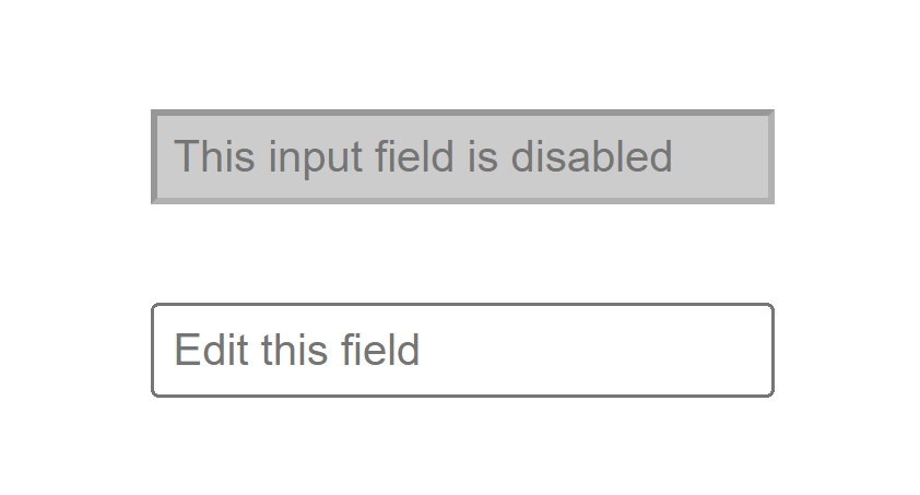
:disabled
The :disabled pseudo-class selector targets elements with the disabled attribute. This attribute can be applied to interactive elements to remove their default behavior under specific circumstances.
Syntax
:disabled {
  /* styles to apply */
}
Example usage
Let’s say we want to provide specific styling only to a disabled text input field.
<!-- HTML -->

<input type="text" placeholder="This input field is disabled" disabled>
<input type="text" placeholder="Edit this field">
/* CSS */

input[type=text]:disabled {
  background-color: #ccc;
}
The code above example applies a light gray background color to the disabled text input field.
Benefit
The :disabled pseudo-class selector can be useful in providing visual cues to the user, signaling that an input field has been disabled. It also helps provide consistent styling for all disabled elements across different browsers.
Browser support
The “Can I Use?” browser support table for the :disabled pseudo-class selector shows it is supported in recent versions of all major browsers.
Conclusion
In conclusion, CSS pseudo-class selectors can prove invaluable for applying styles not easily achievable through conventional means. Understanding and utilizing these features provide web developers with powerful tools to enhance user experience, control form behavior, and improve overall accessibility. Explore a number of these selectors on your Frontend Mentor projects and take your CSS styling control to the next level. Happy coding.
Take your skills to the next level
- AI-powered solution reviews
- 50+ portfolio-ready premium projects
- Professional Figma design files