Skip to content
  • Unlock Pro
  • Log in with GitHub
Profile
OverviewSolutions
20
Comments
24
Guerinik Abderrahmane
@AbderrahmaneGuerinik

All comments

  • Undertesting21•10
    @Undertesting21
    Submitted 12 months ago
    What are you most proud of, and what would you do differently next time?

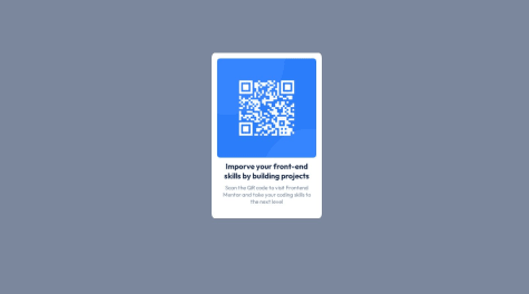
    I'm most proud of how the QR Code Component looks on different screen sizes. Using Flexbox and CSS Grid made it easy to create a responsive design that works well on both mobile and desktop devices. Next time, I would explore using CSS custom properties to manage colors and spacing more effectively for better maintainability.

    What challenges did you encounter, and how did you overcome them?

    One of the main challenges was ensuring the component stayed centered on all screen sizes. Initially, I struggled with alignment issues, but I overcame this by utilizing CSS Grid's centering properties. Additionally, setting up Git and pushing the project to GitHub was a bit tricky, but following detailed guides helped me get everything configured correctly.

    What specific areas of your project would you like help with?

    I'd appreciate feedback on the responsiveness of the component. Specifically, I'm curious if there are more efficient ways to handle the layout adjustments for different screen sizes. Any tips on optimizing the CSS for better performance would also be highly valuable.

    Responsive QR Code Component using Flexbox and CSS Grid

    #node
    2
    Guerinik Abderrahmane•460
    @AbderrahmaneGuerinik
    Posted 12 months ago

    Hey, you did well in general but there is some details that you can improve :

    • add margin bottom and border radius to the image
    img {
       border-radius: 20px;
       margin-bottom: 1.5rem;  
      }
    

    For responsivity of the container div you can do this :

    .attribution {
      width: min(95%, 350px)
      }
    
  • ericli18•70
    @ericli18
    Submitted over 1 year ago

    New landing page

    2
    Guerinik Abderrahmane•460
    @AbderrahmaneGuerinik
    Posted over 1 year ago

    Hey @ericli18 ! If it doesn't work for ios (Siri browser) you should probably verify if the properties you used are supported by siri, you can do that here.

  • Irwing•200
    @Irwing-Dev
    Submitted over 1 year ago

    E-commerce product page with ReactJS, TailwindCSS and TypeScript

    #tailwind-css#typescript#vite#react
    1
    Guerinik Abderrahmane•460
    @AbderrahmaneGuerinik
    Posted over 1 year ago

    hey Irwing! 👋

    I liked the carousel (the animation when you change an image), what library you've used ?

  • Ynotlocin1•80
    @Ynotlocin1
    Submitted over 1 year ago

    Stats preview card, problem with the image width !

    3
    Guerinik Abderrahmane•460
    @AbderrahmaneGuerinik
    Posted over 1 year ago

    Hey @Ynotlocin1! For the image issue try : width: 100%.

    for your question about class and id , usually for styling developers use classes, id's are often used with JS.

  • salmonkarp•260
    @salmonkarp
    Submitted over 1 year ago

    Responsive News Homepage

    1
    Guerinik Abderrahmane•460
    @AbderrahmaneGuerinik
    Posted over 1 year ago

    Hey @salmonkarp, your page looks good, to answer your question about flex you could use Grid instead to avoid a lot of flex divs. I hope this would help you.

  • P
    Kamran Kiani•2,780
    @kaamiik
    Submitted over 1 year ago

    FAQ accordion

    1
    Guerinik Abderrahmane•460
    @AbderrahmaneGuerinik
    Posted over 1 year ago

    Hey kamran ! Pretty nice component and close to the design good job,
    for your first question there is no difference between using max-width and min-width in media queries, it depends on your working strategy (mobile first approach or desktop first), in mobile first approach you'ill often use min-width and for desktop first approach you'll use max-width.

    2- for minus and plus i suggest you use two images, in intial state the image with plus has display: none, and on click you should make the other image display: none , and reset the display of the minus image, you can do that using js or if you're using react just use conditional rendering, Btw i recommend you use <button> tag instead of span for more accessibility.

    I hope this would help you! 😊

    Marked as helpful
  • P
    Daniel 🛸•44,790
    @danielmrz-dev
    Submitted over 1 year ago

    3 column preview card component using Flexbox

    1
    Guerinik Abderrahmane•460
    @AbderrahmaneGuerinik
    Posted over 1 year ago

    Nice work !

    For using grid is pretty easy here is the code :

       main {
         display: grid;
         grid-template-column: repeat(3, 1fr);
       }
    
    • btw i recommend using rem unit instead of px

    Hope this will help you !😉

  • KingSky•290
    @kingskyro64
    Submitted over 1 year ago

    Stats-preview-card-component

    1
    Guerinik Abderrahmane•460
    @AbderrahmaneGuerinik
    Posted over 1 year ago

    Hey👋 it's great you finished this project ! but you can improve your work :

    • in desktop devices the image should be in the right side and the text part in the left, for this you can just do the following :
    @media (min-width: 1170px) { 
    main {
           display: flex;
           flex-direction: row-reverse;
        }
    } 
    

    or change the order of the flex items using order property in css

    • you should consider more the margins, spacing, font-weight, text-align specially in desktop devices

    I wish this would help you😉, Keep it up ! and enjoy coding

  • zHelga•50
    @zHelga
    Submitted over 1 year ago

    Responsive product card using CSS Flex

    #accessibility#bem#semantic-ui#web-components
    1
    Guerinik Abderrahmane•460
    @AbderrahmaneGuerinik
    Posted over 1 year ago

    Hello 👋 You're doing well but you can improve this points :

    • The image is not showing for mobile devices and that's because you are defining the flex-basis of .card-img to 35%, that will not not work because pourcentage height works only if you give a fixed size to the parent element which is not the case here so you have to explicitly define the height of the parent (.card-box).
    • you should also change the font-weight of text to match more the design.

    I hope this would help you 😃

    Keep it up and enjoy coding

    Marked as helpful
  • Islam•190
    @Islam-Yasser
    Submitted over 1 year ago

    responsive page , please don't hesitate to leave any comment to me

    1
    Guerinik Abderrahmane•460
    @AbderrahmaneGuerinik
    Posted over 1 year ago

    Hey👋 Nice work ! but you can improve it

    • You should use more semantic HTML like section, main instead of div of class main.
    • Use rem unit instead of px for more maintainability and for responsive purposes
    • and Also the images in the background are not positioned perfectly like in the design, i've just finished the project and i also struggled width keeping this background images positioned in the right way and stay responsive 😥

    Good Luck and Enjoy coding 😃

    Marked as helpful
  • daniel-howorth•130
    @daniel-howorth
    Submitted almost 2 years ago

    Custom Validation with JavaScript

    2
    Guerinik Abderrahmane•460
    @AbderrahmaneGuerinik
    Posted almost 2 years ago

    Congrats for finishing the project ! For responsive aspect i wouldn't recommend using % unit but rem instead % unit can be very small or very big in some cases .

    Enjoy coding!

    Marked as helpful
  • P
    kxrp•640
    @kxrn0
    Submitted almost 3 years ago

    Order Summary Component

    1
    Guerinik Abderrahmane•460
    @AbderrahmaneGuerinik
    Posted almost 2 years ago

    Great work !

    • I suggest to use BEM methdologie for naming classes.
  • Andrei Andrianov•1,260
    @aveandrian
    Submitted about 2 years ago

    Article preview component - HTML & CSS only

    1
    Guerinik Abderrahmane•460
    @AbderrahmaneGuerinik
    Posted almost 2 years ago

    *Great work ! * I suggest you to use BEM methodologie for naming classs.

    Enjoy coding

  • Kyle Parsotan•140
    @Kyl67899
    Submitted almost 2 years ago
    What are you most proud of, and what would you do differently next time?

    I was able to use html, CSS to be able to create a flexbox qr code. I had trouble with being able to create the container and getting the site to become responsive.

    What challenges did you encounter, and how did you overcome them?

    I have challenges with flexbox and making it responsive. I used my media query tools to be able to get the website to become responsive.

    What specific areas of your project would you like help with?

    I would like to improve on my HTML, CSS, and flexbox to make the site responsive.

    QR CODE

    #accessibility
    1
    Guerinik Abderrahmane•460
    @AbderrahmaneGuerinik
    Posted almost 2 years ago

    Hey congrats for finishing the project ! I suggest you to do this for responsive design :

    • use rem unit instead of px
    html {
       font-size: 62.5%;       //which is 10px because by default 16px is 100%
    }
    

    After that 1rem = 10px for exemple if you define the font-size of a paragraph to 1.5rem its equal to 15px and for responsive design you can just change the font-size in html element using media-queries for exemple :

    
    @media only screen and (max-width : 400px ) {
        html {
          font-size: 50% ; which is 8px
    }
    }
    
    
    • and this will change the font-size of our paragraph to 12px because 8px is 1rem now. ** I hope you understand** you can serach for documentation about this topic.

    Enjoy coding

    Marked as helpful
  • Asliddin Amirov•760
    @asliddinamir
    Submitted almost 2 years ago

    Responsive Landing Page using HTML,CSS and toggler with JS

    #foundation
    1
    Guerinik Abderrahmane•460
    @AbderrahmaneGuerinik
    Posted almost 2 years ago

    Congrats for finishing the project I suggest you to :

    • use rem unit instead of px .
    • use BEM methodologie for naming classes in CSS.
    • do this :
    *,
    *::before,
    *::after {
    padding: 0;
    margin: 0;
    box-sizing: border-box;
    }
    

    Enjoy coding !

  • Saqibytes•150
    @Saqibytes
    Submitted almost 2 years ago

    QR Code Card Using CSS

    1
    Guerinik Abderrahmane•460
    @AbderrahmaneGuerinik
    Posted almost 2 years ago

    Nice work ! I suggest you to :

    • use rem unit instead of px and em.
    • giving a class name to every element in html.
    • using BEM methodologie for naming classes.

    //Enjoy coding//

  • Lauren Delmar•100
    @lrdelmar
    Submitted almost 2 years ago

    QR Code for Desktop and Mobile

    3
    Guerinik Abderrahmane•460
    @AbderrahmaneGuerinik
    Posted almost 2 years ago

    Congrats for finishing this project ! but you can improve your code

    • i noticed you used position : absolute to center the container but no need, you've already used display:flex and set align-items and justify-content to center and its enough to center the container.

    • use CSS variables.

    • use BEM methodologie for naming classes.

    Enjoy coding

  • Lauren Delmar•100
    @lrdelmar
    Submitted almost 2 years ago

    QR Component

    2
    Guerinik Abderrahmane•460
    @AbderrahmaneGuerinik
    Posted almost 2 years ago

    Nice component ! You can improve your code by :

    • Using BEM methodologie for naming classes.
    • the height of section-qr equal to zéro so you should define the height of this section
    .section-qr {
       height: 100vh;
    }
    

    *Enjoy coding ! *

Frontend Mentor logo

Stay up to datewith new challenges, featured solutions, selected articles, and our latest news

Frontend Mentor

  • Unlock Pro
  • Contact us
  • FAQs
  • Become a partner

Explore

  • Learning paths
  • Challenges
  • Solutions
  • Articles

Community

  • Discord
  • Guidelines

For companies

  • Hire developers
  • Train developers
© Frontend Mentor 2019 - 2025
  • Terms
  • Cookie Policy
  • Privacy Policy
  • License

Oops! 😬

You need to be logged in before you can do that.

Log in with GitHub

Oops! 😬

You need to be logged in before you can do that.

Log in with GitHub

Oops! 😬

You need to be logged in before you can do that.

Log in with GitHub

Oops! 😬

You need to be logged in before you can do that.

Log in with GitHub

Oops! 😬

You need to be logged in before you can do that.

Log in with GitHub

Oops! 😬

You need to be logged in before you can do that.

Log in with GitHub

Oops! 😬

You need to be logged in before you can do that.

Log in with GitHub

Oops! 😬

You need to be logged in before you can do that.

Log in with GitHub

Oops! 😬

You need to be logged in before you can do that.

Log in with GitHub

Oops! 😬

You need to be logged in before you can do that.

Log in with GitHub

Oops! 😬

You need to be logged in before you can do that.

Log in with GitHub

Oops! 😬

You need to be logged in before you can do that.

Log in with GitHub

Oops! 😬

You need to be logged in before you can do that.

Log in with GitHub

Oops! 😬

You need to be logged in before you can do that.

Log in with GitHub

Oops! 😬

You need to be logged in before you can do that.

Log in with GitHub

Oops! 😬

You need to be logged in before you can do that.

Log in with GitHub

Oops! 😬

You need to be logged in before you can do that.

Log in with GitHub

Oops! 😬

You need to be logged in before you can do that.

Log in with GitHub

Oops! 😬

You need to be logged in before you can do that.

Log in with GitHub

Oops! 😬

You need to be logged in before you can do that.

Log in with GitHub

Oops! 😬

You need to be logged in before you can do that.

Log in with GitHub

Oops! 😬

You need to be logged in before you can do that.

Log in with GitHub

Oops! 😬

You need to be logged in before you can do that.

Log in with GitHub

Oops! 😬

You need to be logged in before you can do that.

Log in with GitHub

Oops! 😬

You need to be logged in before you can do that.

Log in with GitHub

Oops! 😬

You need to be logged in before you can do that.

Log in with GitHub

Oops! 😬

You need to be logged in before you can do that.

Log in with GitHub

Oops! 😬

You need to be logged in before you can do that.

Log in with GitHub

Oops! 😬

You need to be logged in before you can do that.

Log in with GitHub

Oops! 😬

You need to be logged in before you can do that.

Log in with GitHub

Oops! 😬

You need to be logged in before you can do that.

Log in with GitHub

Oops! 😬

You need to be logged in before you can do that.

Log in with GitHub

Oops! 😬

You need to be logged in before you can do that.

Log in with GitHub

Oops! 😬

You need to be logged in before you can do that.

Log in with GitHub

Oops! 😬

You need to be logged in before you can do that.

Log in with GitHub

Oops! 😬

You need to be logged in before you can do that.

Log in with GitHub

Oops! 😬

You need to be logged in before you can do that.

Log in with GitHub

Oops! 😬

You need to be logged in before you can do that.

Log in with GitHub

Oops! 😬

You need to be logged in before you can do that.

Log in with GitHub

Oops! 😬

You need to be logged in before you can do that.

Log in with GitHub

Oops! 😬

You need to be logged in before you can do that.

Log in with GitHub

Oops! 😬

You need to be logged in before you can do that.

Log in with GitHub

Oops! 😬

You need to be logged in before you can do that.

Log in with GitHub

Oops! 😬

You need to be logged in before you can do that.

Log in with GitHub

Oops! 😬

You need to be logged in before you can do that.

Log in with GitHub

Oops! 😬

You need to be logged in before you can do that.

Log in with GitHub

Oops! 😬

You need to be logged in before you can do that.

Log in with GitHub

Oops! 😬

You need to be logged in before you can do that.

Log in with GitHub

Oops! 😬

You need to be logged in before you can do that.

Log in with GitHub

Oops! 😬

You need to be logged in before you can do that.

Log in with GitHub

Oops! 😬

You need to be logged in before you can do that.

Log in with GitHub

Oops! 😬

You need to be logged in before you can do that.

Log in with GitHub

Oops! 😬

You need to be logged in before you can do that.

Log in with GitHub

Oops! 😬

You need to be logged in before you can do that.

Log in with GitHub

Oops! 😬

You need to be logged in before you can do that.

Log in with GitHub