Not Found
Not Found
Not Found
Not Found
Not Found
Not Found
Not Found
Not Found
Not Found
Not Found
Not Found
Not Found
Not Found
Not Found
Not Found
Not Found
Not Found
Not Found
Not Found
Not Found

All comments

  • Demaxs26 80

    @Demaxs26

    Submitted

    What are you most proud of, and what would you do differently next time?

    Hello ,

    Here is my solution to the challenge "recip page" I have some question :

    • How can I change the color of the puces in the list ?
    • Is the table a god solution for the "nutrition" part ?

    Have a nice day !

    What challenges did you encounter, and how did you overcome them?

    /

    What specific areas of your project would you like help with?

    /

    Anuj Gupta 250

    @AnujCodeIt

    Posted

    I think you got mixed up with same color on different heading. Other than that its good.

    2
  • Anuj Gupta 250

    @AnujCodeIt

    Posted

    Great work

    1
  • P

    @cleyrolsc

    Submitted

    What are you most proud of, and what would you do differently next time?

    I was able to find the solution by googling a lot

    What challenges did you encounter, and how did you overcome them?

    I did not noticed that my initial width was a fix amount of px. Then, when I tried to do responsive layout for mobile, padding was not working, the reason was that the width was broader than the actual screen size.

    What specific areas of your project would you like help with?

    None

    Anuj Gupta 250

    @AnujCodeIt

    Posted

    • I think the padding should me more on the left and right side of the content, so that it will look good.

    • I think you forget to make the active state design of this UI.

    Great work.

    Marked as helpful

    0
  • @AbdulSamadCodes

    Submitted

    What are you most proud of, and what would you do differently next time?

    Guide me on my mistakes

    Anuj Gupta 250

    @AnujCodeIt

    Posted

    Great work.

    0
  • @Meseriasul19

    Submitted

    What are you most proud of, and what would you do differently next time?

    I am proud of me because I finally understood how grid works. Next time it will be much easier for me to make a responsive layout.

    What challenges did you encounter, and how did you overcome them?

    I've encountered a lot of difficulties using grid. At the beginning, I didn't find any method to arrange the first and the last card in the center with grid without the use of grid-template-areas, grid-row-start and end didn't have any effect.

    What specific areas of your project would you like help with?

    I would like to get help with elements from some cards. Without using height 100%, I was unable to make the card fill all the cell, but using this propriety, the flexbox from the elements inside the card took a new row for the added space. I couldn't move the icon on the bottom of the card and always there was a space. I had problems also with the sizes of the cards, they are not changing constantly together.

    Anuj Gupta 250

    @AnujCodeIt

    Posted

    Neat work.

    0
  • @lindajensen

    Submitted

    What are you most proud of, and what would you do differently next time?

    I think I'm most proud of the fact that I figured out how to use two different pictures using the picture element. Or no, I'm probably most proud of the fact that I tried a mobile-first workflow and did great. It was like something just clicked and I felt like i temporarily knew what I was doing and where to start and how to move forward. It was just an amazing feeling. Especially since I've been in a place where I've just felt like I don't understand a thing and I'll never be good enough and well you know...

    What challenges did you encounter, and how did you overcome them?

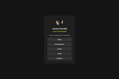
    The first challenge was actually how to use two different pictures. I think I tried a gazillion different ways before even getting it to work. It was probably not as complicated as I made it out to be, but I just couldn't get it working. I spent a couple of hours on it and ended up using the picture element. Me having set a max-with on the card complicated things a bit but when I increased the max-width on the card in the media query it worked just fine.

    What specific areas of your project would you like help with?

    I'd like to know if using the picture element was the best way to go or if there are other (more suitable) solutions? How did you do it?

    And then just general feedback I guess, anything you can tell me that can help me develop is much appreciated.

    Anuj Gupta 250

    @AnujCodeIt

    Posted

    Thinks I noticed:

    • You should have used fontweight on the button element to make it bold.
    • I think the margin between the image and content could be better.

    Great work.

    0
  • phemmyils 80

    @phemmyils

    Submitted

    What are you most proud of, and what would you do differently next time?

    i tried some media queries

    What challenges did you encounter, and how did you overcome them?

    box model

    What specific areas of your project would you like help with?

    box model & media queries

    Anuj Gupta 250

    @AnujCodeIt

    Posted

    Great work.

    • I think the main container is a bit wide. You should narrow the container, It will look great then.

    Marked as helpful

    1
  • SIBI 70

    @sibi404

    Submitted

    What are you most proud of, and what would you do differently next time?

    I'm able to complete the challenge as the design given

    What challenges did you encounter, and how did you overcome them?

    There is no much harder challenges in this project. Most of the things are familiar to me. Main goal of this challenge is to implement hover effect.

    What specific areas of your project would you like help with?

    I would like to know more about the changes to be made while displaying different pages.

    Anuj Gupta 250

    @AnujCodeIt

    Posted

    Great work done, man. Although I would suggest using some animation in the hover effect as It will look realistic. Something like transition delay will work better try it.

    0
  • P

    @kyloren808

    Submitted

    What are you most proud of, and what would you do differently next time?

    I am proud to have been able to get my solution looking close to the challenge design. Using media query was something that was new to me, but I got it working with little effort. With a little research I was able to get it after a try or two.

    What challenges did you encounter, and how did you overcome them?

    The one challenge I struggled to resolve was having the box-shadow grow on hover. Looking at the design file(.figma) I noticed the shadow grew on hover. I was not sure how to implement this.

    What specific areas of your project would you like help with?

    I would like some direction on hover actions and how to implement them.

    Anuj Gupta 250

    @AnujCodeIt

    Posted

    Great work, all the spacing and sizing seem to be accurate. Although, I think you have used unnecessary semantic tags in this project.

    Marked as helpful

    0
  • salahdine 100

    @salahdinebocuif

    Submitted

    What are you most proud of, and what would you do differently next time?

    I am proud of making this project and hope for development in the future

    What challenges did you encounter, and how did you overcome them?

    Control the elements

    What specific areas of your project would you like help with?

    everything

    Anuj Gupta 250

    @AnujCodeIt

    Posted

    • The size of the container is small
    • You have not used the proper spacing (like padding on left and right)
    • You have not used shadow

    Marked as helpful

    0