Not Found
Not Found
Not Found
Not Found
Not Found
Not Found
Not Found
Not Found
Not Found
Not Found
Not Found
Not Found
Not Found
Not Found
Not Found
Not Found
Not Found
Not Found
Not Found
Not Found

All comments

  • jmahamed• 370

    @jmahamed

    Submitted

    What are you most proud of, and what would you do differently next time?

    that i used react and did mobile first.

    What challenges did you encounter, and how did you overcome them?

    making use of reusable components and conditional rendering of the daily, weekly and monthly data

    What specific areas of your project would you like help with?

    nothing

    Anwar Mestycer• 400

    @AnwarMestycer

    Posted

    Well done!

    0
  • P
    yoe7501• 240

    @yoe7501

    Submitted

    What are you most proud of, and what would you do differently next time?

    I finished this honestly really quickly

    What challenges did you encounter, and how did you overcome them?

    I thought getting the padding/ margin pixel perfect was pretty difficult but got the pretty close.

    What specific areas of your project would you like help with?

    I would like tips on cleaner code. I don't think its messy but maybe ways to make it easier going forward?

    Anwar Mestycer• 400

    @AnwarMestycer

    Posted

    Your work looks amazing. Well done!

    • Add some font-weight to your text to match the design.
    • Every button ought to take you to the relevant web page. You may include

    <a href="website link here">text here</a>

    • Try to make it unique by including your social media links, profile picture, etc.

    I hope this was helpful, and if you need any help, don't hesitate to contact me HERE

    0
  • Anwar Mestycer• 400

    @AnwarMestycer

    Posted

    Hi, I see you almost match the design perfectly,

    Here are some tips to make it perfect.

    • Instead of repeating the same style to every button alone, you could just give the same class name and style them all together in the CSS file

    • Change the button's text color to white.

    • Wrap all the buttons in on <div class="button"> and apply this css:

    .links {
        display: flex;
        flex-direction: column;
        justify-content: space-around;
        gap: 2%;
        width: 80%;
        height: 50%;
        margin-top: 15px;
        margin-bottom: 20px;
    
    • Try to personalize it by adding your picture, social link, etc.

    This is just the beginning of your awesome journey as a front-end developer Keep up the good work.

    I hope this was helpful, and if you need any help, don't hesitate to contact me Here

    Marked as helpful

    0
  • Ryan King• 40

    @MsftKing

    Submitted

    What are you most proud of, and what would you do differently next time?

    I am very proud due to the fact that I focused on not looking at my notes and just trying to code this as if I was working on a project for a client on a deadline. I tried to use the documentation for many of the aspects that I was unsure of and played around with styling for a little before I figured out what I needed to do to get the display that I was looking for.

    What challenges did you encounter, and how did you overcome them?

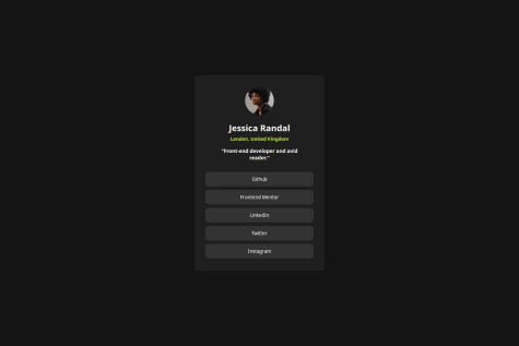
    This biggest challenge I had was styling the @media query although I know it is not perfect, I am happy with the results. I used the documentation on media query to do the best that I can, and I am very happy with how it turned out in the end, especially in the sense of scalability.

    What specific areas of your project would you like help with?

    The media query if someone wants to explain what I did wrong or what I can do better next time, I am all ears.

    Anwar Mestycer• 400

    @AnwarMestycer

    Posted

    Hi Ryan, You did well, and your work is great.

    here's how can help you make it better,

    • In your HTML file, as best practice, all the code should be inside the <body> like this:
    <!DOCTYPE html>
    <html>
    <head>
    </head>
    <body>
    your code should be written here
    </body>
    </html>
    

    then add a body selector in your CSS file and apply the background-color: #D5E1EF; inside instead of html, which is useless in our context.

    • Also, to center your card display:flex; justify-content:center; align-items: center in the body selector. -Change the color of the h1 to black to match the design

    This is just the beginning of your awesome journey as a front-end developer Keep up the good work.

    I hope this was helpful, and if you need any help, don't hesitate to contact me here.

    0
  • Anwar Mestycer• 400

    @AnwarMestycer

    Posted

    Hi, you did well. You are a few steps away from matching the design.

    • Change the body background to hsl(220, 15%, 55%).
    • Add justify-content:center; align-items: center; to your body selector in the CSS file to center your qr-component in the middle of the screen horizontally and vertically.
    • Remove the background color from the card selector so it remains white by default.
    • Set the border radius to 5% to match the design.
    • I can't see why divide the paragraph on two p tags, put the inside one p tag
    • Instead of using the <center> tag add text-align: center; to the card selector in css file, same the for the h2 tag.

    This is just the beginning of your awesome journey as a front-end developer Keep up the good work.

    I hope this was helpful, and if you need any help, don't hesitate to contact me here.

    1
  • @ImMarcio

    Submitted

    What are you most proud of, and what would you do differently next time?

    I like build this site more fast, but i learned much

    What challenges did you encounter, and how did you overcome them?

    Somethings not adjust and i broken my mind for adjust they

    What specific areas of your project would you like help with?

    somethings in javascript

    Anwar Mestycer• 400

    @AnwarMestycer

    Posted

    Hi, Márcio, you are on the right path; well done!

    • Try to use rem instead of px to give your element more flexibility on different screens.
    • Use media queries in CSS to match mobile screens and change the image on desktop and mobile screens.

    style.css

    @media screen and (max-width:600px ){
     .card-main {
         height: 100%;
         flex-direction: column-reverse;
     }}
    

    main.js

    const image=document.getElementByClassName("img-card")
    function imageAdjust (){
    
      if (window.matchMedia("(max-width: 900px)").matches) {
        image.src="/assets/images/illustration-sign-up-mobile.svg"
      }
      else{
        image.src="/assets/images/illustration-sign-up-desktop.svg"
      }
    }
    
    window.onload = imageAdjust;
    window.onresize = imageAdjust;
    

    This is just the beginning of your awesome journey as a front-end developer Keep up the good work.

    Hope this was helpful and if you need any help don't hesitate to contact me here.

    Marked as helpful

    0
  • Anwar Mestycer• 400

    @AnwarMestycer

    Posted

    Hi Alejandro, You did well with the design; it looks good.

    • For mobile, try to place share-icon and share_div in the same div and hide the share_div initially. Once the user clicks the share_icon, hide the user_div and display the share_div, displaying them on top of each other is not a good practice.

    • Add the else case once the user want to hide the share options, it's not included in your code just by adding an else statement that undoes what you changed in the if statement .

    • Add some semantic HTML to make your code accessible to screen readers.

    I Hope this was helpful

    Marked as helpful

    0
  • Anwar Mestycer• 400

    @AnwarMestycer

    Submitted

    What are you most proud of, and what would you do differently next time?

    getting comfy to work with tailwind and build responsive and pretty design

    What challenges did you encounter, and how did you overcome them?

    fetching the data and manipulating DOM elements using javascript

    What specific areas of your project would you like help with?

    I need help with javascript.

    • I can't access data outside the fetch function scope, even though I tried lots of solutions.
    • I can't access global variables inside the functions, so I find myself obliged to repeat them in every function.

    Thank you in advance

    Anwar Mestycer• 400

    @AnwarMestycer

    Posted

    all the bugs are fixed

    0
  • Aryarishi Sikdar• 220

    @ArryBlack

    Submitted

    What are you most proud of, and what would you do differently next time?

    Tried mobile-first workflow for the first time.

    What challenges did you encounter, and how did you overcome them?

    Surprisingly, recreating the design was harder than the responsiveness.

    What specific areas of your project would you like help with?

    I've a lot to improve on for this project. Any feedback is welcome.

    Anwar Mestycer• 400

    @AnwarMestycer

    Posted

    • it looks good good job.
    • Writing CSS code in a separate file will make it more organized and easier to manage and maintain.
    • For the nutrition table, I encountered the same problem and overcame it by using three different div with the same class and styling them to look like the design you can check my work here.
    • For accessibility, write something that describes the image in the alt attribute.

    keep it up & Hope this was helpful!

    Marked as helpful

    1
  • Anwar Mestycer• 400

    @AnwarMestycer

    Posted

    • Well done; it looks good.
    • Since there is a lot of CSS code, you better move it to a separate file.
    • Get the font from the URL in the style-guide.md file and import it in the index.html.
    • Add an anchor tag to each social media tag to make it a valid link. For example:
    <a href="www.github.com"">GitHub</a>
    
    • The image needs some height.
    • Center your container in the middle of the screen. you can try this inside your body selector
    display: flex;
    justify-content: center;
    align-items: center;
    
    • Adjust the width and height to match the design

    • Try to customize it by adding your name, profile picture, and personal social links.

    • Add some creative stuff, like icons for every social media button, maybe some effects when hovering,...

    • If you needed any help feel free to contact me Anwar Mestycer

    keep it up

    I hope this was helpful!

    0
  • Anwar Mestycer• 400

    @AnwarMestycer

    Posted

    • Well done; it looks amazing.
    • Center your container in the middle of the screen. you can try this inside your body selector
    display: flex;
    justify-content: center;
    align-items: center;
    
    • Adjust the width and height to match the design

    • Try to customize it by adding your name, profile picture, and personal social links.

    • Add some creative stuff, like icons for every social media button, maybe some effects when hovering,...

    keep it up

    Hope this was helpful!

    0
  • Adeeb Alkahat• 70

    @AdeebAlk

    Submitted

    What challenges did you encounter, and how did you overcome them?

    styling the page because of the amount of things to style

    What specific areas of your project would you like help with?

    any better approaches or solutiones

    Anwar Mestycer• 400

    @AnwarMestycer

    Posted

    Well Done

    Challenge yourself by using CSS pro-processors like Sass, Less,. or CSS frameworks like Tailwind and Bootstrap.

    I hope this was helpful!

    1
  • Anwar Mestycer• 400

    @AnwarMestycer

    Posted

    • Well done; it looks amazing.

    • Just add some width and height to match the design

    • Try to customize it by adding your name, profile picture, and personal social links.

    • Add some creative stuff, like icons for every social media button, maybe some effects when hovering,...

    keep it up and hope this was helpful

    Marked as helpful

    1
  • Nephilimist• 50

    @Nephilimist

    Submitted

    What are you most proud of, and what would you do differently next time?

    I'm quite proud how fast I was able to make this project.

    What challenges did you encounter, and how did you overcome them?

    Nothing at this point.

    What specific areas of your project would you like help with?

    Just let me know what you think. Constructive criticism is always welcome.

    Anwar Mestycer• 400

    @AnwarMestycer

    Posted

    • Well done; it looks amazing.

    • Just add some width and height to match the design

    • Try to customize it by adding your name, profile picture, and personal social links.

    • Add some creative stuff, like icons for every social media button, maybe some effects when hovering, ...

    Keep it up and hope this was helpful!

    Marked as helpful

    1
  • Anwar Mestycer• 400

    @AnwarMestycer

    Posted

    • It looks good Well done
    • You need to center your container to match the design. add this to the body selector:
    display: flex;
    justify-content: center;  //center vertically
    align-items: center;  //center horizontally
    
    • Adjust the divs dimensions to match the design

    Hope this was helpful

    0
  • Anwar Mestycer• 400

    @AnwarMestycer

    Posted

    • You did well on small screens but it appears you have a problem on the desktop screen.

    • In HTML, the main tag should wrap all the page content and then wrap all four divs into one section.

      • this code must be sufficient to make it work on desktop screen:
    @media(min-width: 1024px){
    display: flex;
    flex-direction: row;
    flex-wrap: wrap;
    }
    

    now it's up to you to make it exactly like the design.

    Hope this was helpful

    0
  • vicky2805vky• 70

    @vicky2805vky

    Submitted

    What are you most proud of, and what would you do differently next time?

    I tried hard to make my website similar to the design. I have concentrated on many small details on the design and give them to my website. I hope my website looks similar to the design.

    What challenges did you encounter, and how did you overcome them?

    I had some doubts on using flex-box or grid but when I used grid my container became long so I have switched to flex-box

    What specific areas of your project would you like help with?

    :)

    Anwar Mestycer• 400

    @AnwarMestycer

    Posted

    • Almost perfect good job with following the design
    • Try using some CSS pre-processors: scss, Stulys to test and strengthen your knowledge, it is recommended for this challenge.
    • You better import your fonts directly in the CSS file using @import.

    Hope this was helpful!

    0
  • alexstrauch• 60

    @alexstrauch

    Submitted

    What are you most proud of, and what would you do differently next time?

    I remember more and more stuff and don't have to look stuff up so soften.

    What challenges did you encounter, and how did you overcome them?

    The table at the end was challenging. Had to look stuff up because I hadn't used tables for a while.

    What specific areas of your project would you like help with?

    Responsive design, open for all feedback, thanks.

    Anwar Mestycer• 400

    @AnwarMestycer

    Posted

    • In your HTML code, you imported the fonts twice and I recommend importing it directly in the CSS file using @import.

    • Try to more semantic HTML like sections, headers, ... for the image alt attribute, remove the word "picture" as the screen readers will mention it is an image.

    • Add some height and padding to your card to match the design.

    • Chane the width property to max-width and give it at around 45rem.

    • Add media queries to match small screens: change the max-width to around 20rem value to phone screens.

    Hope this was helpful !

    Marked as helpful

    0
  • Anwar Mestycer• 400

    @AnwarMestycer

    Submitted

    What are you most proud of, and what would you do differently next time?

    First time working with shadow in CSS

    What challenges did you encounter, and how did you overcome them?

    no challenge encountered yet

    What specific areas of your project would you like help with?

    always needs to upgrade responsiveness.

    Anwar Mestycer• 400

    @AnwarMestycer

    Posted

    Wow, thank you so much for taking the time to share your insights! I'll definitely put them into action and see how they elevate the project. Your support means the world to me!

    1
  • CodeHeaven• 160

    @twobottles2092

    Submitted

    What are you most proud of, and what would you do differently next time?

    I am proud that although I have a very basic knowledge, I can still finish this challenge.

    What challenges did you encounter, and how did you overcome them?

    I am still learning how contents be responsive

    What specific areas of your project would you like help with?

    Responsiveness

    Anwar Mestycer• 400

    @AnwarMestycer

    Posted

    You need to use some semantic html like section, header,... Add some accessibilities to your HTML example complete the alt attribute for example. you did well in responsive design. the code is well structured you forgot to apply a border to your card

    Marked as helpful

    0
  • Anwar Mestycer• 400

    @AnwarMestycer

    Posted

    Yes, the solution includes semantic HTML. No, it's not accessible: add the alt attribute to the image tag. I tested the layout on different screens and it needs more work on small screens also the QR card looks too big than the design. Yes, the code is readable and well-structured. I followed the Figma design and there is a considerable difference between the design and the solution.

    0