
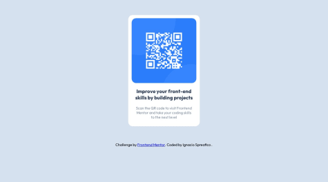
@ThatDevDiaz

Aq1q
@Aq1qAll comments
- @Aq1q
Hi
1 To make the profile pic fit within a circle you could give border-radius of 50% to it directly either by id or a class
2 From what I see there is in fact margin top and margin bottom on both h1 and p tags in your statistics. You can select those tags by giving each paragraph and heading a class and then change your paragraphs margin-top to 0 and your headings margin-bottom to 0
3 You don't need to space those tags with margin left and right, you can just use
justify-content: space-evenlyorjustify-content: space-between4 You could also center text inside your statistics h1 and p tags with
text-align: center;Marked as helpful - @nachospreafico@Aq1q
It looks like display grid doesn't change how your body behaves, it does not center your component
You could give it height of 100vh to take whole page, display it as flex, make it's direction column so that your footer stays at the bottom and justify it's content to the center, so your code would look something like this:
body {
    display: flex;
    flex-direction: column;
    justify-content: center;
    align-items: center;
    height: 100vh;
}
This also makes paddings in your body, and both margins in your .card-container obsolete, because you already have it centered within body tag
Marked as helpful - @RahulCoder9999@Aq1q
Hello There
I have some things you could think while doing your future projects:
-It seems that your solution is not really centered and it looks like your component overflows the page, you can fix that adding some style to your body tag, for example:
display: flex;
justify-content: center;
align-items: center;
height: 100vh;
margin: 0;
It makes your body tag take full device height, stops it from overflowing the page and centers your component vertically and horizontally
I can also see you did not create style for mobile devices media queries are something that could help you with it
Marked as helpful