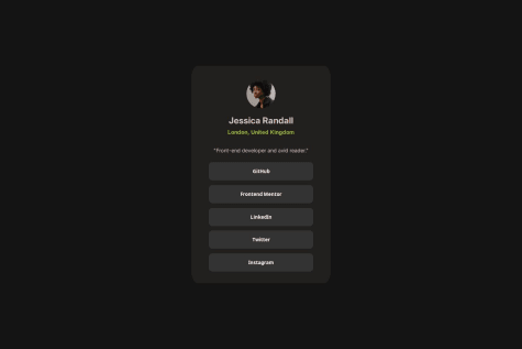
Successfully creating a clean, minimalistic UI for the profile with a central layout and responsive buttons.
The hover effects on the buttons improve user interactivity and visual appeal.
Organized and modular code, separating styles into a CSS file for maintainability.
What challenges did you encounter, and how did you overcome them?Centering the container: Aligning the .container element perfectly in the viewport was challenging until using position: absolute combined with transform: translate(-50%, -50%).
Button styling consistency: Achieving a uniform look for buttons across different states required experimenting with padding, borders, and hover effects.
Text alignment and spacing: Balancing margin and padding for proper spacing around text elements took multiple iterations. Overcoming them:
Leveraged browser developer tools to tweak styles in real-time. Referred to documentation like MDN Web Docs and explored community examples for inspiration.
What specific areas of your project would you like help with?Responsiveness: How can I optimize the layout to work better on smaller screens, such as smartphones or tablets? Any tips for implementing a mobile-first design?
Button Styling: Are there better ways to style buttons to achieve a more modern, accessible design? For example, ensuring hover and focus states are intuitive and visually distinct.
Code Optimization: Are there ways to improve my CSS class naming conventions (e.g., BEM) or the structure of my code for scalability and reusability?
Accessibility: What additional steps can I take to make the project more accessible, such as for screen readers or users navigating via keyboard?