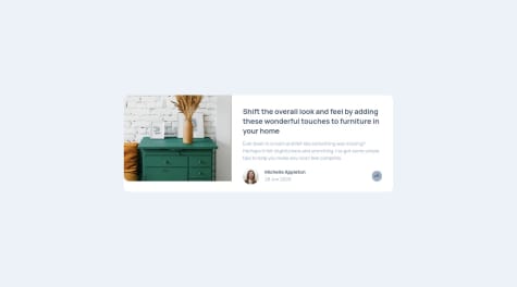
Hey guys, I just finished a new project, Try checking it out. Please any feedback is appreciated. :)
Carlos E Alford
@CarlosEAM
All comments
- Carlos E Alford• 275
@CarlosEAM
Posted
Hi, Nice effort on the challenge! There are two things I wanted to feedback on:
- A
<button>and<a>should not be used together. They are similar but have different roles. Here is a little article about the differences: https://bitsofco.de/anchors-vs-buttons/ - As the button doesn't have a descriptive text, think about using an
aria-labelso assistive technologies announce its purpose. (there are other ways to achieve this)
Hope it helps and keep going :)
Regards, Carlos
Marked as helpful
0 - A
- Axel• 250
@AxlMrt
Submitted
I've tried to be as perfect as possible on this one and i think, i've focused too much on it. I losted a lot of time on moving things around and i was kind of lost with the mobile to deskopt.
For the js, it felt easy.. Still, I wasn't focus enough and i couldn't figure out how to do better.
I've tried my best but it is still a way far from perfect. If someone has something to say to improve this challenge, i'll be glad !
Waiting for comments, thanks for you interest !
Carlos E Alford• 275@CarlosEAM
Posted
Hi Axel, Like what you have done so far. I just have one more point of feedback.
- The whole component should have been wrapped in a single tag so that you can reuse it if there are more cards to add. So let's say moving everything inside the <section> tag, this way all the related card component elements are housed together.
Hope it makes sense. :)
Marked as helpful
1 - Eseoghene• 550
@EseAlli
Submitted
I would love to know if there is a better way to implement the share buttons display
Carlos E Alford• 275@CarlosEAM
Posted
Hi, the card looks great and is responsive. Read your README and thanks for the tip on using the filter property with an example!
Only have two things to feedback on:
- The large screen one needs a little bit more padding to the right so the text lines up exactly.
- The <main> tags are not for creating cards, because you are only meant to have one pair and if you need to add more cards then it would fail the semantic test.
Great effort loved the component.
Marked as helpful
1 - dewslyse• 3,025
@dewslyse
Submitted
Comments and feedback welcomed. Thanks 🙏
Carlos E Alford• 275@CarlosEAM
Posted
This looks really good, soooo close to the design. Works well on all devices.
Keep going! and happy coding
1 - Ayush Sharma• 85
@ayushsh841
Submitted
Learning React so any suggestions on it would be great also anything else you guys think could be improved, let me know.
Thanks :)
Carlos E Alford• 275@CarlosEAM
Posted
I love that you took it a step further and did a React app. :)
My feedback is more on the CSS and HTML side of the project.
-
You need to use Semantic HTML to make the page more accessible, this is the reason for the issues in your report. Make sure you use
<section>or<header>. See HTML5 landmarks -
CSS, looking at the live site I noticed the component is not responsive. Between 568px and 1070px the elements inside the card dont fit. It would be good to have a look at your media queries.
Hope this helps somewhat :-). Have a good weekend
Happy Coding
Marked as helpful
1 -
- Haytham Chhilif• 75
@Bidbogs-prog
Submitted
Any advice on how to correctly position the middle section similarly to the design as well as any improvements overall would be greatly appreciated. Thank you!
Carlos E Alford• 275@CarlosEAM
Posted
Nice job replicating the card. Apart from what Ahmed Faisal pointed out, I would recommend:
- looking into HTML5 Semantics. It will help separate your content by its meaning and also improves accessibility.
- also, not required, it would make reading code easier to read if you add indentation.
Happy coding :-)
0 - Quibble7s• 130
@Quibble7s
Submitted
Any feedback is greatly apreciated!
Carlos E Alford• 275@CarlosEAM
Posted
I would suggest adding some information to the README file for people who dont know what the challenge is about. If I look at your github repo without knowing about this challenge, all i know is that is a challenge about a profile card component but I dont know what was required to complete it.
I do like your end product.
1


