
@tariq063

Tharun Raj
@Code-BeakerAll comments
- @Code-Beaker
- @Stryde2022What are you most proud of, and what would you do differently next time?
so far, this is the fastest i have completed anything on here, i am super happy of that.
What challenges did you encounter, and how did you overcome them?N/A
What specific areas of your project would you like help with?As i said, this is my best so i want alot of criticisms so that i know how i can get better. Please criticisms are welcomed
@Code-BeakerHey there. Congratulations on completing this challenge. I'm sure you must've had fun playing around with your HTML and CSS knowledge! 🎉
I have visited your live site and checked the source code. I have come to notice that while focusing on the looks of the site, you need to make sure you use the most appropriate tags for each element.
- The buttons in this case are links that are styled like buttons. It is better to use
atags when creating links like these. - Use
min-height: 100vhinstead ofheight: 100vh. Using just theheightwill prevent the page's vertical height on mobile phones and smaller devices. - Instead of
px, useremvalues which are more responsive and easier to handle. - Use CSS Variables to make your code more re-usable. You can assign a name to a property and call use that property by that name.
- Your site isn't responsive for mobile so you can try out media queries and optimise it to be viewed on phones.
That's all I've wanted to point out. I hope this helps you improve your solution.
Happy coding! 😄
Marked as helpful - The buttons in this case are links that are styled like buttons. It is better to use
- @aymanbajar@Code-Beaker
Hi 👋 Good job completing the challenge. I want to share some of my suggestions for improving your solution.
- Use colors with good contrast to make it readable. The links are not clearly readable because it's black inside grey.
- You don't need to use all that unnecessary JavaScript in this project. Simply use the
<atag to create all those links. Something like this:
<ul> <li><a href="#">GitHub</a></li> <li><a href="#">Twitter</a></li> ... </ul>- You could minimize the use of
brtags by using adisplay: flexon theulelement and adding agap: 1rem. - There's a typo in the project title: "Social medai" -> media
- Make sure heading tags decrease one by one.
h1
h2
h3
...
...
This is essential for the accessibility of the website.
- Instead of
px, you can use eitherremoremto make responsive layouts easier for you. - Use class selectors instead of tag selectors. Tag selection can mess up your code when you're dealing with large projects.
- Use CSS Variables or Custom properties to make your CSS reusable.
I hope this helps you learn something new! 🤝
- @artasvest@Code-Beaker
Hi friend! 👋 Congratulations on completing this challenge 👏🥳
I have noted down a few points while I visited your website and source code and I would like to share it with you and help you improve your solution.
- Instead of using pixels, use relative units like
remto make it easier to make the website responsive for different screens. - There's no need of these lines of code:
body {
    width: 100%;
    height: 100%;
}
The
bodyelement already takes the full width and height of the document and hence it doesn't make any difference. Same applies to themainelement.- The links should be wrapped in
atags and notbuttontags. They're meant to be links that take you to an external website. Right now, they're set to be buttons and do not serve their actual purpose. - You can use CSS Custom Properties and avoid writing the same thing again and again for CSS properties. Here's a guide on Getting started with CSS Custom Properties
- NEVER set
font-sizein pixels. Read this.
That's what I've got for you. I hope you found these helpful! 😊
Marked as helpful - Instead of using pixels, use relative units like
- @safyabdelrahem@Code-Beaker
Hi there, congratulations on completing the challenge. You've done a good job with this one... 🥳
I have taken a look at your live preview and source code. Let me share some of my suggestions to help you improve your current solution.
- Use
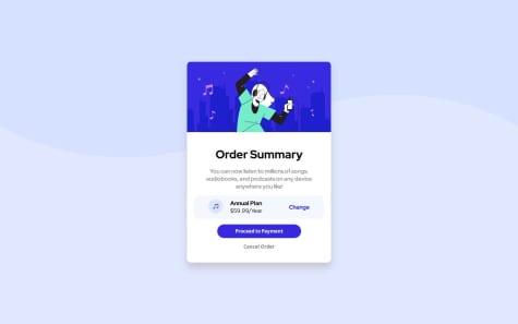
classfor styling components rather than the element/tag selector. When working on big projects, classes can be a lifesaver. Using tags can make it complex and confusing as it applies to all instances of the specified tag. - The "Change" link should not be wrapped inside
ptag. It is a link and should only be wrapped in anatag. - You can have the buttons use the same font as the rest of the body by using an inherit in the CSS:
body { font-family: "Red Hat Display", sans-serif; } button { font-family: inherit; }- There's an easier way to center something vertically and horizontally on a page by using
display: flex:
.container {
display: flex;
justify-content: center;
align-items: center;
}
But, you need to move the card's elements into a new container.
<div class="container"> <div class="card"> ... EVERYTHING INSIDE THE CARD GOES HERE ... </div> </div>- Import Google Fonts inside the HTML. This is better for the website's performance.
- Use CSS Variables/Custom Properties to improve reusability across your CSS. Here's how you can create variables:
:root {
--font-main: "Roboto", sans-serif;

--weight-light: 300;
--weight-regular: 400;
--weight-bold: 700;

--color-white: #fff;
--color-black: #000;
}
Learn more about variables here
- Never* use pixels to set your font size. Here's why
Hope you find these helpful in improving your solution, Happy coding! 😄
Marked as helpful - Use
- @Error-at-nightWhat are you most proud of, and what would you do differently next time?
I'm proud I also able to solve the challenge and finally put RTK query into practice. If I'm to solve the challenge next time, I will build it as a full stack project, right now I'm just using json-server to generate endpoints
To start this application run the following command (in your terminal) in the project directory
- npm install
- npm install json-server (if you don't have json-server installed)
- npm json-server --watch data/data.json --port 8000
- npm run dev
@Code-BeakerHi there, congratulations on completing this challenge... 🥳
I visited your live preview and unfortunately it throws the error "Could not fetch the comments".
I hope you will look into it and fix the issue. Good luck! 😄
- @alvnavraiiWhat are you most proud of, and what would you do differently next time?
What I'm most proud of is that I did the challenge following a tutorial and, since there were things that didn't work, according to the tutorial's specifications, I had to modify styles myself and complete the entire Javascript part
What challenges did you encounter, and how did you overcome them?For me, the most complicated part is the styles.
When I saw that the tutorial I was following did not fit the styles requested, I had no choice but to improvise. But I think I've done a good job.
Regarding the Javascript issue, as I am more used to it, it turned out to be less challenging than the styles issue.
What specific areas of your project would you like help with?Any help or comments will be appreciated.
On the other hand, sorry if my English is not good enough. It's not my native language
@Code-BeakerHi there, congratulations on completing this challenge. You've done a great job with this one! 🎉
I want to share some of my suggestions to help improve your solution.
- Use the specified font or a font of your choice to make the site look better as fonts play a major role in the website's personality.
- Maintain a little space between the error message and the email input.
- Make fonts bigger to improve readability and accessibility. Right now, the fonts are too small and are almost unreadable. Don't use pixels to size the fonts. Read this article
- Use
reminstead of pixels for properties such aspadding,margin, etc. This makes it easier to make your websites responsive for different screen sizes. - For styling, use classes instead of selecting elements via their tags. When handling complex projects, classes will be better and easier to understand and manage.
- Splitting your CSS into multiple files is a good way to make it cleaner and organized.
- Be careful when nesting classes/tags in CSS since it can create confusions when it becomes too long.
Hope this helps you! 😄
Marked as helpful - @mohamans-0@Code-Beaker
Hey there, congratulations on completing this challenge... You've done a great work on this one! 🎉
I visited your website and also took a look at the source code. I want to share some of my suggestions on your solution that might help you improve it.
- Format your code. Formatting your code is helpful when collaborating or sharing your code as it makes reading the code easier and makes it well-structured. If you're using Visual Studio Code, you can install the Prettier extension and format the code.
- Make sure to use appropriate tags to create the components. This is a list of links and it should be created that way.
This is your current markup:
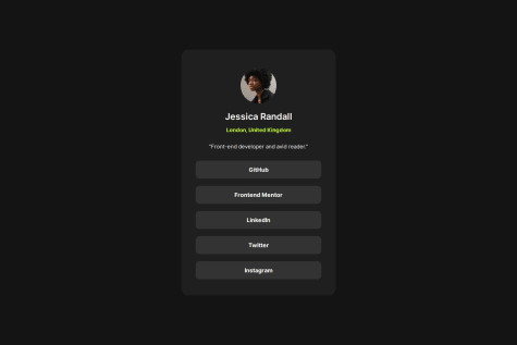
<div class="btn">
<button> GitHub </button>
<button> Frontend Mentor </button>
<button> Linkdin </button>
<button> Twitter </button>
<button> Instagram </button>
</div>
This should be an unordered list where each link should be a list item.
A better and structured markup:
<ul class="social-links"> <li class="social-links__item"> <a href="#" class="social-links__link">GitHub</a> </li> <li class="social-links__item"> <a href="#" class="social-links__link">Frontend Mentor</a> </li> ... ... </div>- Use CSS Variables to speed up your workflow. Many properties like colors, font-size, margins, paddings, etc. can be used with variables. This way, you don't have to type in the actual values of the property but a custom name you created for it.
- Use
remoreminstead ofpx.remis a relative unit and is best when dealing with responsive layouts. Also, ensure you never usepxto setfont-size. Learn more
These are areas where you can improve your solution. Keep learning and getting better. Good luck on your next projects.
I hope you find this helpful... Happy coding! 😄
Marked as helpful - @temesgen-982What specific areas of your project would you like help with?
I still fell the css is not organized well
@Code-BeakerHi there, congratulations on completing this challenge...You've done a great job! 🎉
I have visited your live site URL and checked your source code. I found some areas where you can possibly improve. Let me share some of my suggestions regarding your solution.
- Split your CSS into multiple files to keep it cleaner. You can have different files to store fonts, variables, etc. Here's a simple example:
style.css
variables.css
fontImports.css
As a side note, while working on larger projects, you will usually split your CSS into many files.
- Disable the default validation done by the browser. When entering an email without the
@symbol, the browser gives the invalid popup. If you're using JS to validate your form, then this will probably be useless. Add thenovalidateattribute to theformtag to disable it. - It looks like the input and the button doesn't use the Roboto font. You can fix that and make it better as well.
- In the
assetsfolder, you will find two versions of the cover image.- one for desktop screens
- one for mobile screens
You have to use the
pictureelement along with thesrcsetattribute on thesourcetag. Here's an example for this method:
<picture>
<source media="(min-width: 50rem)" srcset="folder/desktopImage.jpg"/>
<img src="folder/mobileImage.jpg" />
</picture>
This benefits the performance of the website as you don't have to load both of the images and make use of CSS to swap them. Everything is done by the HTML itself.
I hope you found them helpful to you 😄
Marked as helpful - @SigneWinnieWhat are you most proud of, and what would you do differently next time?
i am happy about the fact that i am improving on my css skills
What challenges did you encounter, and how did you overcome them?what i encoutered was being able to separate the paragraphs and being able to align the image with the text
What specific areas of your project would you like help with?javascript and css
@Code-BeakerHi there, congratulations on completing this challenge... 🎉 Unfortunately, it looks like you've submitted the solution for a different challenge. 😢
Currently, the live site URL displays your
README.mdfile. You have to move theindex.htmlfile to the root of your directory and publish the page again. Alternatively, you can use a tool like Vercel to publish your site where you will be able to edit the root directory of your website while deploying it.I want to share some of my suggestions regarding the source code you've shared.
- Do not use
%to define widths, heights, etc. It breaks the site's responsiveness and is harder to maintain on different screen sizes. Instead, useremoremunits. They're relative and are easier to define and manage. - Use CSS Custom properties/CSS Variables to make your CSS reusable and cleaner.
- Use
remto createfont-size. NEVER usepxto definefont-size. Read this article which explains why this is important.
I hope you find it helpful... 😄
- Do not use
- @ChimiRinzin-HWRWhat are you most proud of, and what would you do differently next time?
I have become a lot more familiar with JavaScript and its integration with the HTML and CSS.
What challenges did you encounter, and how did you overcome them?It was a bit overwhelming dealing with JavaScript and also had some difficulties in general with the CSS to design the results summary the way it had to be.
@Code-BeakerHi there, you've done a great job on this one. Congratulations on successfully completing this project! 🎉
I wanted to share some of my suggestions regarding your solution that might help you improve it. I visited your live site solution and you've done good work of getting it close to the design. However, I noticed that the layout was not working properly as the content was overflowing between the columns.
- I think it must be caused by the flex layout. Instead of the
max-width: 600px, use aremvalue to set the maximum width of the container. I also addedflex: 1to make the two child elements equally sized.
.card {
max-width: 45rem;
}

.card > * {
flex: 1;
}
This did fix the layout issue.
- Instead of using
position: absoluteon the.card, you can use adisplay: flexon themainelement and center it vertically and horizontally.
main { display: flex; justify-content: center; align-items: center; }- Make sure the page contains an
h1. Then the order of the heading levels should decrease by one. - The gap between the overall and the total score does seem to be overly spaced. I did try tweaking it using the Developer Tools and I think using
pxis a bad idea. Useremfor theheight, andwidth. Replace thepadding-topwith justpadding.
I hope you found these helpful and you will be able to make use of these to improve your next project! 😄
Marked as helpful - I think it must be caused by the flex layout. Instead of the
- @shreyashpatel5506@Code-Beaker
Hi there, congratulations on completing this project... You've done a great work on this one! 🎉
I want to share some of my recommendations on improving your solution that I found while checking your live site and source code.
- Store your assets inside a folder. When I visited your GitHub repository, I noticed that you had stored the images as well as the code files in the root directory itself. Instead, move the images into a separate folder for example,
images/ | - image1.jpg | - image2.jpg | - image3.jpg- Use appropriate tags for your components. Heading levels should decrease by one as it is an important factor in improving the accessibility of the page.
h1 h2 h3 ... ... ...- In the footer, you have used the
spantag to create the links. They are hyperlinks and should be created with theatag. - Instead of
px, use relative units likerem. Note thatfont-sizeshould never be defined inpx. Here's an article that explains the topic. You can useremfor the following properties and more.- margin
- padding
- font-size
This will make it easier to make the page responsive.
Overall, it looks good. You have done a good job with the responsiveness on mobile.
Hope you find these helpful! 😄
- @Abd-ulelah@Code-Beaker
Hi there, congratulations on completing this challenge... You've done a great work with this one! 🎉
I have checked your live site preview as well as your source code and I would like to forward some of my suggestions regarding your solution that might help you improve it.
- Your site isn't fully responsive, meaning it currently sticks to the left side of the screen on the desktop. I think you've prioritized mobile screens here. But, make sure your site is responsive for all screens since it is an important part of building websites. Give this article a read and get an idea about making a website responsive.
- NEVER use the
idattribute for styling elements. It is more oriented towards scripting with JavaScript. Instead, use theclassattribute to select your elements using the class. Here's an article that explains the purpose of the ID attribute. - Write your CSS inside an external CSS file to keep your HTML file smaller.
- This is subjective and optional. This is important when you're sharing your code with other developers and collaborating on a project. But, try to improve the class names you give.
- Instead of
pxunits, use relative units likerem. Read this article about it.
I hope you find these points helpful in improving your solution. 😄
Marked as helpful - P@Lo-DeckWhat are you most proud of, and what would you do differently next time?
Hi, here is my solution for Fylo-dark-theme-landing-page. I used HTML, CSS, JS.
What specific areas of your project would you like help with?Feel free to leave any comments.
Thanks.
@Code-BeakerGreat job completing this challenge! 🎉 Let me share some of my suggestions regarding your code.
- Using CSS Variables/Custom properties is a great way to code faster. You can create variables for colors, font-weights, font sizes, etc.
- Avoid using
idfor styling a component as it is more appropriate to be used in JavaScript. Here's an article about this topic. - It might be unnecessary to define
heightandwidthfor buttons. Instead usepaddingto adjust their spacing and size.
Hope you find these helpful... 😄
Marked as helpful - @OrnellaSablicWhat are you most proud of, and what would you do differently next time?
This challenge allowed me to review basic notions about html and css.
What challenges did you encounter, and how did you overcome them?I had a problem centering the element but I was able to solve it using flexbox
What specific areas of your project would you like help with?Any suggestion is welcome!
@Code-BeakerHi there, good job on completing this challenge... 🎉 Let me point out some areas where you can improve your code and solution.
- Use proper semantic tags in your HTML to make your site more accessible. For example, the credits should be wrapped inside a
footertag and not aspan. - The page should contain an
h1(level-one heading), and don't be scared to use it because of its large size. It can be styled using CSS to match with the design. - Instead of
height: 100vh, usemin-height: 100vh. Using the first one will limit the height of the body to100vhand it will not look properly on taller screens. - Use
remto define properties such asborder-radius,font-size, etc. Also, usingpxto definefont-sizeis not a good idea. [Here's why)[https://fedmentor.dev/posts/font-size-px/].
Overall, you've done a good job. There is always areas for improvement. You can find articles and videos online that will help you build better websites.
I hope that does help you improve your solution. Happy coding!
- Use proper semantic tags in your HTML to make your site more accessible. For example, the credits should be wrapped inside a
- @shubhamr10What challenges did you encounter, and how did you overcome them?
I did not have the design file for the page, therefore there can be a difference in implementation and actual design. Also, the color for gray 800 and gray 900, were not working for me. So, I did make a change in them a bit.
@Code-BeakerHi there, congratulations on completing this challenge... You've done a great work here! 🎉
I have checked the live site and your source code and I want to share some of my suggestions to improve your site.
- Consider adding
classnames to your HTML elements. This will make it easier for you to style the components. - You can actually declare the components without wrapping them inside a
sectiontag. - The links should be wrapped inside an unordered list
ul. Then, each link should be a a list item. Here's an example of this markup
<ul class="links"> <li><a class="links__link" href="#">GitHub</a></li> <li><a class="links__link" href="#">Twitter</a></li> ... ... </ul>- Make sure your headings are in hierarchical order and they decrease by one level. This is essential in keeping the website accessible.
h1 h2 h3 h4 ... ...- Instead of
pxunits, useremoremto define properties such as margins, paddings, font-sizes, etc.
These are small but extremely important in making a website. I hope you understand them. If you want to learn further about them, you can find many articles and tutorials online.
Hope you find these helpful 😄
- Consider adding
- @Mohammedayman2010What are you most proud of, and what would you do differently next time?
nothing
What challenges did you encounter, and how did you overcome them?nothing
What specific areas of your project would you like help with?nothing
@Code-BeakerHi there... unfortunately, it looks like your live site URL is displaying the
README.mdfile itself, rather than your website.It might have occurred because GitHub Pages is unable to find the
index.htmlfile in your project root directory. Try renaming thesecond.htmlintoindex.htmland see if it is fixed. - @VitorEmanoelNogueira@Code-Beaker
Hi there, congratulations on completing this project... You've done a great job on this one! 🎉
I visited your live site and GitHub repository. And I think you've done a great work trying to match it with the design. I would like to make you aware about some things you can improve in this solution.
- It will be better for the social links to be marked inside a
ul, where each list item is anainside anli. Something like this:
<ul class="links"> <li><a href="#">GitHub</a></li> <li><a href="#">Frontend Mentor</a></li> ... </ul>- Avoid using
idattribute to style elements. They're not meant to be used in CSS but rather in scripting using JavaScript. Here's an article covering this topic. - You don't need the
strongtag to wrap the link's text. You have to use CSS to style the links. - This is a relatively small project and does require a lower number of tags, but in larger projects, you will have lots of components using the same tag but with different looks. It is recommended to use
classfor all your elements and then style them using their class. - Don't limit the width of the body by using
width: 100vwbecause that is completely unnecessary. Thebodyelement takes the full width of the document by default. Using aheight: 100vhwill break the site on taller screens. Instead, usemin-height: 100vhand that will fix it. - I have noticed that most of your elements use
pxforpadding,margin,font-size, etc.Here's [why font-size should not be in pixels].(https://fedmentor.dev/posts/font-size-px/) - To make your CSS cleaner and re-usable, try experimenting with CSS Custom properties/variables
I hope this helps you improve your solution. These points are important in building better and accessible websites. 😄
Marked as helpful - It will be better for the social links to be marked inside a