@faruking

Victor
@CodeVeeAll comments
- @CodeVee
@faruking Good job. Few pointers
-
Clicking the sun and moon icons break the applications.
-
The App is not responsive on Tablet and Mobile.
-
- @pvl-ao@CodeVee
Hi Pavlo. Fantastic job on this task. I also use rem for my responsiveness. I think it's good and less confusing than em. Few Suggestions
-
Wrap your code with a
maintag to fix the landmark accessibility issue. -
Consider using a different element than the
ulor use border-top and border-bottom for yourliwith padding rather thanhr.
I hope you find this helpful
Marked as helpful -
- @nobody1234455@CodeVee
Hi THIH_NEZZY, Great job on this task. Few Suggestions
- Wrap your code with a
maintag to remove the accessibility errors
<main> <div class="card"> ... </div> </main>- Remove the images from the span in the
price-timediv and place them side by side with the span
<div class="price-time">
    <div class="price">
        <img src="./images/icon-ethereum.svg" alt="eth" />
        <span>0.041 ETH</span>
    </div>
    <div class="time">
        <img src="./images/icon-clock.svg" alt="clock" />
        <span>3 days left</span>
    </div>
</div>
Also update the CSS to look like
.price-time { display: flex; justify-content: space-between; margin: 7% auto 0 7%; } .price,time { display: flex; align-items: center; } .price,time > img { margin-right: 5px; } .price>span { color: var(--cyan); } .time>span { color: var(--soft-blue); }-
I would recommend you research the use of padding and apply it to the parent
cardrather than using margin on child elements. -
To overlay properly would then be easier with absolute positioning and flexbox.
I hope you find this useful
- Wrap your code with a
- @Plut0r@CodeVee
Hi Ogunola, Great Job completing this task. Few Suggestions:
-
Wrap your code with the
maintag like<main> your code here </main> -
Set the border and outline to none to remove the white and additional colors from your buttons
button { border: none; outline: none; }- For Screens below 375px, I would suggest you don't worry about it.
I hope you find this helpful
Marked as helpful -
- @Kehinde13@CodeVee
@Kehinde13 Hi Kehinde Balogun, Great job completing this assignment. Few Suggestions :
-
Wrap your code with a
maintag. -
Replace your
h4with ah1. -
Try and center your button
-
- @deksa89@CodeVee
@deksa89 Hi Dean Hudek, Great Job completing this assignment. Few Suggestions
-
Change the price heading to
h2rather thanh3to clear the accessibility issue. -
For the hover state. Remove the blue image and set the background of
.inner-phototo cyan00FFF7. Use flex to center both horizontally and vertically the eye SVG.
-
- @keltech18@CodeVee
@keltech18 Hi Kelvin Ginikanna, Great job completing the assignment. Few Suggestions
-
Replace the
divwith classmain-boxwith amaintag. -
Replace
ptagfirst-paragraphwithh1 -
Add a
titletag between theheadtags. Just aftermetashould be ok.
-
- @Khaltech99@CodeVee
@Khaltech99 Hi khaltech99, Great job on this assignment, and the cool animation was a nice touch. Few Suggestions
-
Your container seems too wide. Reduce the width and padding as it seems there is too much space on the right.
-
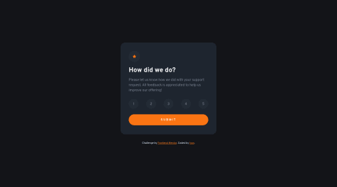
An active class should be applied to your rating to know the selected option.
-
Use
constfor the other selectors as they are not reassigned.
-
- @SalehAbuhussein@CodeVee
@Honko-o Hi Saleh, Great job on this. A few things I would say are
-
Good use of destructuring. Adds Clarity
-
JQuery was a bit of overkill. Still good though.
-
pcan be anh1tag for accessibility. -
ashould be a button. Makes for better Markup
-
- @ladking@CodeVee
@ladking, Hi Hakeem. It seems you have done this on a private repository. Make it public so that assistance can be offered to you.
- @Chiku100@CodeVee
@Chiku100 Hi Abhilash, Great job on this assignment. I have a few suggestions
- Wrap your card with a
maintag. I would suggest swapping thedivtag with attribution class for it. - for the attribution styling I'd say change it for it to cover the entire screen like
.attribution { display: flex; height: 100vh; background-color: hsl(212, 45%, 89%); justify-content: center; align-items: center; }- Use
h1instead ofh2
Marked as helpful - Wrap your card with a
- @Lino-OTM@CodeVee
@Lino-OTM Hi Iván De León Lino, Great job on this. My only suggestion would be to use
constrather thanletfor your query selectors as the are not reassigned.Marked as helpful - @cluod-Alfakhre@CodeVee
@cluod-Alfakhre Great job on this. A few things I might suggest adjusting
- The active button does not change once selected.
- There is no need for padding on the main hours
- Your variables were declared with
let. Useconstsince they are never reassigned. - The casing for some of your text is mixed up.
- The background color for the profile card is different
- @Julr09@CodeVee
@Julr09 Hi Julian. Great job using Angular on this task. I have a few suggestions
- Your model class should be within the app folder so as not to need default export.
- You should try to declare more interfaces to avoid using any in your code.
- Your CSS class naming could be better. Naming a class t might not be descriptive enough.
- You could place all your configuration information in an array of objects. Thereby all you need to do is loop through the list. Save in Markup and adds more clarity to it.
Marked as helpful - P@katrien-s@CodeVee
@graficdoctor. Great job on this project. I have a few comments:
- There is a need for more spacing between sections
- Also the grid was switched around. I don't know if that was a creative choice. If it was an issue then I could give a few suggestions on that.
- The hover is working on chrome
- There were also alignment issues.
- The struggle of doing this with a full-time job is highly applauded.
- I'd recommend using the Figma design and sectioning the project for your to-do list.
- @b-l-u-e@CodeVee
Awesome job. You could increase the size of your cards or reduce the font and image size to create more space
Marked as helpful - @b-l-u-e@CodeVee
Awesome job. You could increase the size of your cards or reduce the font and image size to create more space
Marked as helpful - @Jimender@CodeVee
Awesome job. In your repo, you used the color value even though you declared the variable in the root . Still great