


@DaFlusher
Latest solutions
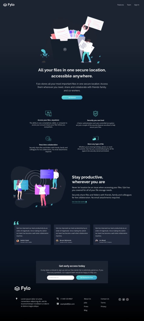
Responsive Space Tourism Website made with Vite+React
#accessibility#react#sass/scss#viteSubmitted over 1 year ago
Latest comments
- @DaFlusher
Added a setinterval() to refresh the advice every 8seconds
- @DaFlusher@DaFlusher
I reviewed the code. Instead of using the lightbox component from reacjsexample.com, I imported the react-modal from their github repo and customized it. The lightbox now looks much closer in appearance to that of the design. I still have to work on the add to cart functionality.
- @Yadier01@DaFlusher
Hello Yadier! Nice job. The mobile version looks good. The web version though has the thumbnail images spilling over onto the product section, so the user cannot interact with the buttons. Maybe, you can check it out. It happens from a screen width of about 1035px. I would also suggest adding some padding to the navigation for the mobile view. Goodluck!
Marked as helpful - @Muraddevp@DaFlusher
Nice job Muraddevp! It looks great. I just have a few suggestions : 1)adding semantic html like 'main' as a wrapper after the body element, instead of a div. 2)Using relative units for padding,font-sizes, 13px = 0.8125em/rem. 3) Not setting absolute values for grid template rows, I personally think using grid-auto-row: minmax(); is more responsive. 4)Finally, from my end, at a screen-width of 767px, the elements at the edge were clipped, maybe try increasing it to 1200px or more. Well done and goodluck!
- @jacobaroberts1993@DaFlusher
Nice work Jacob! I almost couldn't tell the transition between the hero section and the next section. The background was quite something. I noticed the mobile screen for the links(about us down to privacy) had a smaller margin/padding when compared to the rest of the footer so it was a bit to the left of the screen. Well done!
Marked as helpful - @bosslakrym@DaFlusher
Good job LakryM. I noticed the mobile page was moved a bit to the right of the screen. The Bootstrap container-fluid class can help with that. Maybe you may have used different utility classes for the different sections. Using bootstrap to get the off canvas side navigation with a drop-down was a little tricky for me as well. Maybe you can look up the navbar section of bootstrap docs, there is an offcanvas solution there. Well done!