@Demils13

Dun
@DundeeAAll comments
- @DundeeA
Good job completing this challenge, The QR code image isn't loading because the route you provided isn't correct.
The "src" in your img tag should be changed to this:
<img src='./images/image-qr-code.png' />This is because starting your image url with a "./ " is referring to the current folder, since the index.html and the "images" folder are in the same directory you just need the one "./".
Edited to correct "/" to "./"
Marked as helpful - @davinceey@DundeeA
Hey, great job completing this challenge. I'm going to try to answer your questions but let me know if you need further explanation.
"How would I be able to implement that triangular focus"
I recommend you take a look at the pseudo-elements "before" and "after", they're a really good way to stylize your page without adding extra html. Read more here
Here's how you would utilize the "after" pseudo-element to achieve the triangle.
.social__media:after {
    content: '';
    position: absolute;
    display: block;
    width: 0;
    z-index: 1;
    border-style: solid;
    border-color: #607a78 transparent;
    border-width: 20px 20px 0;
    bottom: -20px;
    left: 50%;
    margin-left: -20px;
}
Now, as for your javascript, the event listener you implemented actually works as you intended, your problems seems to be with how you styled the class "active", so funny enough your javascript problem is a CSS problem in disguise.
When you click share, you add the class "active" to the element you want to hide, I would actually just change that class name to "not-active" and in the css do
.not-active{ display: none; }Marked as helpful - @josegomez832@DundeeA
Hey great job completing this challenge, I took a look at the javascript and I have some suggestions.
Currently in your game logic you have a series of "and or" statements to decide if the player and the computer had the same selection. The same functionality can be achieved with a Strict equality operator.
if(selection === computerSelection) {document.getElementById('message').innerHTML = 'Draw';}Secondly , You're making the computer run extra code it doesn't have to run to fix this you can re-order your game logic.
What your code is doing
- run all the code to check if player lost
- if not , check if its a draw
- if none of that , player won
efficient version
- check if its a draw (if so stop code immediately)
- check if player lost (if not player won)
Here's how I would restructure your code.
if(selection === computerSelection) {
 document.getElementById('message').innerHTML = 'Draw';

return; // will stop the game logic immediately so no extra code is ran.
}

if(selection == 'Paper' && computerSelection == 'Scissors' || selection ==
 "Scissors" &&
computerSelection == 'Rock' || selection == 'Rock' && computerSelection ==
'Paper'){
 wins--;
document.getElementById('message').innerHTML = 'You Lose';
document.querySelector('#Computerselected
.userSelection').classList.add('win');
 document.getElementById('wins').innerHTML = wins;

return; // player lost so stop the game logic
}

//if the code didn't hit any return statements the player won
wins++;
document.getElementById('message').innerHTML = 'You Win';
document.querySelector('#selected .userSelection').classList.add('win');
document.getElementById('wins').innerHTML = wins;
Hopefully this makes sense if you have any questions let me know!
- @zofia-mm@DundeeA
Great job completing this challenge, I have just a couple suggestions to improve.
Typescript: After testing I realized its possible to get negative points when you lose with a score of '0'. You can fix this issue quite easy by adding an if statement right before you subtract a point.
if (this.score != 0) { this.score -= 1; }Accessibility: Your buttons don't have an accessible name, screen readers announce it as "button", making it unusable for users who rely on screen readers. You can add an accessible name to a button by adding an aria-label.
Example:
<button aria-label="scissors"> </button>Marked as helpful - @Durgathev@DundeeA
Great job completing this challenge, I noticed a few things that can be improved
HTML structure:
You did a good job with semantic html by having key landmarks (header,main,footer), but you placed them inside a div, for best practice and to be sure your webpage is accessible you should place landmark elements directly in the <body>.
You could restructure your html by moving the container div like so : https://i.imgur.com/4PrXX8Z.png
Semantic html (accessibility) : Your 'register' button is actually a div, I suggest using a <button> instead for several reasons but most importantly it makes the web page accessible to screen readers, most the time when you have something the user can click its a good idea to use the built in button element.
CSS: I noticed you used display 'flex', now you can set 'align-items: center' which will put all the elements along the center of the screen.
I highly recommend taking a look at this guide for flex: https://css-tricks.com/snippets/css/a-guide-to-flexbox/
Marked as helpful - @arturo0427@DundeeA
Hey good job completing this challenge, it looks great.
I highly recommend using a <form> element for this , considering you're asking for a user input and then providing a 'submit' button, that's exactly what forms are for, so its a great opportunity to make your code even more semantic.
The rating buttons would be an excellent time to use "radio buttons", not only are radio buttons semantic as-well, but they work in conjunction with the html form. If you're unfamiliar with radio buttons, they basically allow the user to only choose one option out of many. (perfect for this solution because the user can only choose 1-5).
And finally for the submit button, you can add aria-label="submit rating". The aria label lets screen readers know what a button does which makes the page more accessible.
example: <button aria-label="submit rating"> submit </button>
Marked as helpful - @yashgo30@DundeeA
Congratulations on completing this challenge. This solution is so well made its difficult to give advice on how to improve, but I did notice the responsiveness to larger screens could use a little work.
Its not uncommon for users to browse the web with a 4k monitor (3840 x 2160). The elements are a little small with 1080p but really shrink at 4k resolution. This can also help with accessibility considering the text will be harder to read on bigger screens if the elements don't scale up accordingly.
Marked as helpful - @kanarian@DundeeA
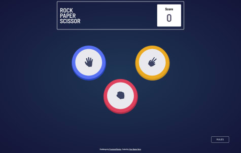
Hey, good job completing this challenge. I would recommend having the possible play choices be <buttons>, the button element is semantic html and lets screen readers know this element can be clicked.
For the 'shaded' circles I recommend looking into box-shadows, you can actually put as many as you want around an element and they're fully customizable similar to borders you can have them wrap around the entire element to get the same effect you have here.
box-shadows: https://www.w3schools.com/cssref/css3_pr_box-shadow.asp
Marked as helpful