Latest solutions
REST Countries API: ReactJS, NextJS and Chakra-UI
#chakra-ui#next#react#typescriptSubmitted over 2 years agoE-Commerce-Product-Page Built with HTML, CSS and ReactJS
#react#semantic-uiSubmitted over 3 years ago
Latest comments
- @Mateo-Le-Fur@EmmanuelOloke
Hello Mateo, trust you're doing great. Great job on completing this project, it looks really clean and professional, kudos.
I do have some observations that I wish to bring to your attention;
-
When a user clicks on a country card to show more details about the country and then refreshes the country details page, the user is taken back to the Home page as opposed to still being on the country details page that they refreshed on.
-
On the country details page, there's no state to handle when the country has no Border Countries to display, you can have a div with a text that says "No Border Countries" for example.
-
Also on the country details page, for countries with Border Countries, the design from Frontend Mentor did show that the country names be displayed in full and also be clickable in order to navigate to the corresponding country, but at the moment only the acronyms of the countries present in the "borders" property returned by the API are being displayed.
I also had this problem while attempting this challenge some weeks back. A way I was able to solve the issue was to loop over allCountries and also loop over the "borders" property array and check where the borderCountry matches the allCountries.cca3 property, then you can now return the allCountries.name.common value for that country in a separate array. Then use that array to display the border countries.
That worked for me, you can then go on to add a link to the div that navigates to that particular country's details page. This will fulfill the original design specifications.
Just thought to bring these to your notice and also share my experience building the same challenge. Hope this has been helpful. Enjoy!
Marked as helpful -
- @tchydy@EmmanuelOloke
Hello Tochi, fantastic job you've done with this challenge, it really looks good. Kudos!
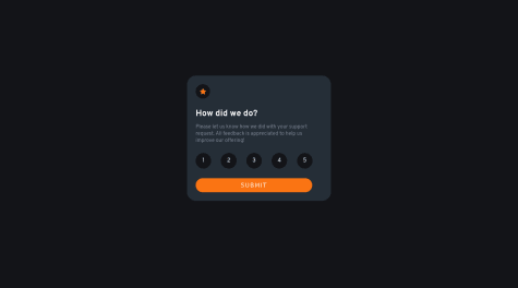
One observation I've made is that there is no colour change on hovering over the rating number elements. As per the style guides provided, the colour is supposed to change to orange on hover to depict the active state.
I just thought to bring that to your notice. Once again, good job on the challenge.
Marked as helpful - @olaniyivictor@EmmanuelOloke
Hey Victor. Great work on this challenge. Everything looks really good. Big kudos!!
One observation I'll like to bring to your notice though, the Active State for the "Equilibrium #3429" text has not been implemented yet. I'm sure it was just an oversight but just thought to bring it to your attention and point it out nonetheless.
Awesome job completing the challenge once again. Peace!
- @olaniyivictor@EmmanuelOloke
Hello Victor, great job you have done on this challenge.
Just one minor observation though, the header text is without spaces. That is, the "Get insights that help your business grow" text.
Just wanted to bring that to your attention.
Great job once again. Peace!
- @olaniyivictor@EmmanuelOloke
Hello Victor, great job completing this challenge, keep up the good work.
There are a few observations I've made while going through the preview site though. I think the mobile responsiveness can be improved upon. Elements on the page can be better positioned to align more with the mobile design file provided in the challenge. I think using appropriate @media queries can take care of this problem, the right spacing and positioning should do it.
Also in the first section of the page, the Get Started button and input field could use some spacing and margins.
In addition, in the Get early access section, the text and form are supposed to be displayed side by side on the desktop view as opposed to the current arrangement.
Finally, I think the colour of the Fylo logo in the Footer section should be changed to white, to improve the contrast, the current colour is really difficult to see at the moment.
Once again, good job on completing the challenge. Enjoy the rest of your week.
- @CaioPaulin0@EmmanuelOloke
Hello @CaioPaulin0, great work on this challenge, especially the mobile view. Looks really clean, however, there are some observations I've made that I'd like to bring to your notice:
-
The contents are bigger than the provided design file recommendations. Just a few adjustments in your HTML and CSS will fix this.
-
Clicking the thumbnails on the main page opens up the modal which I don't think conforms with the intended performance, it should instead change the main image to the larger version of the thumbnail image clicked. Also, the active state on the clicked thumbnail isn't implemented.
-
On the modal, there are no next and previous buttons. Also, the active state of the selected image in the thumbnail isn't implemented.
These are just some observations and improvements I think can make the solution look even better. Once again, great work on the challenge. Thanks.
-


