


@yashh247
Latest solutions
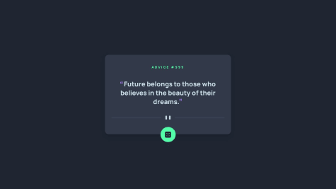
Advice generator app using React Styled Components
#react#styled-components#fetchSubmitted about 2 years agoNewsletter signup using React - Styled Components - Formik - Yup
#react#styled-componentsSubmitted about 2 years agoMulti-step form using React Styled component - Formik - Yup - ChakraUI
#react#styled-components#chakra-uiSubmitted about 2 years ago
Latest comments
- @F4YY
Hi @yashh247,
Congratulation for successfully completing the challenge...
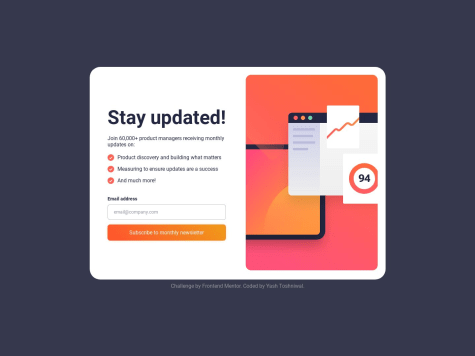
There's little suggestion about what you've missed to the given design. Which is when user submits their email address through the form and clicked subscribe button, then the Thank You component will be rendered, displaying the thank you message along with the
user's email addressthat has been inputted instead of just static text@loremcompany.com.To achieve the desired behavior, you might need to add JavaScript function, so that the
inputted email addressis dynamically inserted into the thank you message.Hope that could be Helpful. Above all you did very good. Keep happy coding...
- @KeoLamola@F4YY
Hi @OekPhlesym,
Congratulations on successfully completing the challenge, you did very well...
There is improvement room to make it closer to the given design. Which is appearance of the
eye iconoverlaying above the equilibrium image when hovering. You can set overlay component and make its absolute position, also set relative position of the image container.Then insert it in HTML & CSS, the code snippet could be like this, you might adjust it as you like:
in HTML:
<div class="avatar">
    <img src="images/image-equilibrium.jpg" alt="preview">
    <img src="images/icon-view.svg" class="overlay" />
</div>
in CSS:
.avatar {
   display: flex;
   position: relative;
   justify-content: center;
   align-items: center;
   height: 60%;
   width: 100%;
}
.overlay{
   position: absolute;
   top: 0;
   left: 0;
   right: 0;
   bottom: 0;
   opacity: 0;
}
.overlay: hover{
   opacity: 1;
   background: hsl(178, 100%, 50%, 0.5);
}
Hope that could be Helpful. Keep happy coding...
- @ArinjayBhola@F4YY
Hi @ArinjayBhola,
Congratulation for successfully completing your 1st challenge, you did great...
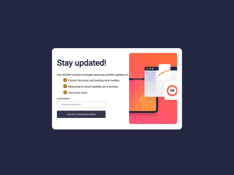
Little suggestion to make it closer to the given design, which is when user submits their email address through the form and clicked subscribe button, then the Thank You / Success component will be rendered, displaying the thank you message along with the
user's email addressthat has been inputted instead of just static textash@loremcompany.com.To achieve the desired behavior, you might need to add JavaScript function, so that the
inputted email addressis dynamically inserted into the thank you message.Hope that could be Helpful. Keep happy coding...
- P@peipeix2@F4YY
Hi @peipeix2,
Congratulation for successfully completing the challenge, nicely done...
However, when on mobile screen view the image's not showing. In your code, the src attribute for the mobile screen size is specified as
src="../images/image-product-mobile.jpg". The use of the..in the path indicates that the image file is located in a directory one level above the current directory.Try using
src="./images/image-product-mobile.jpg"is the way to specify the relative path to the image file when it is located in the images folder directory within the same directory as the HTML file. By using this path, the browser will display theimage-product-mobile.jpg.Hope that could be Helpful. Keep happy coding...
Marked as helpful - @rgap@F4YY
Hi @rgap,
Congratulation for successfully completing your challenge, you did very well...
Based on the CSS code you provided, it seems that the width of the
.boxelement is set to 20%. This means that the width of the.boxelement will be 20% of its parent container's width. When displaying on a mobile screen, it can cause the.boxelement to shrink and the text within it to overflow. This can result in the text not fitting within the container and appearing outside of it.To fix this issue, you might consider using media queries to adjust the width of the .box element for different screen sizes. Such like CSS code snippet below:
@media (max-width: 480px) {
    .box {
        width: 80%; /* Adjust the width as per your requirement */
    }
}
You can customize the styles for different screen sizes and ensure that the text fits within its parent container without overflowing.
Hope that could be Helpful. Keep happy coding...
- @HatemGw@F4YY
Hi @HatemGw,
Congratulation for successfully completing the challenge...
There's suggestion to make it closer to the given design, which is when user submits their email address through the form and clicked subscribe button, then the Thank You / Success component will be rendered, displaying the thank you message along with the
user's email addressthat has been inputted instead of just static textash@loremcompany.com.To achieve the desired behavior, you might need to add JavaScript function, so that the inputted email address is dynamically inserted into the thank you message.
Hope that could be Helpful. Above all you did great. Keep happy coding...
Marked as helpful