Not Found
Not Found
Not Found
Not Found
Not Found
Not Found
Not Found
Not Found
Not Found
Not Found
Not Found
Not Found
Not Found
Not Found
Not Found
Not Found
Not Found
Not Found
Not Found
Not Found

All solutions

  • Submitted

    Product Preview Card

    #accessibility#bem#vite
    • HTML
    • CSS

    1


    Heyo,

    This is my solution to the product preview card challenge. Wasn't too complicated so I turned it into a speedrun. Managed to code and deploy it under an hour. If I missed anything, feel free to point it out!

  • Submitted

    Meet Landing Page

    #accessibility#vite#sass/scss
    • HTML
    • CSS

    2


    Hey guys,

    Seemingly a simple newbie challenge but along the way I found a lot of little details that proved to be a bit tricky, like the image placement in the hero area or the decorative numbers. It was a lovely design that I really enjoyed working on.

    If you see anything out of place or anything I could improve on, don't hesitate to point out (:

    Have a great day!

  • Submitted

    Job listings with filter

    #react#tailwind-css#typescript#vite
    • HTML
    • CSS
    • JS

    0


    Hey guys,

    I first made an attempt at this challenge last summer and I found it really difficult so I unfortunately gave up. I thought I'm going to feel amazing someday when I get around to finish it. Now I finally did it. I didn't have any trouble completing it. I guess, this is a positive thing, in a sense that I must've learned a few things in the past year. On the other hand, maybe if I didn't give up so easily last year, I could've done it back then...

    It wasn't my favourite challenges. Just felt a bit bland I suppose. And so probably there's room for improvement, especially when it comes to accessibility but for now I'll leave this challenge as it is. On the bright side, Tailwind is still an awesome tool to work with, I absolutely love how much time it saves me with the setup.

    If you check out this solution, thank you (: If there is any problem with it that I haven't noticed and should be corrected, feel free to let me know!

  • Submitted

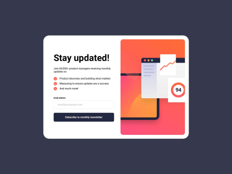
    Newsletter Signup Page

    #accessibility#bem#typescript#vite
    • HTML
    • CSS
    • JS

    5


    Hey guys,

    I haven't submitted anything in a while so I'm happy I could find some time for this. Feels like I've been focusing on different things at work lately (even some backend stuff) so I really enjoyed doing CSS again. ^^

    This was a quick and easy challenge, I learned nothing new, I just wanted to have some fun with it and see how rusty my CSS got in the past few months.

    Take a look if you want, if you see any mistakes, don't be scared to point them out. Have a good day, peeps! ❤️

  • Submitted

    Advice generator app with vanilla stuff

    #accessibility
    • HTML
    • CSS
    • JS
    • API

    1


    Hey guys,

    This was a small speedrun challenge. Nothing too complicated, but as I've been working with React only in the past few weeks, months it was kinda refreshing to do a tiny bit of vanilla javascript (even though this was really just a tiny bit).

    One thing I noticed though, while the API calls work as intended in Chrome and I manage to generate new advice, it doesn't work very well in Firefox.. It just returns the same piece of advice every time, unless I wait a fair few minutes and close+reopen the project. Not sure what might be causing this, so if anyone can point me in the right direction, I'd be grateful.

    Any other feedback is greatly appreciated, as usual!

    Have a lovely evening! ^_^

  • Submitted

    Interactive Rating Card - turned into a modal in a pizza app

    #firebase#framer-motion#react#react-router#sass/scss
    • HTML
    • CSS
    • JS

    5


    Hey guys,

    I'd like to apologise to anyone who's only interested in the rating card component. Just click through the pizza creation, on the finish page you can see it as a popup, if you choose to give a feedback.

    Because that's what this component turned into. A pizza app. Somehow. I wanted to practice React so I kept adding new things to it and this is what I ended up with. Design wise it's not the fanciest (I'm really not a designer, sorry) but that wasn't really the point here anyway.

    I added a couple of features: a pizza creation function, signup/login function with Firebase (password reset as well), a light-dark theme, a contact form and a pizza-loader animation (thanks to my sister for the pizza images she made for this and for the home page background). And finally there's the rating card component as a modal, which was the original challenge.

    I learned a lot in the process: I got a tiny bit better at Framer Motion, I wrote a bunch of React code, used context and Firebase for the first time. I even managed to reuse some things from my other projects (like the mobile menu) - it felt great that I didn't have to do it again from scratch.

    I appreciate if you take the time to look at it. I take any sort of feedback regarding accessibility, React best practices, css (a bit messy at the moment), animations, how to make things more reusable... anything.

    If there's anyone who's a pro at Framer Motion and can give me a hint on how to do exit animations, I'd love it.

    And lastly I hope it isn't inappropriate to upload this app here. It really started out as the rating card component, just got carried away.

    Anyway, happy Easer/have a good weekend everyone!^^

  • Submitted

    Space tourism - with React and Framer Motion

    #react#react-router#framer-motion
    • HTML
    • CSS
    • JS

    2


    Hey guys,

    This is my first React project. Well... there are some part I'm satisfied with and others, less so >.< I'm quite happy with an overall layout, especially the mobile and tablet view. The backdrop filter also looks super pretty (too bad Firefox still doesn't have support for it).

    What I'm not happy out is the layout shifts. Especially in the Crew tab, the content "jumps around" a fair bit. It only happens on the initial load. Tried to find a way around it with some animations but I'm still a bit clueless how to solve it, so if anyone has any idea, I'd be happy to hear it.

    I'd love to hear other feedbacks too on how to improve my work, as usual ^^ Have a great day!

  • Submitted

    Pricing component with toggle switch

    #accessibility
    • HTML
    • CSS
    • JS

    2


    Hey guys,

    I used this challenge to learn a bit about creating accessible toggle switches. I followed an awesome pen by Scott O'Hara and tweaked it so it fits the design.

    The design of this challenge was really lovely and I had a lot of fun playing around with the gradient and coming up with some custom focuses for the buttons. The Javascript part is probably not the most elegant solution but it works well, as far as I can tell. ^^

    If you see anything I have missed, I'd love to hear it, so feel free to leave a feedback!

    Thanks and have a lovely weekend everyone!

  • Submitted

    QR code component

    #accessibility
    • HTML
    • CSS

    1


    Hey hey,

    This was a very small challenge that I did more for completeness sake than for anything else. Made it into a speedrun, to see how fast I can deploy. :)

    If you have any feedbacks though, feel free to add.

    Have a great day!

  • Submitted


    Hey guys,

    This was a really fun little project. Without proper data behind it, it seem like a useless component so I just focused on having fun with it.

    I added a tiny animation for the data bubble so the whole thing doesn't look so static.

    I also tried declaring my custom properties differently this time following Kevin Powell's video so I can manipulate colours more easily. This is definitely something I add to future projects as well!

    I used fixed widths for this component. I usually go with max-width, clamp, minmax, etc for setting the width but I thought for this challenge having a fixed width just makes more sense. I tried to pay attention to having the right breakpoints, so it's still responsive, hopefully :)

    For the functions (like upload, etc) I used buttons but there may be a better solution. My logic was that these icons would add some functionality instead of pointing to different websites, so button seemed the most appropriate.

    Since the display bar of that data usage isn't functional, I just had fun with CSS and made it purely decorative. ^^

    If there was any way to improve on this, I'd love to hear it!

    Have a good evening everyone!

  • Submitted


    Hey guys,

    This challenge turned out to be a lot harder than it seemed at first glance! Lots of layout and accessibility problems I had to solve but I learned heaps and really had fun completing this project.

    Inspired by Kevin Powell's recent video, I added a Skip navigation button as well.

    I'd be very happy to hear some feedbacks (especially regarding accessibility and HTML)! Was also wondering, if I should add animations to the page but then decided against it as I kinda like the clean looks of the design (also unsure how much animation a banking app should have^^). What do you think?

  • Submitted


    Hey guys,

    I found this was an overall pretty easy challenge, I completed it in an hour or two. Most of this time I've spent on trying to figure out the background shadows (ended up using a mix of box-shadow and pseudo-element) and pondering what would be the best solution for the image overlay from an accessibility point of view. I went with having a link and an image side by side in a container (was wondering if it would be a better solution to wrap the image inside the link?) and used ::before for the overlay. I'm not sure if this is the prettiest solution, as I had to use fixed width&height to achieve what I wanted. If anyone can recommend something nicer, I'd really appreciate it!

    If you have any feedback on other parts of my solution, I'd be very happy to hear that as well!

    Have a great day everyone!

  • Submitted

    Huddle with scss and a lot of flexbox

    #accessibility#sass/scss#parcel
    • HTML
    • CSS

    1


    Hey guys,

    I wanted to practice some CSS with this challenge as I was focusing a lot more on Javascript recently and felt like I was getting a bit rusty ^^ I'd like to get some feedback, especially on the semantic side of things, if there's any way to improve what I did, I'd love to know! If anyone could suggest some animations for the hero section of the page, I'd appreciate that too! I don't have a lot of experience with animations and I don't want to go overboard with them, but without any that section seems a bit... plain? >.>

    Any feedback, good or bad, is greatly appreciated! Have a lovely day!

  • Submitted


    Hey guys,

    This was a trickier challenge than it looked like. Much trickier, actually. I know it's not a pixel perfect copy of the design but that even intentional in some places ^^ Please feel free to roast me, I'm sure I made some errors!

    Have a great day!

    edit: I couldn't figure out what's up with the fonts! They just look different than shown on the design. Any idea why?

  • Submitted


    Hiyo, this wasn't particularly challenging at this point, I just wanted to practice using Sass and Parcel ^^ Still, if there's anything I could do to improve it (as there usually is), please let me know!

    Have a great day guys!

  • Submitted

    Fylo Dark Landing Page using Sass, Parcel, deployed with Netlify

    #lighthouse#parcel#sass/scss#accessibility
    • HTML
    • CSS
    • JS

    2


    Hey guys! I had a blast building this, even if it was a bit challenging at times! It also gave me a good opportunity to experiment with some new tools and I'm kinda happy with how it turned out. I've changed a few small things (on purpose :P).

    It would be awesome to get some feedback, especially regarding the HTML. I try to pay attention to semantic markup so I'd love to hear some feedbacks on this (or on anything else really).

    edit: When I check on my phone, for some reason it's all messed up, like only half of my css was working. I didn't have this issue with the browser's inspect mode. Can anyone explain me why this may happen?

  • Submitted


    I had to work a surprising amount of time on this challenge to make it look nice on all screen sizes but I think the result is satisfactory! If there's anything I could improve on, please let me know, perhaps there's something I overlooked ^^

    Have a great day people!

  • Submitted


    This is my first Junior challenge completed! ^^ I'm more or less satisfied with the final result but I had a hard time coming up with a nice-looking layout for medium screen sizes and I feel like I had to use one or two small "hacks" to make things look like how I wanted. I sometimes felt a bit frustrated and confused about the length of this design, as so far I only did smaller components, but I'm sure this is something I'll get used to ^^

    Pretty please give me your honest feedbacks about it, I'm sure there's plenty to improve on my html, how I organised my code and on these small "hacks". One of these hacks was how I aligned the feature divs in the workflow section. The images are not the same width and height, which made the text look all over the place. The only solution I could came up with is to set a fixed height for the image holder divs, but I'm sure there's a more elegant way to do this (probably it's just my lack of knowledge of flexbox).

    I'd appreciate it if you take time to look at my work. Have a lovely day everyone! :)

    edit: After looking at the report, I'd like to ask, do I need to provide an alt for all images even if I set aria-hidden for them?

  • Submitted


    This challenge was my way to check if I improved in the past months and I'm happy to see I did! I completed it quickly and it was fun :) Still, if there's anything I could improve on (especially html wise), please let me know!

    Have a nice day everyone ^^

  • Submitted


    Hey guys, if there's anything I could improve on, please let me know. Have a great day! :)

    Edit: I set an animation delay on my cards so they don't show up in the challenge screenshot. Is there a way to fix this?

  • Submitted


    Hey guys,

    I'm quite happy with the final product and learned a whole lot from this challenge. Feedback are much appreciated and I also have a specific question. When I set the input type to email the browser automatically throws an error message when the format is incorrect. This prevents the styled error message I made from showing up. The only way I could make it work was to get rid of the type="email" of the email input field. I would like to write semantically correct markup, is the input type important? Is there a way to do this better?

    Thanks and have a lovely day everyone :)

  • Submitted


    Hey guys,

    I had some trouble with this one, specifically with the images in desktop view. The images kept jumping around as the container's height changed (when you open up the answers). For now I set a height on the container to avoid this and I think it looks fine but I was wondering if there was a better solution for this problem? (I also tried using different units than vh and vw when setting the position of those background images but none of them seemed to work out right.)

    And here I thought javascript will be my biggest struggle in this challenge... :'D

    Also, feedbacks are much appreciated, even if it's unrelated to my question :) Have a great day!