Skip to content
  • Unlock Pro
  • Log in with GitHub
Profile
OverviewSolutions
1
Comments
3

Ígor Haag

@HaaguitosAraricá, RS70 points

ᓚᘏᗢ

Latest solutions

  • Next.JS responsive Space Tourism website

    #next#tailwind-css

    Ígor Haag•70
    Submitted about 2 years ago

    0 comments

Latest comments

  • Shchetkov Maksim•470
    @ArmsAndArrows
    Submitted about 2 years ago

    Space tourism multi-page website NextJS

    #next#sass/scss#react
    1
    Ígor Haag•70
    @Haaguitos
    Posted about 2 years ago

    Hey, Shchetkov!

    Awesome solution! The smooth animations and redirects make it a great experience browsing through your website, and I really like how you made the application icon redirect to the homepage (believe me, not everybody does that)!

    I'll leave some points here as a feedback:

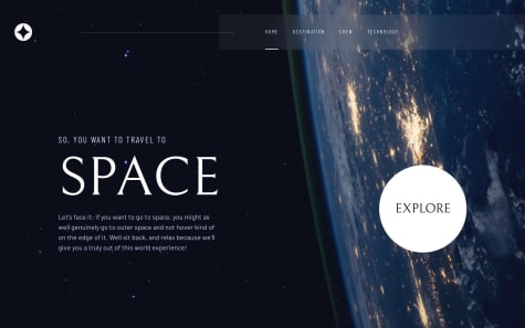
    • On the tecnology tab, the image could have more spacing between it and the text on web devices, since there is a big free space on the right;
    • still on technology tab, but on cellphones, there is no spacing between the texts, and some gap could increase the readability;
    • on the crew tab, the images don't have fixed size, so the screen jumps when changing to Douglas Hurley, caused by the scrollbar appearing.

    Hope it helps!

  • Jordan Herrera Vera•490
    @jordanheve
    Submitted about 2 years ago

    Space tourism website, React + Vite, slider moon

    #react#animation
    1
    Ígor Haag•70
    @Haaguitos
    Posted about 2 years ago

    Hello, Jordan!

    Nice solution. The slider really solves some problems with the images on mobile and tablet, where it's harder to click and some of the animations are on point (but a bit too agressive, in my opinion).

    I have some points that bothers me a little while using the application, so I'll leave it here as a feedback:

    • Application icon (fixed on the left side of the header) could be used to redirect to homepage;
    • on tablet sizes, the blured section of the header overlaps the scrollbar;
    • still on tablet sizes, tech images could fill some more space of the screen (maybe 100% of the width?);
    • on laptop sizes, font sizes are very big, even for full HD resolutions.
    Marked as helpful
  • Emmanuel Daniel•1,170
    @coderdannie
    Submitted about 2 years ago

    Responsive Space tourism website

    #accessibility#react#react-router#styled-components#bem
    3
    Ígor Haag•70
    @Haaguitos
    Posted about 2 years ago

    Amazing work, Emmanuel!

    One thing I could say is that, in your crew page (all device sizes), the buttons move when the crew changes, so we end up having a troublesome experience. But, besides that, it's all nice!

Stay up to datewith new challenges, featured solutions, selected articles, and our latest news

Frontend Mentor

  • Unlock Pro
  • Contact us
  • FAQs
  • Become a partner

Explore

  • Learning paths
  • Challenges
  • Solutions
  • Articles

Community

  • Discord
  • Guidelines

For companies

  • Hire developers
  • Train developers
© Frontend Mentor 2019 - 2025
  • Terms
  • Cookie Policy
  • Privacy Policy
  • License

Oops! 😬

You need to be logged in before you can do that.

Log in with GitHub

Oops! 😬

You need to be logged in before you can do that.

Log in with GitHub

Oops! 😬

You need to be logged in before you can do that.

Log in with GitHub

Oops! 😬

You need to be logged in before you can do that.

Log in with GitHub

Oops! 😬

You need to be logged in before you can do that.

Log in with GitHub

Oops! 😬

You need to be logged in before you can do that.

Log in with GitHub

Oops! 😬

You need to be logged in before you can do that.

Log in with GitHub

Oops! 😬

You need to be logged in before you can do that.

Log in with GitHub

Oops! 😬

You need to be logged in before you can do that.

Log in with GitHub

Oops! 😬

You need to be logged in before you can do that.

Log in with GitHub

Oops! 😬

You need to be logged in before you can do that.

Log in with GitHub

Oops! 😬

You need to be logged in before you can do that.

Log in with GitHub