


@Njeriwaweru
Latest solutions
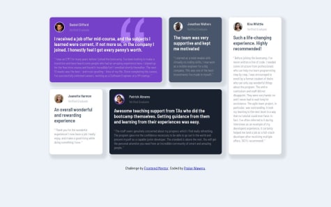
Responsive testimonials grid section
#sass/scssPSubmitted 6 months agoI'm open for reviews and suggestions.
Product preview card component using Sass
#sass/scssPSubmitted 10 months agoI'm open for reviews and suggestions.
Social Link Profile with Fluid Sizing
#sass/scssPSubmitted 11 months agoI'm open for reviews and suggestions.
Latest comments
- P@IncorrigibleSpirit
Hi Njeriwaweru,
Great job on your project! I had the chance to review your code, and I must say that everything is well-organized and implemented correctly. It's also responsive, which is fantastic!
Once again, excellent work. Keep it up!
Happy coding!
- P@Maanlicht91What are you most proud of, and what would you do differently next time?
This time I used few breakpoints to make more responsive.
P@IncorrigibleSpiritHi Aynur! How's it going?
You did a fantastic job! The solution you implemented is accurate and well-thought-out.
If possible, I’d like to suggest adding a bit of margin to the top and bottom of the main container to enhance the layout.
I also noticed you used the font-size: 62.5%; rule to simplify rem calculations. That’s a smart approach! Here’s a helpful tip: try the "px to rem & rpx & vw (cssrem)" extension for Visual Studio Code. With it, you can write measurements in px, and it will automatically convert them to rem for you.
Happy Coding!
Marked as helpful - P@wonderlust101P@IncorrigibleSpirit
Hi Sergei,
Great job! I had the chance to review your code, and I must say that you have implemented an accurate solution. One thing that caught my attention is your skills in using Sass and the way you structured the code. I noticed that you applied many resources to enhance and make your code reusable.
Happy coding!
- @HamzeKabiWhat are you most proud of, and what would you do differently next time?
-
I used sassy css this time, and applied it's robust features like mixin and nesting. It makes reducing redundancies much easier.
-
Started designing mobile first, and used media queries for larger screen sizes
-
So far I've been coding in plain notepad to make myself more familiarized with syntaxes, in my next project I'll be using vs code so as to reduce redundancies along writing (since it is harder without IDEs features) and increase speed.
I wanted margin-top of the image to become 0 for mobile screen and 5% for bigger screen sizes, even though I added margin-top of 5% in the following media query:
@media only screen and (min-width: 376px)
It would not get applied, and seemed to get overridden by margin-top of 0 outside media query, I had to use !important inevitably.
What specific areas of your project would you like help with?I mentioned my problem in
"What challenges did you encounter, and how did you overcome them?"
section, How can I overcome it without using !important.
P@IncorrigibleSpiritHi @HamzeKabi! How's it going?
Great job! I had the chance to review your code, and I must say that you have implemented a really clean and semantic HTML structure. Also, I noticed that you are using Sass to enhance the way you control the properties and values.
A bit of friendly constructive feedback:
- As you suspected, there is a rule that takes priority over the one in your media query. You can check the "specificity" of your rules using developer tools like Google Inspector.
Specificity: (0,1,1)
main .image-omelette {
    width: 40rem;
    max-width: 100vw;
    margin: 0 0 5% 0;
}
Specificity: (0,1,0)
@media only screen and (min-width: 376px) {
    .image-omelette {
        margin: 5%;
        border-radius: 1rem;
    }
Which options do you have to increase specificity on the media screen?
-
Adding more class selectors or an ID increases specificity. For example, using: main .image-omelette {....}
-
Nesting selectors more specifically also increases specificity. For instance: main .recipe_container .image-omelette {....}
I hope my comment can help you to resolve your question.
Happy Coding!
-
- @data-dev05P@IncorrigibleSpirit
Hi Alexis,
Firstly, congratulations on creating such an accurate copy of the social profile card! I'd like to invite you to explore an excellent resource that complements this challenge: Fluid Typography - Fluid Sizing.
I had the opportunity to utilize fluid sizing to adjust the padding in this challenge (you can also use it for typography, margins, gaps, and padding), and it proved to be a perfect solution without the need to create media queries.
Happy coding!
Marked as helpful - @Kikino02What are you most proud of, and what would you do differently next time?
.
What challenges did you encounter, and how did you overcome them?.
What specific areas of your project would you like help with?.
P@IncorrigibleSpiritHey there! You did a great job! Your copy of the card is extraordinary. It's accurate and pays attention to all the details, including sizes and shadows.
By the way, I noticed you used a media query to adjust the typography. It's a great resource! I would like you to check out these other alternatives. They are also really useful.
Useful resources
-
Modern Fluid Typography Using CSS Clamp - This article illustrates how to correctly calculate fluid typography.
-
Getting started with Variable fonts on the web - This video offers a meaningful overview concerning variable fonts and also shares useful resources and tips for working with typography in our projects.
Happy Coding!
Marked as helpful -