Skip to content
  • Unlock Pro
  • Log in with GitHub
Profile
OverviewSolutions
5
Comments
6

Ineke

@Ineke84The Netherlands130 points

I’m a mysterious individual who has yet to fill out my bio. One thing’s for certain: I love writing front-end code!

Latest solutions

  • Perfume product preview


    Ineke•130
    Submitted 5 months ago

    I don't have specific questions, any feedback on improvement is welcome.


    2 comments
  • Social links profile


    Ineke•130
    Submitted 8 months ago

    I don't have any specific questions, but any suggestions to improving my solution are very welcome.


    1 comment
  • Blogpost preview with clamp and flex-box

    #accessibility

    Ineke•130
    Submitted 11 months ago

    I would love to hear if there's another/better solution for the positioning of de blogpreview and the attribution at the bottom. I want the card vertically centered in the middle and the attribution at the bottom of the screen as longs as this would fit. If the blogpreview gets to big with a narrower screen only then the attribution should move further down so you would need to scroll down to see it just below the card. At the moment I fixed it with flexbox and height with clamp(). But I'm not really sure about it.

    Any other feedback is also very welcome.


    1 comment
  • Recipe page using css and html


    Ineke•130
    Submitted about 1 year ago
    • Use of semantic html
    • My solution of the header image

    Any other feedback is also appreciated.


    0 comments
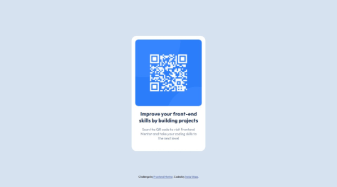
  • QR component using html and css


    Ineke•130
    Submitted over 2 years ago

    I completed this challenge quite some time before learningpaths, I already got some feedback.


    1 comment

Latest comments

  • Ineke•130
    @Ineke84
    Submitted 5 months ago
    What are you most proud of, and what would you do differently next time?

    Most proud of that I finished it quite quickly.

    What challenges did you encounter, and how did you overcome them?

    The most challenging was to think about how to make the preview responsive, decide when to make the grid change to two columns.

    What specific areas of your project would you like help with?

    I don't have specific questions, any feedback on improvement is welcome.

    Perfume product preview

    2
    Ineke•130
    @Ineke84
    Posted 5 months ago

    Hi Ademuyiwa,

    I used grid with (first) 1 column. On a screen size of minimal 40rem I switch to 2 columns (first column is the image, secons column contains all content).

    Hope this helps.

    Regards, Ineke

  • danielnero-bot•290
    @danielnero-bot
    Submitted 5 months ago

    Product Preview

    1
    Ineke•130
    @Ineke84
    Posted 5 months ago

    Hi, Could it be that something went wrong with uploading your solution to github? It doesn't really look like the screenshot you uploaded and the responsiveness seems broken.

    Kind regards, Ineke

    Marked as helpful
  • Opeoluwa•310
    @opeoluwa7
    Submitted 6 months ago

    recipe-main-website with pure html and css

    1
    Ineke•130
    @Ineke84
    Posted 6 months ago

    Hi Opeoluwa,

    Your solution looks visually really good and responsive. A few suggestions:

    • to improve accessability you could use semantic html (main, header, footer, section)
    • you use a <h3> just below the <h1> for 'Preparation time', those heading tags are for creating structure, so the level below <h1> is <h2> and if you add another sublevel, then you use <h3>. If you need a header to look different you could do this for example with a class.

    Hope you find this helpfull.

    Marked as helpful
  • Rido Septiawan•100
    @riddsep
    Submitted 8 months ago
    What are you most proud of, and what would you do differently next time?

    quite similar to the design provided

    What challenges did you encounter, and how did you overcome them?

    The biggest challenge was that the figma design didn't exist so I worked on it based on the existing design photos

    Social links profie

    2
    Ineke•130
    @Ineke84
    Posted 8 months ago

    Hi Rido,

    Your solution looks good and I did see some things I could improve in my own solution.

    One of the points in the challenge was to make sure visitors could go through the buttons with their keyboard. The focus that's on the buttons then (white outline) is different from your hover (lime green). Did you mean this to be different?

    At the moment there is quite some styling in the html index file itself. I myself find it easier to put this in a seperate css file.

    Hope this helps.

    Regards, Ineke

    Marked as helpful
  • Tatiana•60
    @Pavlinova
    Submitted 11 months ago
    What are you most proud of, and what would you do differently next time?

    Using global variables in :root

    What challenges did you encounter, and how did you overcome them?

    Adaptive layout, detailed study of the Figma

    What specific areas of your project would you like help with?

    For the first time I came across variable fonts, I hope that it turned out correctly

    Blog-preview-card solution

    #accessibility
    2
    Ineke•130
    @Ineke84
    Posted 10 months ago

    Hello Tatiana,

    Good job on finishing the challenge. It looks spot on in the comparison.

    I recently (during the same challenge) learned some things that might also be interesting for you:

    • Use semantic html (with tags like <main>, <article> etc) , that way you can make a webpage more informative for browsers and search engines.

    • I also missed it at first, but the hover not only changes the color of h1, but also creates a bigger dropshadow.

    • You could also use global variables for the font-sizes. I created 3 variables with font-sizes. With 'clamp' as I used it you have a linear scale from small to bigger font-sizes. But if you use media-queries you also only have to define what the size is for each media query and you don't have to set the font-size for element seperately again (you wouldn't need h1 and .description in your media query).

      --font-size-heading: clamp(1.25rem, 5vw - 1rem, 1.5rem);
      --font-size-medium: clamp(0.875rem, 5vw - 1rem, 1rem);
      --font-size-small: clamp(0.75rem, 5vw - 1rem, 0.875rem);
      

    Hope you find it usefull!

    Ineke

    Marked as helpful
  • P
    Dom Leverment•120
    @DomLeverment
    Submitted about 1 year ago
    What are you most proud of, and what would you do differently next time?

    Proud to have finished the project, still a lot of learning to do.

    What challenges did you encounter, and how did you overcome them?

    I found it difficult to centre the container until i found out to specify the min-height 100vh in the body.

    What specific areas of your project would you like help with?

    CSS is a big challenge for me. So any tips and advice for cleaner code would be amazing.

    QR code challenge

    1
    Ineke•130
    @Ineke84
    Posted about 1 year ago

    Hi Dom, Your solution looks really good (I didn't use flexbox myself yet, but it's so logical now I see your solution).

    A few things you could take another look at are:

    • the box of <p> falls outside .main-qr (100% width + margin)
    • you could avoid a fixed height by using gap and padding on your .main-qr. That way the element would also look alright if the text becomes longer.

    I hope this helps :)

Frontend Mentor logo

Stay up to datewith new challenges, featured solutions, selected articles, and our latest news

Frontend Mentor

  • Unlock Pro
  • Contact us
  • FAQs
  • Become a partner

Explore

  • Learning paths
  • Challenges
  • Solutions
  • Articles

Community

  • Discord
  • Guidelines

For companies

  • Hire developers
  • Train developers
© Frontend Mentor 2019 - 2025
  • Terms
  • Cookie Policy
  • Privacy Policy
  • License

Oops! 😬

You need to be logged in before you can do that.

Log in with GitHub

Oops! 😬

You need to be logged in before you can do that.

Log in with GitHub

Oops! 😬

You need to be logged in before you can do that.

Log in with GitHub

Oops! 😬

You need to be logged in before you can do that.

Log in with GitHub

Oops! 😬

You need to be logged in before you can do that.

Log in with GitHub

Oops! 😬

You need to be logged in before you can do that.

Log in with GitHub

Oops! 😬

You need to be logged in before you can do that.

Log in with GitHub

Oops! 😬

You need to be logged in before you can do that.

Log in with GitHub

Oops! 😬

You need to be logged in before you can do that.

Log in with GitHub

Oops! 😬

You need to be logged in before you can do that.

Log in with GitHub

Oops! 😬

You need to be logged in before you can do that.

Log in with GitHub

Oops! 😬

You need to be logged in before you can do that.

Log in with GitHub

Oops! 😬

You need to be logged in before you can do that.

Log in with GitHub

Oops! 😬

You need to be logged in before you can do that.

Log in with GitHub

Oops! 😬

You need to be logged in before you can do that.

Log in with GitHub

Oops! 😬

You need to be logged in before you can do that.

Log in with GitHub

Oops! 😬

You need to be logged in before you can do that.

Log in with GitHub

Oops! 😬

You need to be logged in before you can do that.

Log in with GitHub

Oops! 😬

You need to be logged in before you can do that.

Log in with GitHub

Oops! 😬

You need to be logged in before you can do that.

Log in with GitHub

Oops! 😬

You need to be logged in before you can do that.

Log in with GitHub

Oops! 😬

You need to be logged in before you can do that.

Log in with GitHub

Oops! 😬

You need to be logged in before you can do that.

Log in with GitHub

Oops! 😬

You need to be logged in before you can do that.

Log in with GitHub

Oops! 😬

You need to be logged in before you can do that.

Log in with GitHub

Oops! 😬

You need to be logged in before you can do that.

Log in with GitHub

Oops! 😬

You need to be logged in before you can do that.

Log in with GitHub

Oops! 😬

You need to be logged in before you can do that.

Log in with GitHub

Oops! 😬

You need to be logged in before you can do that.

Log in with GitHub