
@M-AminAlizadeh

Ishmael
@IshmaelsealeyAll comments
- @Ishmaelsealey
Hi @M-AminAlizadeh
Well done on completing this challenge! It looks great!
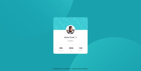
I have a suggestion for you. I noticed that you did not use any headings in the entire document. I think you could place the name of the person in an
<h1>.Using headers provides structure to the page for screen readers to use when navigating a site. It is primarily for accessibility. The name can still be styled as it is, just in an
<h1>.Next, you can also use CSS grid to make the three "statistic" sections at the bottom. It is achieved by using the following code on the
profile-card__social-infoclassdisplay: grid; grid-template-columns: 1fr 1fr 1fr; grid-gap: 20px;The
1frmeans a fraction of the available space and the grid gap is similar to a margin between each grid item!That being said, utilizing flexbox is a great way of achieving the end result, I just wanted to share another way it could be done! ✌️
Hope you found my suggestions helpful!
Happy Coding ✈️
Marked as helpful - @patiltukaram@Ishmaelsealey
Hi There!
Well done on completing your first challenge! 💯
To answer your question about centering the content: Yes, there are many ways of centering your content. Although you are already doing part of what is necessary to center your content!
Your
bodyis a flexbox and has thejustify-content: center;andalign-items: center;properties, however your body does not span the width and height of the user's screen. Use themin-width: 100vw;andmin-height: 100vh;on your body tag to make it appear centered.Media Queries are used to change the styling of specific elements on a webpage when the size of the screen changes. Styles can be nested in a media query, meaning that you do not need to write a new media query before each element you style.
@media screen and (min-width: 700px) {
body { ...styles... }
h1 { ...styles... }
}
Designing a mobile first website means that all your styles will be made for a mobile device initially Then you will use media queries so the styles change when the screen gets bigger than a specified size.
Finally, for the purpose of accessibility, your websites should contain one
<h1>tag. I saw you used a<h3>for your header.I hope my comment helps you! Happy Coding! 🪁
- @imd94@Ishmaelsealey
Hi Ivan!
Well done on completing the challenge! It resembles the design intimately.
To answer your question, yes it does. When using google chrome, if I increase my zoom value, eventually a website will appear in it's mobile version as the browser thinks that the screen is less pixels wide. I found this stack overflow response that also explains it.
I hope my response helps you!
Happy coding
Marked as helpful - @Tatiana190389@Ishmaelsealey
Hey Tatiana!
Great job on completing the challenge!
Below I have suggestions that I think you will find helpful.
- For accessibility purposes, your webpage could contain one
<h1>tag. - The button does nothing when I hover over it, however it changes color when I click on it. use the pseudo class
:hoveron an object to add styles when the cursor hovers over it. More information about pseudo classes here! - The attribution class does not need margin to center the text. Use the
text-align: center;style to do this. - Your html uses many
<div>elements and while it does get the job done, some of them are not necessary. In the future I suggest you take time before beginning to style your webpage, to put everything in a suitable html element to form a base to build your webpage on. - Your website is not mobile responsive. Using
@media screen (max-width: 1000px) { ...mobile styles here... }will help you do this. For instance, you used display flex on the card class, to make a mobile version, you can use theflex-direction: column;style to change the layout. W3 schools has a lovely article that discusses media queries. Check them out here!
I do hope you find my suggestions helpful! Happy coding!
Marked as helpful - For accessibility purposes, your webpage could contain one
- @GaganpreetKaurGill@Ishmaelsealey
Hey There!
Well done on completing the challenge using the provided
.jsonfile! (I struggled to implement it 😅)I have some suggestions you may take into consideration.
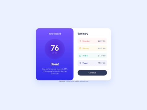
- The
index.htmlfile contains two<h1>tags. The h1 is the most important heading on any given page, and as such, there should only be one of them. Including only one h1 also improves the accessibility of your website for screen readers! - The circle containing the average result is correctly using a gradient, however the gradient should be
linear-gradient( );as opposed toradial-gradient( );. - The button also uses a gradient background in the hover state. The gradient is the same as the one used for the background of the
.left-section
I hope you find my suggestions helpful! Happy coding!!
Marked as helpful - The
- @Only-Czesio@Ishmaelsealey
Hi There!
Well done on completing the challenge using html and css only! It only gets easier with practice.
I have some suggestions that I hope you consider and may find useful.
You did not add the font to your css file so it shows up as the default text of the browser, Times New Roman. Go to this google fonts link to get the font for this project. Outfit. Use
@import url('https://fonts.googleapis.com/css2?family=Lexend+Deca&display=swap');at the start of your css file and includefont-family: Outfit, sans-serif;in the styling of your body.You placed everything in a div with the class of background and then styled the class. Alternatively, you can add the background color to the body element.
For purposes of accessibility, your
<h2>tag should be an<h1>tag. You can style the h1 tag so the font size is similar to that of the h2 tag.I hope you find my suggestions helpful
Happy Coding!
Marked as helpful - @comradeintense@Ishmaelsealey
Hi There
This is a great solution. Near completely identical to the original design!
The one thing that is deviant from the design is the line height of the heading and paragraph. I suggest you make the line height smaller.
Additionally, for the purpose of accessibility, you should switch the heading from an
<h2>tag to an<h1>tag.I hope you find my suggestion helpful
Marked as helpful - @wea2ne@Ishmaelsealey
Hi!
Your solution is great already, however there are three things you could do to make it better.
- Use the line spacing style option with an adequate value in px (I used 25px) to add a bit more space between lines in the paragraph.
p { line-spacing: 25px; }- The hsl value -> hsl(0, 0%, 95%) was provided for use on the background. It will make the screenshot a bit closer to the original design.
- The buttons do a weird wrapping thing when I shrink my window size. To prevent this, you can add
text-wrap: nowrap;to the button styles.
Keep at it!!
Marked as helpful - @therealmaduanusi@Ishmaelsealey
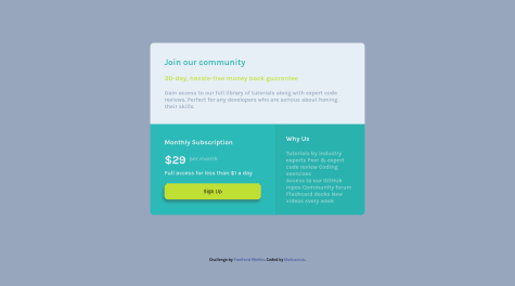
<div class="item3">
        <h3>Why Us</h3>
        <p class="why-us">
          Tutorials by industry experts
          Peer & expert code review
          Coding exercises
          <p>Access to our GitHub repos
          Community forum
          Flashcard decks
          New videos every week</p>
        </p>
      </div>
You could do this section better by only using 1 big paragraph tag, (excluding the heading tag) with line break tags
<br/>where you wanted the line to end<div class="item3"> <h3>Why Us</h3> <p class="why-us"> Tutorials by industry experts<br/> Peer & expert code review<br/> Coding exercises<br/> Access to our GitHub repos<br/> Community forum<br/> Flashcard decks<br/> New videos every week<br/> </p> </div>My second point is that the Sign Up button doesn't do anything when I hover over it. If you don't know how to do that, this should help you get started.
There are other minor things that stray from the original design but I don't see them as major problems.
Good Job!