


Lul• 20
@lulam
Submitted
Any and all feedback is welcomed
Looking to hire developers?
@JacobMarshall0
@lulam
Submitted
Any and all feedback is welcomed
@JacobMarshall0
Posted
Good job it matches the design well, and has great accessibility!
To improve it more you may want to look into adding a hover effect for the button, you can do this with:
button:hover {
* your css styling goes here*
}
This helps improve the usability of your components, as it feels more responsive to the user.
@munyite001
Submitted
Feedback is always appreciated :)
@JacobMarshall0
Posted
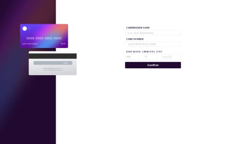
You may want to explore the element.eventListener("input", ...) more, as this allows you to update the card details on the display whilst the user enters their details.
I see you have used it to update the formatting of the cardnumber input, but this could use a little work as it breaks when users remove characters and enter them again. I think this may be down to your if statement if(i % 4 == 0 && i < 16) and how you handle i, as when users use backspaces the eventListener i increments, causing the if statement to incorrectly add spaces, and eventually the entry bypasses the if statement. You could also include maxlength in the <input> to limit the number of characters a user may enter.
Other than that issue, you've followed the design well and your site looks good on mobile and desktop. Good job.
Marked as helpful
@TylerDurden230
Submitted
I know i have to improve this solution, but i'm still pretty satisfied with the result, considering time i needed to do it. CSS is pretty confused. Found some bug. I used Vanilla JS but I want to retry this challenge using React, cause i'm pretty sure there is easier and cleaner way to handle states.
@JacobMarshall0
Posted
Looks good to me. What bug did you find?
@nachtwurst
Submitted
I'm unsure about my use of @media. I basically copy and pasted all of my CSS inside the media query and altered it there. I'm not clear on what the minimum is that I would need to put inside the media query for it to be effective.
@JacobMarshall0
Posted
Hey nachtwurst, good job on this project, your design looks great on both mobile and desktop.
Typically in an @media query you only include the classes and attributes you want to change. So for instance if you wanted to change the box-shadow for the container, in your media query you would have .main_container with just a new value for the box-shadow design, instead of everything again.
This is a useful resource for learning more about them, and applying them to more advanced projects.
Keep up the good work!
Marked as helpful
@awwsman
Submitted
1.this is by far the toughest challenge i've done 2. I have issues with making the input tag borders gradient in color and also round in edges when focused on.
@JacobMarshall0
Posted
Hi Usman, good work. You may have to use border-radius on the input:focus css identifier too to achieve the rounded edges when focused on.
You can also use EventListeners on form inputs too, allowing you to show errors as the user enters data, instead of telling them when they click the Confirm button.
cnum.addEventListener("input", () => {
    *check if the form value is only digits here and use if statements to update errors*
}
Marked as helpful
@Chaffexd
Submitted
Feedback welcome :)
@JacobMarshall0
Posted
Hi Shane, I like your solution. It looks good on both desktop and mobile. I like the use of type="number" for the month and year, but feel type="text" would be more appropriate for the CVC, as I doubt a user would increment up to a 3 digit number.
The form validation could use a little work, for example I can place spaces in the card number input, allowing me to enter a string with less than 16 digits which is of course the incorrect format, this can be fixed in the JS by stopping the user from entering a space character, or altering the card number maxlength, or using an error message to say that it should be digits only and not spaces.
It is also possible to submit the card details when the information is an incorrect format. For example, alphabetical characters can be included in the cardnumber and the submit button will still work. To fix this in your solution, I would expand your validate() function to include regex for each form input, and test the values against this. This could be extended to include an error message too, if the user tries to click the submit button without the correct information you could show that some details are incorrect, or instead grey out the button showing that it is disabled. Greying out the button could be performed with an event listener for hovering over the button calling the validate function, before the user clicks it.
The CVC can also be accepted as a 1 or 2 digit number which is incorrect, though this is an easy fix requiring the user to enter 3 or 4 digits which can be done with regex or with an if statement focusing on the length.
Numbers can also be entered as part of the cardholder name, but this is not a big problem. Another small problem is that the user can enter an expired credit card, as the year can be a value for a year which has already passed, for example 21.
Regardless of these issues, the solution's design is great. Good luck with your next challenge.
@carlfremault
Submitted
Hi,
I have two issues with my current submission:
Any pointers would be much appreciated !
Many thanks in advance & best regards, Carl
@JacobMarshall0
Posted
Hi, your code is very good, well laid out and good comments. The button icon can be included in an <img> tag inside the <button> tag, rather than used as a background image.
Your solution has good accessibility too, with semantic elements and image alts.
I believe the issue with the mobile size is owing to the min-height or the background-image, try playing around with these.
Marked as helpful
@Hashirrazzaq256
Submitted
@JacobMarshall0
Posted
If you want the whole background to be the design's background colour, you can style the body tag.
body { background-color: hsl(212, 45%, 89%); }
You can also use Flexbox to center the qr card component, instead of using margins.
You may also want to check out media rules, to help with mobile views. Here is a useful resource.
Good luck with your future challenges.
@Canice10
Submitted
Had problems with the padding and margin issue; the qr code image kept on reducing in size as I used the padding styling instead of the margin. Then again, using margin made the #main div to move along :(
@JacobMarshall0
Posted
Hi Canice, good job!
I feel it matches the design quite well. If you would like the card to remain in the middle at all times, maybe try removing the width:1650px;.
Regarding the image size changing, try placing it in it's own div and declaring height and width on this div, and then use .class > img to isolate the image inside the div, and using max-width: 100%; and max-height: 100%;. This should stop the image from resizing on it's own.
@ravindra135
Submitted
@JacobMarshall0
Posted
Hi Ravindra, great job! You've done well to match the design and it has good accessibility. My only issue with the implementation is the responsiveness when changing to mobile. On smaller mobile screen sizes the design remains large and text falls off the card, but I understand you aimed to compensate for the maximum screen width (from the comment above the @media). My solution to this would be to change the font sizing greatly in the @media.
Also, the implementation only uses the perfume desktop image, rather than changing to the mobile image for smaller screens. This is okay as it still looks good, but it can be achieved by using unique ids or classes with "display: hidden; ", and altering the style in the @media.
Keep up the good work!
Marked as helpful