Skip to content
Explore
For companies
Unlock
Pro
Log in
with GitHub
Profile
Overview
Solutions
18
Comments
10
Lakshan
@M-lakshan
Follow
All solutions
simple cloud storage consumption preview webpage using HTML & CSS
Lakshan
•
305
Submitted over 2 years ago
0 comments
1 like
a simple rating component webpage using HTML, CSS & JS
Lakshan
•
305
Submitted over 2 years ago
0 comments
3 likes
a simple coming soon page for an apparel company website
Lakshan
•
305
Submitted over 2 years ago
0 comments
2 likes
An Intro Component with a Sign-Up form using HTML, CSS & JS
Lakshan
•
305
Submitted over 2 years ago
0 comments
2 likes
Responsive Article Preview Component using HTML, CSS & JS
Lakshan
•
305
Submitted over 2 years ago
0 comments
2 likes
simple NFT Preview Card Component using only HTML & CSS
Lakshan
•
305
Submitted over 2 years ago
0 comments
5 likes
simple Product Preview Card Component using HTML & CSS
Lakshan
•
305
Submitted over 2 years ago
1 comment
4 likes
Simple Order-Summary Component for a music website using HTML & CSS
Lakshan
•
305
Submitted over 2 years ago
2 comments
5 likes
Simple QR code preview using HTML & CSS
Lakshan
•
305
Submitted over 2 years ago
2 comments
5 likes
Ping Single Column Coming Soon Page
Lakshan
•
305
Submitted almost 3 years ago
0 comments
1 like
a simple stats preview card with HTML & CSS
Lakshan
•
305
Submitted almost 4 years ago
3 comments
4 likes
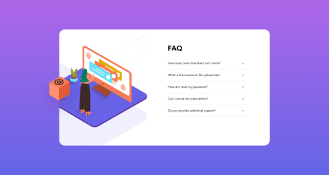
web page of FAQs form of a responsive dropdown using HTML, CSS & JS
Lakshan
•
305
Submitted almost 4 years ago
0 comments
1 like
a simple landing page of 3 column preview with HTML & CSS
Lakshan
•
305
Submitted about 4 years ago
0 comments
1 like
a simple responsive social proof website page using HTML & CSS
Lakshan
•
305
Submitted about 4 years ago
0 comments
1 like
Responsive four card feature section grid with HTML & CSS
Lakshan
•
305
Submitted about 4 years ago
0 comments
1 like
a simple price grid component with HTML & CSS grid
Lakshan
•
305
Submitted about 4 years ago
1 comment
3 likes
a responsive simple profile component with HTML & CSS layout
Lakshan
•
305
Submitted about 4 years ago
1 comment
1 like
Responsive Landing Web Page with HTML + CSS
Lakshan
•
305
Submitted about 4 years ago
1 comment
1 like
Oops! 😬
You need to be logged in before you can do that.
Log in
with GitHub
Oops! 😬
You need to be logged in before you can do that.
Log in
with GitHub
Oops! 😬
You need to be logged in before you can do that.
Log in
with GitHub
Oops! 😬
You need to be logged in before you can do that.
Log in
with GitHub
Oops! 😬
You need to be logged in before you can do that.
Log in
with GitHub
Oops! 😬
You need to be logged in before you can do that.
Log in
with GitHub
Oops! 😬
You need to be logged in before you can do that.
Log in
with GitHub
Oops! 😬
You need to be logged in before you can do that.
Log in
with GitHub
Oops! 😬
You need to be logged in before you can do that.
Log in
with GitHub
Oops! 😬
You need to be logged in before you can do that.
Log in
with GitHub
Oops! 😬
You need to be logged in before you can do that.
Log in
with GitHub
Oops! 😬
You need to be logged in before you can do that.
Log in
with GitHub
Oops! 😬
You need to be logged in before you can do that.
Log in
with GitHub
Oops! 😬
You need to be logged in before you can do that.
Log in
with GitHub
Oops! 😬
You need to be logged in before you can do that.
Log in
with GitHub
Oops! 😬
You need to be logged in before you can do that.
Log in
with GitHub
Oops! 😬
You need to be logged in before you can do that.
Log in
with GitHub
Oops! 😬
You need to be logged in before you can do that.
Log in
with GitHub
Oops! 😬
You need to be logged in before you can do that.
Log in
with GitHub
Oops! 😬
You need to be logged in before you can do that.
Log in
with GitHub
Oops! 😬
You need to be logged in before you can do that.
Log in
with GitHub
Oops! 😬
You need to be logged in before you can do that.
Log in
with GitHub
Oops! 😬
You need to be logged in before you can do that.
Log in
with GitHub
Oops! 😬
You need to be logged in before you can do that.
Log in
with GitHub
Oops! 😬
You need to be logged in before you can do that.
Log in
with GitHub
Oops! 😬
You need to be logged in before you can do that.
Log in
with GitHub
Oops! 😬
You need to be logged in before you can do that.
Log in
with GitHub
Oops! 😬
You need to be logged in before you can do that.
Log in
with GitHub
Oops! 😬
You need to be logged in before you can do that.
Log in
with GitHub
Oops! 😬
You need to be logged in before you can do that.
Log in
with GitHub
Oops! 😬
You need to be logged in before you can do that.
Log in
with GitHub
Oops! 😬
You need to be logged in before you can do that.
Log in
with GitHub
Oops! 😬
You need to be logged in before you can do that.
Log in
with GitHub
Oops! 😬
You need to be logged in before you can do that.
Log in
with GitHub
Oops! 😬
You need to be logged in before you can do that.
Log in
with GitHub
Oops! 😬
You need to be logged in before you can do that.
Log in
with GitHub
Oops! 😬
You need to be logged in before you can do that.
Log in
with GitHub
