


Édson Fischborn• 60
@edsonfischborn
Submitted
Looking to hire developers?
@Moyo75
@edsonfischborn
Submitted
@Moyo75
Posted
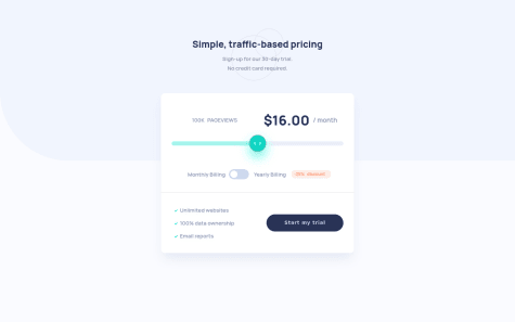
Your pageviews count is not hooked up with your slider and the toggle button too is not hooked up with the pricing, as described in the readme file. This is a JS issue.
You might also want to set a max-width for the component. Your app should be OK if you can fix these issues.
@VICTOR-CHUKWU
Submitted
any way to help me improve will be welcomed, please
@Moyo75
Posted
On mobile:
The subtexts in the header should be displayed vertically, not inline. You might want to use two p tags and display them accordingly, based on desktop or mobile.
The elements in your component are sandwiched on many mobile screen sizes and and width is comparatively smaller than in the design. I think this is due to width: 200px you gave to <div class="hero_main background"></div>.
General:
Based on the values provided in the project requirements, you slider is not properly hooked up with pageviews count and the pricing amount as described in the readme file. This should be from your JS.
Your toggle slider seems out of place. You might want to adjust the width and height of <label for="checkbox" class="label"></label> a bit.
The slider thumb is probably not styled at all. You can catch it with .slider::-webkit-slider-thumb {} since you gave it a class of slider and style it accordingly.
<span class="discount discount-display">-25%</span> is not properly styled, you should refer to the design; the disappears on clicking the toggle button, I see not grounds for this in the project requirements. I think this is the reason why: checkbox.addEventListener('change', function(){ discount.classList.toggle('discount-display'); })
You might want to include a reference to yourself as the developer and also to FEM.
I believe your app can look and behave more as described in the project requirements when you fix this issues.
@NALZA
Submitted
@Moyo75
Posted
At screen width 1024px, there's a size collapse of the component. I think max-width might help here.
I think the component is also proportionally wider than the design.
You might want to include a reference to yourself as the developer and also to FEM.
Just these few and I think you should be close to the design...
@RajCutinha
Submitted
@Moyo75
Posted
On mobile:
The subtexts in the header should be displayed vertically, not inline. You used one paragraph element, but you might want to make it two and give their appropriate displays. Since you used flexbox, you could try flex-direction: column.
The elements and texts in <div class="details-type"></div> should be in one line. This is party due to the padding in <div class="card-body"></div> and also the font sizes of the elements in <div class="details-type"></div>.
General:
You can get your app to look and behave more as described in the project requirements when you fix this issues. Lemme know what you think!
@Wiss69
Submitted
I'm looking for feedback on the JS logic and what I could improve.
Thanks,
@Moyo75
Posted
On mobile:
<div class="card__toogle-button"></div> should be displayed in one line. This may be partly due to the nesting in its last p tag and also to the padding you gave to <div class=''card-up"></div>. So you might want to fix/adjust those.General:
The elements in <div class="card__toogle-button"></div> should be more aligned to the right. They seem somewhat centered.
The paragraph texts in the header are not visible and the header is too close to the component. I think it's due to the transform property in <section class="card"></section>, so removing that might help.
You might want to include a reference to yourself as the developer and also to FEM.
Hopefully this helps to get your app look and behave more as described in the project requirements.
@ph4ntom5
Submitted
Another FEM project for me had some fun with it but also got challenged on the way, f.ex. implementing the sliders and their interactivity.
@Moyo75
Posted
On mobile:
Your toggle button <label class="switch"></label> seems shrunken and thus the slider <span class="slider-round">::before</span> seems to slide out of place. You might want adjust the max-width and padding you gave to <div class="box"></div> a bit.
The texts and element flanking the toggle button should be in one line and seems distorted respectively. This also goes back to the max-width and padding you gave to <div class="box"></div> a bit.
General:
The slider background color is missing its slight blue complementary color and thus not flowing when the slider is moved. And you're also missing the shadow surrounding the component.
You might want to include a reference to yourself as the developer and also to FEM.
I hope this helps you get your app to look and behave more as described in the project requirements when you fix this issues.
@luispv02
Submitted
The main problems were when making the toggle button, which I had no idea how to do it. The input change was also a problem when changing the color, the size of the thumb, making it bigger among other things, which I solved it by looking at tutorials on yotube and doing research.
@Moyo75
Posted
On mobile:
<div class="boton"></div> should be in one line and 25% discount collapses on some mobile screen sizes like 360px. These elements are also not properly space own on larger screen sizes like 700px. I think part of the problem here is the nesting in <p class="igual dos"></p> and generally the way you lay out <div class="boton"></div> with margin-top: 150px. I suggest putting every element in the same level in <div class="boton"></div> and following the flow of elements in the component design here...General:
At screen size 1024px, the second p element in <div class="header-footer"></div> and <button>Start my trial</button> seem to overlap. I think max-width could help here
Also, the width collapse of <div class="header-principal"></div> at screen size 1024px should be fixed. max-width might also come in handy here.
Your slider is not hooked up with the pageviews number and the pricing, as described in the readme file. This feature is missing in your Javascript. The same also applies to your toggle button.
You might want to add a reference to yourself as the developer and also to FEM as the source of the challenge.
Correcting these deficits should make your app look and function more as described in the project requirements. Lemme know what you think!
@SankThomas
Submitted
@Moyo75
Posted
On mobile:
You might want to reduce the margin values on <div class="container"></div> to make the component look more like the design.
The toggle button seems shrunked, making the toggler appear out of place. Also the elements and texts flanking the buttons should on one line. I think this goes back to the padding on <div class="container"></div>. You might want to reduce it to create more room for the elements.
General:
You're missing the light blue background on the bottom part of the design. I think the color code for this is provided in the style guides.
Your slider is missing its two complementary colors, the arrows on the slider thumb and it doesn't do anything on change. I believe the color codes and necessary assets are in the starter files; on changing the slider, the pageviews count should increase and also the amount as described in the readme file.
The toggle button is missing its background color state changes. The amount should be discounted by 75% when the button is clicked. Multiplying the amount by 0.75 gets the job done.
I hope this helps make your app function and look as described in the style guides and requirements of this project.
@AndreanaPerla
Submitted
I have more problems in doing the toggle button (never made one before!) and the slider than in writing the code! About the code, even if it works (kind of...) it is pretty repetitive so every suggestion to improve it will be welcome ;)
@Moyo75
Posted
On moblie:
The two subtexts in the header are displayed inline, unlike in the design. Your <div class="price-box"></div> takes up the total width of the screen size. A little bit of margin on both sides might help here.
And contents of your <div class="bottom"></div> should be vertically displayed, not horizontally. Depending on your layout too, but since you used flexbox, flex-direction: column with some media query (or not) might help. Also, discount should not be visible; you can easily set display: none.
General:
The circles in the background seem too shoved to the top; since you gave it an absolute position, you could try top: -12px and adjust the value till it looks like what you want. /month should be horizontally centered by the amount text; you could give it a class and hoist it up a bit with a negative margin-top. And the slider should align with the pageviews and amount text, just like in the design; you could increase the width but I think a percentage width relative to the size of <div class="price-box"></div> might help significantly but you'll probably need something extra with a media query.
The toggle button's state changes to false whenever the slider is change. I see not basis for this as far as the guides are concerned; I thinks toggle.checked = false; is responsible in the last line of your slider event listener.
The content of your <div class="billing"></div> isn't spaced out as in the design; I think it's because of the nesting in the last p tag, I suggest putting all four on the same level and trying justify-content: space-between. And the horizontal line should be as wide side as <div class="price-box"></div>; I think it's due to the padding of <div class="price-box"></div>; I don't see a way out without removing its padding, but that messes up everything. You might want to give its individual elements margins/paddings to look like the design.
You might also want to add the reference to yourself as the developer (it's your effort!) and also to FEM.
I hope this helps make your app look and behave more like the design and style guide requirements. Lemme know what you think!
@sneha-khambal
Submitted
@Moyo75
Posted
On mobile:
The main content of your app (what you put in aside tags) takes up the total width of the view, unlike in the design. The monthly amount text seems out of place on many mobile screen sizes.
The toggle button seems shrunken, thus the toggle slides out of place and the background color states aren't changing. Also the text flanking the button should be on one line and discount shouldn't be visible on mobile.
General:
The circles in the header background are somewhat truncated. The pageviews text lacks spacing. The slider's background colors are missing and don't flow too on change.
On toggling the button, the pricing multiplies increasingly out of logic. I believe this is the line in your JS behind that: price.textContent = ${(priceInt -(priceInt * .25)) *12};
And the pink box surrounding the discount text is more curved at the sides.
The shadow surrounding the component seems a little darker and you missed the reference to yourself as the developer and also to FEM.
I hope these help you in making your project look and behave more as illustrated in the designs and style guides. Let me know what you think!
Marked as helpful
@Rohan235
Submitted
@Moyo75
Posted
Good attempt. But it can be better.
The toggle button seems displaced on the mobile view, also the texts flanking it should be on one line. Also the background of the discount percentage is a little blown up. The background color change in your slider seems to lag and doesn't seem to flow at all in some mobile screen sizes, though not when resizing manually.
The arrows on the slider thumb are missing. The circles and the light blue lay in the background too. I believe these assets/guides are provided in the starter files of the project and if you can fix these issues, you'll be close as possible to the design on both screens.