


Alain• 205
@Alain-sys
Submitted
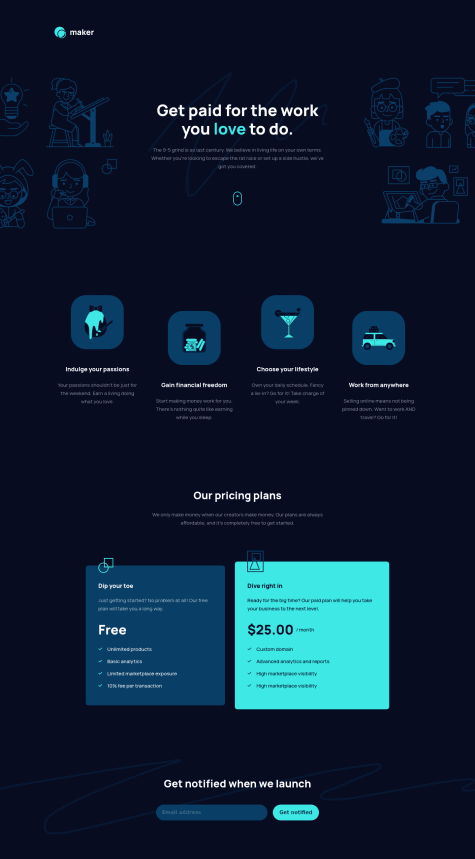
Hello everybody,
I'm glad to present my first project solution on Frontend Mentor.
Any feedback is welcome and very appreciated !
Looking to hire developers?
@NebiyouErsabo
@Alain-sys
Submitted
Hello everybody,
I'm glad to present my first project solution on Frontend Mentor.
Any feedback is welcome and very appreciated !
@NebiyouErsabo
Posted
Hello Alain-Sys,
I think you have done a great job on this challenge. Your page is nicely responsive as well 👍.
I was having some problems when inspecting your page for responsiveness on chrome (the .img-hero-right and the .footer-squiggle svgs were extending way far to the right, making your page align to the left), but it was okay when I opened your page on safari. Not sure if it is my problem or that you haven't used some cross-browser css properties.
But overall you have done an awesome job on your first project! 🙌
Marked as helpful
@vanzasetia
Submitted
Hello Everyone! 👋
I was doing this challenge on my Android phone. Hopefully, it looks good on your deskop. 😅
Questions:
Of course, any feedback is appreciated!
That's it! Happy coding everyone!
@NebiyouErsabo
Posted
Hey Vanza 👋,
I looked at your solution on my PC and it looks great and nicely responsive! I've a few suggestions design wise though.
align-items:baseline; on the features__list container.padding:1.5rem 1.7rem; Also, perhaps make the testimonial__text margin for bottom only (instead of top & bottom like it is right now).Other parts look awesome as far as I can see, well done! I also worked on the same challenge recently, you can def take a look at it and let me know what you think. https://www.frontendmentor.io/solutions/fylo-dark-theme-solution-PYxlNFkZR
Marked as helpful
@Lester-Fong
Submitted
I made the desktop design in just one day, but it took me 2 days to make it responsive. Is there any tips for me to apply to think responsively? I find it hard to make my ddesktop website compatible to phone or other devices.
@NebiyouErsabo
Posted
Hey bro,
I gotta say you've done a great job for desktop view. However, everything looks a bit broken below 1200ish px (mobiles and tablet views). There is some more work that needs to be done on making it responsive.
Again great job on yours!👍
Btw, I also just finished the same challenge few hrs ago. you can def check it out and help me with my issues if possible (https://www.frontendmentor.io/solutions/fylo-dark-theme-solution-htmlcssflexboxgrids-c1HhQJkG2).
@Toycobro
Submitted
Im pretty new at this and would love some feedback.
@NebiyouErsabo
Posted
looks great (funny with them links on the buttons too)! The hover effects are missing tho
Marked as helpful
@Atifaqueeb
Submitted
@NebiyouErsabo
Posted
Hey there, Your solution looks good. You just have to import the the font provided in the style guides.
@Abdulrahman-23
Submitted
I solved it without using flexbox or grid I know that's not the best way to solve it but I think it works fine.
@NebiyouErsabo
Posted
I mean it looks okay for a desktop view. But it is not responsive tho.The content and the images are overflowing. I suggest you use flexboxes and grids next time.
Marked as helpful
@wiridix
Submitted
I have a question with the background image, what measurements would be correct to adapt to any device?
@NebiyouErsabo
Posted
Great job! What you did works just fine for the background SVGs 👍
@Philip-Droubi
Submitted
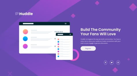
Hey everyone 🙋♂️, this is my solution for Huddle-landing-page challenge,
please Take a look at my solution and tell me your feedback. thanks :)
@NebiyouErsabo
Posted
Hey there, It looks really good. My one suggestion would be to set a max-width for the image and the contents, because the images gets unnecessarily big and the content gets highly stretched till the screen reaches the 767px breaking point.
@Achorn
Submitted
The challenge mentioned using js but it didn't seem like this challenge needed any js.
@NebiyouErsabo
Posted
Looks great! Yes, this challenge doesnt need js. My only suggestion would be to add a margin-top on the attribution to create some space. Also you're meant to fill in your name in the coded by section 👍
@ToNisamBioJa
Submitted
Hii!
I would really appreciate if somebody looked at this one for me!
I used the BEM naming convention and I paid attention to make the code readable and clean. I also ordered declarations by type(position, display, colors, font, miscellaneous…).
This one was trickier for me than I expected. The background image was a problem for me but I managed to complete it on my third try.
I tried hard to get it to the original design but I still didnt manage to place the social links where I wanted. But I think its still pretty close to the original one.
I went with a mobile first approach as always and on mobile I think I got it very close to the original.
On a previous challenge somebody pointed out that I dont use box shadow and hover effects enough so I added some on this one(just something simple). I need to learn animations more and I apply them to these designs more.
On the design comparison it shows it a little different than it is when you preview the site :/.
Sorry for the long text on such a simple challenge.
All feedback is appreciated as always. Thanks in advance!!!
@NebiyouErsabo
Posted
Great job here! Just add cursor:pointer on the social icons and you're good to go.
I think you nailed this one! 👍
Marked as helpful
@iamseb1
Submitted
My first ever lines of independent code!!!
After learning basic HTML/CSS, I've decided to try my new-learned skills with real life challenge. To do that I've used https://www.frontendmentor.io which turns out it has a large number of real-life scenarios.
The card even though seemed to be a fairly easy challenge, soon created quite a lot of problems. Things that I've learned from my previous endeavours went out of the window as soon as I sat down in front of my code editor. I found it really hard to code everything to spec. Most of the things were breaking as soon as I started a new line of code and I had to go back multiple times and google for solutions.
Even tough I didn't manage to completely finish the challenge I'm quite happy with how it turned out. I have definitely learned a lot and will be definitely trying out new challenges soon... but for now, back to the drawing board.
(https://cdn.discordapp.com/attachments/260729565217947648/855458257978785792/Screenshot_2021-06-18_at_15.45.25.png)
ORIGINAL CHALLENGE https://www.frontendmentor.io/challenges/stats-preview-card-component-8JqbgoU62
First I've tried to lay everything out. Put some of the text into h1,h2 and p tags. Later on I've started to style everything which turned out to be a huge mistake, as the card website soon started to break apart. I've decided to go back and work on the structure of my HTML code, so I've googled around and decided to focus on putting my code into flexboxes using div tags. As it turned out the div tags actually helped alot and website started to look like the image I was given for this project. Unfortunately, I managed to break something along the way, as when I was styling the text, boxed, etc. the site was putting additional padding everywhere else. Definitely will have to look into it.
@NebiyouErsabo
Posted
Great attempt bro, looks great for the first time. I suggest you learn more about css flexboxes and grid. Those are the ones that you use here for styling and making the page responsive. Again great job, and keep coding!🔥
@visualdenniss
Submitted
Any feedback is appreciated. Using an image in a flexbox was a bit tricky when it came to responsive design, as preserving the correct ratio of an image was not easy at different widths. I've included therefore tablet version as well. I wanted to have in the desktop version, an flexible image size, while for tablet and mobile fixed image size. So when i added fixed max-widths to image size in that browser-width range, i couldn't get an flexible image on desktop version that keeps also the flex ration (flex: 56% for img, flex: 44% for text-block). I ended up doing fixed image sizes for all version, but if has a suggestion about how to have flexible image that grows and shrinks on desktop version and still have fixed image size in mobile version, please let me know. thnx
@NebiyouErsabo
Posted
looks great! try to include the social media link/icons in the footer tho
@imlohit
Submitted
Have made it responsive for 375px, 992px and 1200px screen sizes. Would love to hear all your feedbacks. How can I improve my code further? Also any suggestion on how I can add proper accessibility tags for screen readers?
@NebiyouErsabo
Posted
Hey there, this looks okay. My few design suggestions would be:
Try to fix those issues 👍
@ravikiran-fullstack
Submitted
@NebiyouErsabo
Posted
Hey there, Looks good responses decently and has good hover state. However, the social media icons are missing. I also suggest adding more space between the logo and the illustration.
@K-ash-ish
Submitted
Any suggestions are appreciated where I can improve.
@NebiyouErsabo
Posted
Looks okay but the hover state on the buttons is missing
@explore-learn-create
Submitted
PLEASE check it out it's fully responsive. AND drop your suggestions also.
@NebiyouErsabo
Posted
Hey there, it looks good and has a decent responsiveness as well.
BTW there was a star svg provided in the starter back. You could've manipulated the svg instead of using fontawesome icons. But either way it works and it looks great as well.
@vanzasetia
Submitted
Hello Everyone! 👋
I finished my first Junior challenge! 🎉
I was doing this challenge on my Android phone. Hopefully, it looks good on your deskop. 😅
Of course, any feedback is appreciated!
That's it! Happy coding everyone!
@NebiyouErsabo
Posted
No issues detected. Awesome work bud! 👏🤝
@ironheart93
Submitted
Hi, this is my code for the Profile Card Component!
I really struggled with the background svg and understanding how to manipulate them!
Please let me know if you have any suggestions or wanna offer help!
@NebiyouErsabo
Posted
Hey there, For the background svgs the code below will do just fine.
background-image: url(images/bg-pattern-top.svg),url(images/bg-pattern-bottom.svg);background-repeat: no-repeat;background-position: right 48vw bottom 40vh, left 42vw top 50vh;Try it out and lmk 👍
@Tabinka
Submitted
Hi, it was a very fun challenge, but I have had one little problem with positioning circles in the background. Are there any better solutions for it?
@NebiyouErsabo
Posted
Hey there, probably depends on how you set your body section but the code below works like a charm for the background circles.
background-image: url(images/bg-pattern-top.svg),url(images/bg-pattern-bottom.svg);background-repeat: no-repeat;background-position: right 48vw bottom 40vh, left 42vw top 50vh;@Shiryu790
Submitted
Hi everyone, this is my fifth challenge. I wish you a good day
@NebiyouErsabo
Posted
Well done! My suggestion would be to adding some box shadow to the cards so that it looks close to the actual design. Otherwise, it looks pretty good to me 👍.
Also totally unrelated but for some reason I'm always reading your feedback requests with war chief Zeke's voice 😂
@Evanny
Submitted
Hello your comments are welcome, I will be attentive to your recommendations
@NebiyouErsabo
Posted
Hey there, This looks good. I got few design pointer tho. I think you should adjust the color scheme of the "why us" section, the "per month" section, and create a hover state for the "sign up" button. 👍
@DeadEyeIndia
Submitted
@NebiyouErsabo
Posted
Hey there, it looks good and responsive. I got some design wise suggestions tho. I think you should fix the font size on both bio and the stats. Also the color and weight of the divider. Other than that it looks good to me 👍.
@TXMack713
Submitted
I completed this using StackBlitz and worked to refine it throughout the day. However, checking it later on my personal laptop I noticed that the text overlapped quite heavily. I haven't checked yet, but I wondered if it may have been due to my OS default setup (new Ubuntu user here). If anyone is seeing any crazy overlap, I would very much appreciate you letting me know.
@NebiyouErsabo
Posted
Hey there, To accurately copy the design I suggest you do these:
I hope it gave out some pointers! Good luck!👍
@vanzasetia
Submitted
Hello Everyone! 👋
This solution has received a major update! 🎉
Questions for the community:
rgb(74,190,189) for background color of why-us section. If you have done this challenge what color code that you use?Note: rgb(74, 190, 189) == #4abebd == hsl(179.5, 47.2%, 51.8%)
Of course, please feel free to write down any suggestions or feedback you may have!
I'll be happy to respond and fix my code.
Thanks!
@NebiyouErsabo
Posted
I know it has been a while since you posted this solution, but I was just checking it out after your feedbacks on mine. Definitely learned some techniques on grid from your code and the code comments help a lot. I'm still a newbie and I look forward to learning more on grids and all. Btw props to you for pulling these solutions off from a phone. Impressive job! 👍🤝🔥
Marked as helpful