


P
@Pillin
Submitted
Looking to hire developers?
@Shahab-Malikk
@Pillin
Submitted
@Shahab-Malikk
Posted
Hi , Great work implemented things well I just want to add something "Use cursor:pointer property " for links and buttons.
Marked as helpful
@nayanabhatm
Submitted
Hi there!,
@Shahab-Malikk
Posted
Hi @Nayana great work implemented things well there is no issue in website
Keep Coding
@1Zapien
Submitted
Any advice on how to approach the email error handling would be appreciated. Any other suggestions on what to improve would be greatly appreciated.
@Shahab-Malikk
Posted
Hi nice work but there are a few problems
There should be some margin between links in header as they are designed for mobile devices so they are not looking good at laptop screens.
In testimonial section remove the overflow:scroll .
Marked as helpful
@Nazeer2020
Submitted
@Shahab-Malikk
Posted
Hi Brother Nice Work implemented things well But there are few problems
@RutC9
Submitted
This is my first JS challenge. Any suggestions/feedback is welcomed !
@Shahab-Malikk
Posted
Hi nice work
overflow-x: hidden property to remove horizental scrollbar.Marked as helpful
@sophieQuin
Submitted
Hi any feedback would be greatly appreciated !
Thank you
Sophie
@Shahab-Malikk
Posted
Hi nice work There are few problems
overflow-x:hidden to avoid from horizentally scrolling@Afrianns
Submitted
if you have any suggestion feel free to give advice, thank you!
@Shahab-Malikk
Posted
Hi nice work but there are some problems
transition effect on hover.
Keep Coding@Athlla
Submitted
Any feedback will bee appreciated
@Shahab-Malikk
Posted
Hi nice work implemented things well Keep Coding And yes add transition property to hover
@Mainul-Islam-Nirob
Submitted
Waiting for your feedback...
@Shahab-Malikk
Posted
Hi Nice work implemented every thing well. Keep Coding
@dubeydivyank
Submitted
Hello Everyone! This is the first time I wrote html and css. It took a while to finish it. Please do let me know how it can be improved. What are some obvious things that I missed which could have helped improve the final outcome?? Eagerly waiting for responses! :) Thank You!
@Shahab-Malikk
Posted
Hi nice work implemented things well Keep Coding
@AbdallahNoor
Submitted
please share your thoughts and tell me what should i improve ?
@Shahab-Malikk
Posted
Hi nice work there is only one problem and that is of main heading
Marked as helpful
@reydelshit
Submitted
ANY FEEDBACK WOULD BE APPRECIATED THANK U
@Shahab-Malikk
Posted
Hi nice work
hover effect
3.There are also responsiveness issues this webpage is only responsive for mobile screens , so try to make it responsive@sorengrey
Submitted
This was one of those challenges where if I fixed something on desktop, it broke something on mobile, but if I fixed something on mobile, it broke something on desktop. But I think I got it straightened out in the end!
Loved the color scheme on this one. If you can see any ways to improve this, please let me know. Thanks!
Also, did anyone else have trouble with Chrome Devtools during this challenge? I could not get the zoom to cooperate. It would cut parts of the page off, and would only show cropped versions of the site. I ended up using What Is My Screen Resolution to get a better look at my whole page layout.
@Shahab-Malikk
Posted
Hi your webpage is not responsive it is just responsive for mobile screens Also
cursor:pointer property for button@Ayda2001s
Submitted
Why font-weight is not working?
@Shahab-Malikk
Posted
Hi, nice work implemented things well Your fonts are not working bcz you have not added link from google fonts library
@Moonwielder
Submitted
any feedback appreciated ^_^
@Shahab-Malikk
Posted
Hi nice work implemented things well but there are few problems
cursor : pointerMarked as helpful
@topieskelinen
Submitted
Feedback appreciated! First challenge submission. Really just trying to figure out how to submit a solution, so some things might be a little all over the place.
In this particular challenge I didn't feel the need to recreate the design 1-to-1 as I felt like it was more about nailing the visual elements than centering the content on the page.
@Shahab-Malikk
Posted
This comment was deleted
@cristianlfonseca
Submitted
any feedback when switching on mobile?
@Shahab-Malikk
Posted
Good work implemented things well You have to set button to look it well as it's looking stretched For this either you can using padding or you can use height and width properties
@Royal-tea
Submitted
Hi guys, this is my very first challenge and I'm completely self taught. I'm looking for a way to make it more responsive. I was also wondering if any one has any pointers/feedback for my CSS and how to make it more concise
@Shahab-Malikk
Posted
Great work implemented things well. You have to make it responsive for mobile devices also , it's responsive till 450px you have to work on it
@gabmotamelo
Submitted
Any feedback will be appreciated...Thank you!!!
@Shahab-Malikk
Posted
Good Work implemented things well but you have to adjust the button by either you are using padding for that or you can use height an width also 2nd thing is you have to adjust the height and width of card as it's not looking well. Keep Coding
Marked as helpful
@Pratik280
Submitted
Feel free to give feedback :)
@Shahab-Malikk
Posted
Good work implemented everything well,
Marked as helpful
@YamenAlzeiter
Submitted
hello guys I just finish this challenge but I have some issues that I don't know how to fix
thank you guys for your help <3.
@Shahab-Malikk
Posted
Hi Yamen implemented things well but you have to use a media qurie for screen of max width 900px you have to display
grid-template-columns: 80%
or like this
@Arsalan-Niazi
Submitted
@Shahab-Malikk
Posted
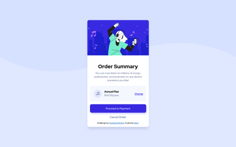
Great work implemented things well There should be margin between annual plan and img
Marked as helpful
@MarlonPassos-git
Submitted
I particularly don't know how to improve this project even more, my biggest doubt is regarding the git-hub, there I use a gif for the best experience, but I don't know where I should put the .gif file Should I host the file? But I couldn't find a good free place to host big gifs without losing quality I see that some sizes I can't reproduce like the photo, there is a tool for those of us who don't have the pro to know the exact spacing size of each element
@Shahab-Malikk
Posted
Hey, implemented everything well. But I noticed a problem in "Change" inside plan box when we hover it looks strange. Also instead of
.card .plan__button { text-decoration: underline; }
you can just use an anchor tag for that by which you don't have to use text-decoration property.
Marked as helpful
@AliceMenzie
Submitted
@Shahab-Malikk
Posted
@Alice implemented everything well. You have not added hover effects to buttons(Proceed Payment) also add hover effect for anchor tag(Change). And the last thing I cannot understand your question so Did you mean that when we change screen size card move?