
@Allangui

Simon Davis
@SkidragonAll comments
- @Skidragon
Hi Allan, nice job completing the challenge and it being useable! For the small buttons, grid-template-columns: repeat(4, 1fr) and grid-template-rows: repeat(4, 1fr) would have made a 4 by 4 grid then the big buttons at the bottom could have been grid-template-columns: repeat: (2, 1fr). Also the buttons should be button elements rather than div elements, I can't use the accessibility capabilities that buttons have like keyboard accessibility. Anyway three components could be made here to organize it: Button, Display, and RangeInput. Putting the CSS with those components into seperate files would be easier to read through the code and to create better names for the CSS rather than for1, for2, for3 or div1, div2, div3. Material UI has a variant property prop to change the buttons styles like 'primary' or 'secondary'.
Marked as helpful - @yingmo55@Skidragon
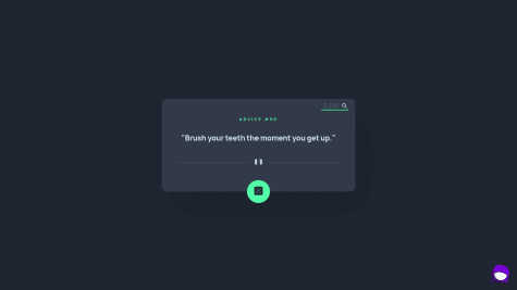
Hi Yingyi, good job on completing the project! It's kind of a combination of the browser and the API. The API wants to cache the advice for 2 seconds on the server to save extra db calls plus the server will use less resources and most modern browsers wants to cache data as much as possible since its cheaper to get data from the browser rather than browser -> server -> database -> server -> browser. They might be only using redis (key,value) store and might not need a seperate database.
Calling with the same URL might make the browser store the URL as a key and the data as the value { URL: data }. So the solution I did was put a new Date() generated timestamp query param at the end of my URL: https://api.adviceslip.com/advice?timestamp=1647571215979. Last thing, the advice container doesn't need a media query, using width: 100%; and max-width: 40rem or something will do the trick instead of vw. Anyway I did wish they would send to the UI how long they will cache things to disable the button on the UI for the period.
Marked as helpful - @vikyij
Memory Game - Typescript, React, Tailwind css
#react#react-testing-library#tailwind-css#typescript#jest@SkidragonHi Victoria, good job at making this and I had fun playing with it. I'm also working on this project and working with Xstate and spawning player instances depending on what the user chooses. Just some ideas that I'm throwing out here: Use a custom component using radio element to create the create game form buttons for accessibility purposes. Xstate.js is simplifying the game making process for me at the moment, essentially I have a game actor and spawn player actors to talk to each other. The game actor state holds the tokens, spawn the amount of players selected, keeps track of player's turn. The player actor tells the game actor that I matched these tokens correctly by storing it in its own state. Also the game actor has different phases like initializingGame -> choosingPlayer -> playerMoves -> checkWin -> choosingPlayer or gameOver. Here is the idea thus far: https://github.com/Skidragon/monorepo-portfolio/tree/memory/apps/memory
- @NotKijana@Skidragon
Hi Kijana, great job completing the project and adding in a search field! I do have a couple of suggestions, since this project isn't very big I would have made only 3 components: AdviceContainer to replace Box since it describes it better because every element is a box essentially, SearchField, and Footer. If the company expands more on the project then we can break out into more smaller components if need be. Also you could look into react-query, I've used it professionally and its great for fetching data and do mutations (create, update, delete). It even tells the status of the fetching process. Another way to challenge yourself is try to use typescript if you have the time. I recommend Jack Herrington youtube channel to learn from his playlist. I hope this is helpful!
Marked as helpful - @Coops023@Skidragon
Hi @cooper, good job on making it full stack. I do have a couple of suggestions, since it's an e-commerce site, SEO is very important, I would look into Next.js because it helps with dealing with SEO, lazy loading images, and even if the user has javascript disabled, they can still see the web page since javascript can build the page on the server rather than client side. Also for the height of the footer, I would use padding with em units instead of height, it adjusts to the content inside the footer rather than a fixed height. I would watch Kevin Powel's em vs rem on youtube. I would make the stepper field input box as disabled and I think there is a type conversion happening because I'm able to add more items then the max. Here is my solution if you want to take a look:
https://www.frontendmentor.io/solutions/nx-nextjs-typescript-graphcms-nestjs-and-styled-components-cPFj72mX9
I didn't do every section since I would need to upload more images/content to the CMS.
- @ndgdl@Skidragon
Hi Nicolas, for width, I usually set the width: 100% then I set a max-width: 120ch or something. I use rem/em instead of pixels because some devices calculate pixels differently. For fetching requests, disabling it is good enough for the frontend since this API should be taking care of any attacks like DOS (Denial of service). If its not an API that uses caching and throttling the requests, you would need to have your own server to talk between the client and the API.
Marked as helpful - @igbokwe-kosi@Skidragon
It looks awesome on the styling and responsiveness. Also liked the variable names and their casing. I would make the input search box not cursor:pointer and just use the default value because it feels like a button to me. Just things to be aware of from a backend perspective: hide the api key on a reverse proxy server which talks between the client and the api in this way you can rate limit and prevent DOS (Denial of Service) attacks unless the API itself does it for you plus I can't steal your api key and make requests in my own app, and in the innerHTML for renderMap function, if the API ever becomes malicious which may never happen in this case, they could add a javascript script in the code (XSS) and make it get information about users' searches though in a more complex app, user authentication information like stealing a JWT from local storage or something. Don't spend too much time on backend stuff if its frontend that you're specializing in and need to get a job quickly.
Marked as helpful - @pernorin@Skidragon
In firefox and maybe in most modern browsers, it caches the same request like a key so it just keeps going to the browser cache to get the info instead of the api. I added a timestamp query param that gives me a new value (key) everytime at the end of the api endpoint instead of updating the headers to no-cache because it wasn't working in my case. Here is an example: https://api.adviceslip.com/advice?timestamp=1646669540478
Marked as helpful - @catherineisonline@Skidragon
It looks good though I keep getting a cached response when fetching for new advice. I believe it has to do with fetch since I used axios for mine, and you might have to do what this post suggested: https://stackoverflow.com/questions/29246444/fetch-how-do-you-make-a-non-cached-request
Just noticed its doing it on mine too. I think it might be firefox dev edition browser.
Marked as helpful - @grizhlieCodes@Skidragon
It looks and animates pretty awesome! The only suggestions I have is the confirm deletion modal could be exited out of when pressing esc and just being more keyboard accessible. Also the fields for creating an invoice could have more validation like the email and having an autocomplete fields for the state and city but MVP wise it's pretty solid. Keep up the good work and grit! I might look at the code base more tomorrow when I have more time. Also I'm doing the audiophile guru one to challenge myself too.
- @norman02@Skidragon
Hi norman02, for spacing list of links between your elements I would look into the lobotomized owl selector * + * since the footer links are kind of squished. Also for your buttons, you can make your buttons grow relative to your text in the button and don't have to use a set width and rem for padding. I would look up em vs rem by Kevin Powell, he does a good explanation. Essentially use em on the padding to set your width and height of your button instead of the rigid width and height properties. Example:
.btn {
display: inline-block;
background-color: white;
padding: 1em;
color: #FF505C;
font-weight: bold;
border-radius: 28px;
}
if you change the font size later for your button in a media query, the width and height of the button will grow with it. Also it will grow or shrink depending on how much text you add into it.
- @Romario-Negreiros@Skidragon
Hi @Romario-Negreiros, for organizing, I would recommend using PascalCase for your classes to be able to distinguish them faster since that is common practice. Also for your item which I guess is a Country Card? The methods need to tell me more about what the code is doing, not how it is doing it. For example: insertClass in the Item class doesn't tell me much and I would have to search for the class name to understand what it is doing which is very problematic in huge projects.
Here is an example of how I would structure the project:
CountriesList.js
CountryCard.js
home.js //where we can import our classes to interact with each other
CountriesList can have the methods add(CountryCard) remove(CountryCard) //We can do this instead of an index because we are pointing to the same object in memory addMultiple(countryCardsData)CountryCard (name, population, region, capital, link)in home.js const data = await fetch() const countryCardsArr = []; loop through data and use it to create the CountryCards and push them into the array CountriesList.addMultiple(countryCardsArr);I haven't looked into the session storage of your code but you can also use query params to fetch data in the next page if you need to store an id to get more detailed information about a country.
- @justin-xia15@Skidragon
Hi @justin-xia15, I think the reason why the CSS is not working is because of this line:
<link rel="stylesheet" href="/Stats-preview-card-component/css/styles.css">it needs to change to this:
<link rel="stylesheet" href="./styles.css">This is referred to as getting the relative path vs the absolute path.
I see that these folders /Stats-preview-card-component/css/ doesn't exist in your repo. It might exist on your local though.
- @tomsky90@Skidragon
Hi @tomsky90, nice job on the dark mode and filtering. I do recommend to setup prettier to format your code to make it look nicer and not worry about formatting code. Also the components need to be simplified more, for example:
const HomePage = ({
    error,
    setError,
    darkMode,
    countriesListData,
    countriesDataForDisplay,
    setCountriesDataForDisplay,
    selectValue,
    setSelectValue,
    inputValue,
    setInputValue,
}) => {
    return (
        <div>
            <Form
                setError={setError}
                darkMode={darkMode}
                countriesListData={countriesListData}
                countriesDataForDisplay={countriesDataForDisplay}
                setCountriesDataForDisplay={setCountriesDataForDisplay}
                selectValue={selectValue}
                setSelectValue={setSelectValue}
                inputValue={inputValue}
                setInputValue={setInputValue}
            />
this is like saying in vanilla js land Form(setError, darkMode, countriesListData, countriesDataForDisplay, setCountriesDataForDisplay, selectValue, setSelectValue, inputValue, setInputValue), I as a developer of this re-usable component wouldn't want to deal with. It needs to be more generic of a form. For example:
<Form
isDarkMode={true} //the "is" tells me it's a boolean
data={[]}
onSubmit={() => {
// fetch, set your countries, set errors, and set load here
}}
onInputValueChange={() => {}}
onSelectValueChange={() => {}}
This way you can re-use the component in more than one place.
- @hi-reeve@Skidragon
Hi @zynth17, seems like everything works well! The only thing is instead of setting the component widths to have like 70% and 30% like the card and search bar, I believe it would be better to give them a max-width and set them to have a 100% width because they are getting a little too small. Also the card with the ip information text is overflowing it's container. I wish I can post photos here.
Marked as helpful - @ruona88@Skidragon
Hi Ejovi, looks pretty good. :) I would suggest looking into em vs rem for CSS and the dangers of using fixed heights from Kevin Powell from Youtube. Also next time use a mobile first approach for your media queries, these things will save you more time on bigger projects. For the main content section, I would suggest a main element in place of a section element to communicate better that this is your main content.
- @AmanyadavFD@Skidragon
Hi @AmanyadavFD, pretty good job on the responsiveness and styling, for the html, I would recommend the main element instead of a section element since you put that as your main. Also I think it's kind of redundant doing classes like main__heading-span. A .purple-accent class would make more since for that. Also I don't see the point of putting a .secondary-heading class when the h2 communicates that already. If I was going to put a class there, I would communicate what the h2 is referring to. For media queries, I think you took the desktop first approach, I would go with the mobile approach first. Use min-width instead of max-width to do a mobile first approach, you can then use $tablet and $desktop variables to place into here instead of this. bp doesn't give me much info.
@media only screen and (max-width: $bp-small) {
      order: 1;
      border-radius: 0 0 1rem 1rem;
      text-align: center;
    }
In summary to improve, I would work on more descriptive and concise class names and organization plus the mobile first approach to help other devs understand the code and save more time for yourself in the future.
- @Skidragon@Skidragon
One last thing, how did you guys use filter to create the orange overlay on the keyboard image or was it a different property?