@ebeeraheem
Latest solutions
Latest comments
- @Slimani-CE
Hey Ibrahim,
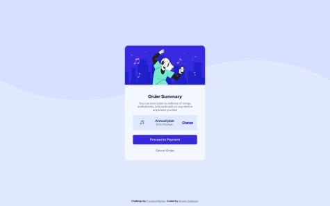
Addressing the first challenge, try setting the height of the image element within the
.topclass to 100% and customize the height of the.topelement itself to be 170px. This should eliminate the unwanted space between the hero image and the bottom of the card.Now, for the second issue related to the arrangement of items in the
.plansection, consider the following steps:- Remove
justify-contentfrom the.planclass. - Add a padding of 15px to the
.planclass. - Introduce
position: relativeto the.planclass. - Apply
position: absolute; right: 15px;to the third child of the.planclass. If needed, you can assign a custom class to this child or select it using.plan:nth-child(3).
- Remove
- @yassine-ramla@Slimani-CE
I suggest implementing a toggle functionality for prices using a clever combination of HTML and
CSS. First, create a hidden checkbox input accompanied by a corresponding label. By placing your toggle button within this label, a click on the toggle will essentially trigger the checkbox. Leveraging the CSS:checkedpseudo-class, you can dynamically style elements based on the checkbox's state. When the checkbox is checked, apply styles to display the monthly price; otherwise, keep the yearly price div visible.