P
@AnjelToppo

Overall, the project is well-structured, and the code is clean and easy to follow. The use of semantic HTML elements like <main>, <section>, and <article> helps with accessibility and SEO, which is great. The CSS is organized with custom properties for colors and fonts, making it easy to maintain and update the design.
The responsive layout works smoothly across different screen sizes, and the use of the <dialog> element for the navigation modal is a nice modern touch. However, keep in mind that <dialog> is not supported in all browsers, so adding a polyfill or fallback could improve compatibility. Also, adding more descriptive alt attributes for images and ARIA labels for interactive elements like the close button would enhance accessibility for keyboard and screen reader users.
One minor suggestion is to consider using <a> tags with role="button" for elements that behave like buttons but navigate to other pages, or to clearly define the button types to avoid any unintended form submissions. Overall, this is a solid implementation with room for small improvements in accessibility and cross-browser support.
Great job! The code is well-structured and clearly separated into HTML, CSS/SCSS, and JavaScript, which makes it easy to read and maintain. I especially liked the use of semantic markup, custom styles for radio buttons and checkboxes, and the focus and error handling through JavaScript. The form validation enhances the user experience nicely. One suggestion for improvement would be to add more aria attributes for better accessibility and possibly refactor some of the repetitive event listener code. Overall, it's a clean and thoughtful implementation!
Unfortunately, I wasn't able to fully review the project because the repository and live site are no longer available. From the screenshot preview, it seems like the layout might not be fully pixel-perfect compared to the original design, but I can’t confirm that without access to the source code and live site.
If you're able to re-upload the repo or share a working link, I'd be happy to take a closer look and provide more constructive feedback!
Nice job! 🎉 The layout looks clean and responsive, and I love that you're using Sass and BEM — it keeps your code well-structured. Great use of Bootstrap too! One small thing: consider using a <button> instead of <a role="button"> for better accessibility. Also, maybe add a check to prevent submitting the form without selecting a rating. Overall, it's a solid project, and it’s awesome that you’re building this without tutorials — keep it up! 🚀
The live site is working — great to see the result online! However, there are noticeable differences between the layout and the original design. Some spacing, font sizes, and alignment look off, and the component isn't fully pixel-perfect. Only two breakpoints seem to be implemented (desktop and mobile), with abrupt transitions and no smooth responsiveness.
Unfortunately, the GitHub repository is no longer available, so it's difficult to provide any feedback on code structure, semantics, or accessibility. Still, publishing your solution is a solid step forward. Keep refining your attention to detail — you’re moving in the right direction!
Unfortunately, I wasn't able to fully review the project because the repository and live site are no longer available. From the screenshot preview, it seems like the layout might not be fully pixel-perfect compared to the original design, but I can’t confirm that without access to the source code and live site.
If you're able to re-upload the repo or share a working link, I'd be happy to take a closer look and provide more constructive feedback!
I'm proud of the active state of the image. I think it could have been done in multiple different ways, so I would say I had to be a little bit creative, which is a good thing because CSS should be about creativity and not just routine tasks. Next time, I would time myself because I think I spent longer on this project than I would have liked.
What challenges did you encounter, and how did you overcome them?Setting the active state of the main image was quite difficult for me. I tried looking for a video on YouTube, but I couldn't find the right one, so I broke down what I was trying to do into tasks.
I want some advice on the structure of my HTML. I tried to follow the BEM methodology, but some elements or blocks didn't fit the BEM structure, such as <div> elements used as containers only to display flex(for layout purposes), should these be elements or a new block entirely? If anyone can rewrite my structure using BEM correctly, so I can see where I possibly went wrong I would gladly appreciate it.
Great job on the project, and it’s especially commendable that you approached the task of setting the active state of the image creatively. Overall, your project looks clean and well-structured, but there are a few areas that could be improved, especially with regard to applying the BEM methodology.
Overall, you're on the right track, and small adjustments in class organization and using BEM more effectively will help make your code cleaner and easier to maintain in the future.
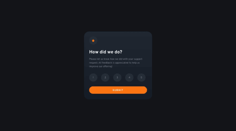
The HTML structure is clean and semantic, which makes the form easy to understand and navigate. Great job using proper labels and clear markup. For improved accessibility, consider setting the input type to email instead of text, adding aria-live="polite" to the success message, and using role="alert" for error messages. These small changes can make a big difference for screen reader users. Overall, solid and well-structured work!
One of the biggest achievements in this project was successfully using Redux for global state management. Since this was my first time working with Redux, it was a challenging yet rewarding experience that strengthened my understanding of state management in larger applications. In future projects, I plan to explore even more advanced capabilities of Redux to optimize performance and maintainability.
Another area for improvement is my styling approach with MUI. In this project, I relied heavily on the sx prop for styling, which can become difficult to maintain in larger applications. Since sx works similarly to inline styles, I realized that it could affect reusability and scalability. Next time, if I continue using MUI, I will focus more on the styled components approach to create reusable and modular styles efficiently.
One of the challenges I faced was testing the social media sharing links. Since I don’t have accounts for Facebook, Pinterest, or Twitter, I couldn’t verify whether the generated links worked correctly for different platforms.
What specific areas of your project would you like help with?I would appreciate any suggestions, especially regarding best practices for using Redux.
I’d love to hear your thoughts!
Really well-structured solution! 👏
Great work! Your solution is visually polished, responsive, and semantically structured. The use of CSS Grid for layout is spot on—especially the way you handled the 4-column desktop layout with asymmetric placement. 👏
Here are a few things you did really well:
✅ Typography and spacing are clean and consistent. ✅ You handled the quotation image layering with good use of position: absolute. ✅ Nice use of CSS custom properties (variables) for maintainability. ✅ The design is responsive across all breakpoints with appropriate layout shifts.
Suggestions:
✅ Using the article tag per testimonial is great semantically! Consider adding aria-label or role="article" only if necessary for screen readers (but in this case, it looks fine).
🛠️ You could simplify some of the media query blocks by avoiding redundant rules (for example, resetting grid-column or grid-row unless they truly change).
📦 Instead of assigning styles via nth-child, a class-based structure might offer more maintainability (like .testimonial--featured).
Overall, your code is very clean and professional. Excellent attention to layout structure and accessibility. Great job! 🌟
Great job on this solution! I really like how clean and well-structured your layout is. The card arrangement matches the design perfectly, and your use of flex and spacing is solid. I also appreciate how readable and organized your CSS is—nicely done with naming and use of variables!
If I may suggest one small improvement: consider reducing the repeated border-color declarations by using a modifier class or even a map structure if you move to a preprocessor like Sass.
Overall, awesome work—keep it up!
Great work! 👏 Your solution looks clean and well-structured. I especially liked how you handled the responsive design — swapping the image source on mobile is a nice touch. The overall layout and spacing are visually balanced and accessible. One small suggestion: you might consider using semantic HTML tags like <article> or <section> instead of just <main> to improve structure and accessibility further.
Keep up the great work!
i will improve next time on all the techniques i used.
What challenges did you encounter, and how did you overcome them?Encountered media queries issue and add spacing in between the list items and markers.
What specific areas of your project would you like help with?it will be of great honor if y'all can review my code and tell me where i need to make improvements. Thanks
Nice work putting together the Recipe Page! 🍳 ✅ What’s good:
Overall, solid effort! With a bit of cleanup, this would be even more professional. Great job and keep practicing! 🚀
I am proud of the little progess I have made so far in my Front End Development Journey. What I would do differently, I would take enough time to arrange my layout and how I want to achieve my frame work before commencing a project.
What challenges did you encounter, and how did you overcome them?With every challenge encountered, YouTube was my solace.
What specific areas of your project would you like help with?I need to understand the GitHub interface. Please recommend helpful and significant resources. Thank you!
Great work completing the challenge! 👏 You’ve made good progress, and it’s clear you’re experimenting and building confidence with layout and structure. Nice use of Bootstrap for quick setup.
A few suggestions for your next steps:
You're doing great — keep experimenting and building! 💪
All feedback and support will be greatly appreciated!
You did a great job matching the design and keeping the layout clean and responsive! I really liked your use of CSS variables, font scaling, and hover transitions. One suggestion: consider removing the <picture> element since you're not using multiple sources — a regular <div> would be more appropriate here. Also, simplifying class names could improve maintainability. Overall, strong and thoughtful work!
having done the replica of the sample giving
What challenges did you encounter, and how did you overcome them?Been able to align the properties as expected
What specific areas of your project would you like help with?none
Great job replicating the layout! You've matched the design nicely and showed good understanding of Flexbox and general styling. I’d suggest improving a few basics — like properly importing the Google Font (via <link> in HTML, not in CSS), and fixing the media query syntax so responsiveness works as expected. Keep it up — you're on the right track! 🚀