Skip to content
  • Unlock Pro
  • Log in with GitHub
Profile
OverviewSolutions
9
Comments
5

Toluwalase

@Tolux001Not Too Far Not Too Close160 points

Front-End Developer in progress | HTML5, CSS3 & JavaScript (ES6+) | Computer Science Student | Self-paced Learner | Building Awesome Stuffs | Checkout my Github profile to find more projects !

I’m currently learning...

NEXT.js Transitioning to the MERN stack.

Latest solutions

  • Responsive Page built Using Flex-Box && BEM Naming Implementation

    #accessibility#bem#webflow

    Toluwalase•160
    Submitted almost 2 years ago

    0 comments
  • Reponsive Page Built Using CSS Flexbox

    #accessibility#webflow

    Toluwalase•160
    Submitted almost 2 years ago

    3 comments
  • Responsive Landing page using Flexbox

    #accessibility#web-components#workbox#webflow

    Toluwalase•160
    Submitted almost 2 years ago

    0 comments
  • Result Summary Card🛡[SEMANTIC MARKUP - CSS3 -MOBILE FIRST - FLEX-Json

    #accessibility#animation#fresh

    Toluwalase•160
    Submitted about 2 years ago

    0 comments
  • Order card component🎯 [ SEMANTIC MARKUP - CSS GRID - CSS FLEX ]

    #accessibility

    Toluwalase•160
    Submitted about 2 years ago

    1 comment
  • Semantic HTML5 markup, Flexbox Responsive shopping product card

    #accessibility#airtable

    Toluwalase•160
    Submitted about 2 years ago

    2 comments
View more solutions

Latest comments

  • Damola Adebogun•110
    @Surfboyfr
    Submitted 4 months ago
    What are you most proud of, and what would you do differently next time?

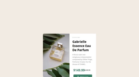
    The most interesting part of the project was making it responsive

    What challenges did you encounter, and how did you overcome them?

    It was pretty basic

    Product-preview-card-component

    1
    Toluwalase•160
    @Tolux001
    Posted 4 months ago

    Nice design Damola

    I enjoyed going through your code, it was clean and precise.

    However, you could have reduced the margin top and bottom to a considerable length

    .container{
       width: 550px;
       height: 450px;
       /*margin: 350px auto;*/
       margin: 5em auto;
       display: flex;
       border-radius: 10px;
    }
    

    Or consider using

    display: grid; 
    

    and it`s placeitem property to center it perfectly!

    Good luck Champ.

  • Nwanda Joseph chekwube•90
    @Crypto-Dominic
    Submitted about 2 years ago

    Nft preview card using pure HTML and CSS

    #webflow
    1
    Toluwalase•160
    @Tolux001
    Posted about 2 years ago

    Hello Joseph.

    Congrats successfully completing this challenge! 🤝

    There are other recommendations I can assist you with regarding centering the whole NFT DIV and regarding your code.

    I want to break down the easiest way of making your layout stand out without using absolute positioning. We don't need to use absolute to center the component both horizontally & vertically. Because using absolute will not dynamical centers our component at all states To properly center the component in the page, you should use Flexbox or Grid layout.

    For this demonstration we use css Grid to center the component

    body {
        min-height: 100vh;
        display: grid;
        place-items: center;
    }
    

    You can also read more on centering a div ----> https://moderncss.dev/resource-the-complete-guide-to-centering-in-css/

    Now your component has been properly centered.

    I hope you find this helpful 😄 Above all, the solution you submitted is great !

    Happy coding!

    Marked as helpful
  • Hadi homaei•190
    @FisherSHADOW
    Submitted about 2 years ago

    stat preview card has been done with html and css

    1
    Toluwalase•160
    @Tolux001
    Posted about 2 years ago

    Hello FisherSHADOW

    I Went through the code and it was brilliant, but their were no media queries which allow access to user on mobile and tabs to access all properties on your web page.

    At least 60 - 70% of people who preview your web page would do so on mobile phone or Desktop site functions in the browser.

    Once again, Great work

    001💙✌️

    @media(){ }

    Marked as helpful
  • Toluwalase•160
    @Tolux001
    Submitted about 2 years ago

    Semantic HTML5 markup, Flexbox Responsive shopping product card

    #accessibility#airtable
    2
    Toluwalase•160
    @Tolux001
    Posted about 2 years ago

    Hello @0xAbdulKhalid,
    So I was able to take your advice and I worked on another challenge . Please is their any other thing I can improve in this challenge that I didn't do

  • Sudip Khatri•540
    @SudipKhatri036
    Submitted about 2 years ago

    Web page using Html, Css, Javascript

    1
    Toluwalase•160
    @Tolux001
    Posted about 2 years ago

    Hello. An idea on how to make your image responsive on different devices

     <picture> 
      <source 
        srcset="name of image"
        media="(min-width: screen size )"
      />
       
      <source 
        srcset="name of image"
        media="(min-width: screen size)"
      />
      
    **Default if your picture media query doesn't work**
      <img 
        src="" 
        alt=""
      />
    
    </picture>
    

    For other responsiveness, you need to take note of important break point. Mobile S -320px. Mobile M -375px.

    Mobile L - 425px --> Tablet - 768px Most important to me for mobile devices

    Marked as helpful
Frontend Mentor logo

Stay up to datewith new challenges, featured solutions, selected articles, and our latest news

Frontend Mentor

  • Unlock Pro
  • Contact us
  • FAQs
  • Become a partner

Explore

  • Learning paths
  • Challenges
  • Solutions
  • Articles

Community

  • Discord
  • Guidelines

For companies

  • Hire developers
  • Train developers
© Frontend Mentor 2019 - 2025
  • Terms
  • Cookie Policy
  • Privacy Policy
  • License

Oops! 😬

You need to be logged in before you can do that.

Log in with GitHub

Oops! 😬

You need to be logged in before you can do that.

Log in with GitHub

Oops! 😬

You need to be logged in before you can do that.

Log in with GitHub

Oops! 😬

You need to be logged in before you can do that.

Log in with GitHub

Oops! 😬

You need to be logged in before you can do that.

Log in with GitHub

Oops! 😬

You need to be logged in before you can do that.

Log in with GitHub

Oops! 😬

You need to be logged in before you can do that.

Log in with GitHub

Oops! 😬

You need to be logged in before you can do that.

Log in with GitHub

Oops! 😬

You need to be logged in before you can do that.

Log in with GitHub

Oops! 😬

You need to be logged in before you can do that.

Log in with GitHub

Oops! 😬

You need to be logged in before you can do that.

Log in with GitHub

Oops! 😬

You need to be logged in before you can do that.

Log in with GitHub

Oops! 😬

You need to be logged in before you can do that.

Log in with GitHub

Oops! 😬

You need to be logged in before you can do that.

Log in with GitHub

Oops! 😬

You need to be logged in before you can do that.

Log in with GitHub

Oops! 😬

You need to be logged in before you can do that.

Log in with GitHub

Oops! 😬

You need to be logged in before you can do that.

Log in with GitHub

Oops! 😬

You need to be logged in before you can do that.

Log in with GitHub

Oops! 😬

You need to be logged in before you can do that.

Log in with GitHub

Oops! 😬

You need to be logged in before you can do that.

Log in with GitHub

Oops! 😬

You need to be logged in before you can do that.

Log in with GitHub

Oops! 😬

You need to be logged in before you can do that.

Log in with GitHub

Oops! 😬

You need to be logged in before you can do that.

Log in with GitHub

Oops! 😬

You need to be logged in before you can do that.

Log in with GitHub

Oops! 😬

You need to be logged in before you can do that.

Log in with GitHub

Oops! 😬

You need to be logged in before you can do that.

Log in with GitHub

Oops! 😬

You need to be logged in before you can do that.

Log in with GitHub

Oops! 😬

You need to be logged in before you can do that.

Log in with GitHub