


@code-nick
Latest solutions
fylo-dark-theme-landing-page-master (react js , scss, vite)
#accessibility#react#sass/scss#viteSubmitted about 2 years agohuddle-landing-page-with-alternating-feature-blocks (#ReactJs , #Vite)
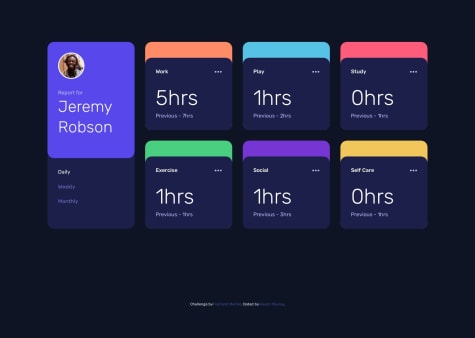
#react#sass/scss#viteSubmitted about 2 years agotime-tracking-dashboard-main(scss, React Js + Vite)
#react#sass/scss#vite#accessibilitySubmitted about 2 years agoexpenses-chart-component-main (#Jquery, #SCSS)
#accessibility#sass/scss#jquerySubmitted about 2 years ago
Latest comments
- @VikashMaurya10
Hey 👋, you did a good job🎊. But there is a problem in mobile view, To solve :
- Increase width of all card according to design.
- Add correct border properties:
.Luxury { border-bottom-left-radius: 11px; border-bottom-right-radius: 11px; }- I'm noticed hover on button of each card increased height of that card to solve it set border and its color is adjacent of card background. On button hover change
background: transparent;:
background-color: $Very-light-gray; padding: 1.1875rem 2rem; margin-top: 1.875rem; // 30px; border: 2px solid $Very-light-gray; outline: none; font-weight: 400; border-radius: 30px; cursor: pointer; font-size: 0.8rem; transition: background 0.1s ease-in; &:hover { background: transparent; color: $Very-light-gray !important; } }- To understand better go to my solution maybe you can find it useful click here 🌐.
- @code-nick@VikashMaurya10
@code-nick, you did good job🎊. I want to draw your attention to some point:
- Add transition property to make more smooth loading some other css.
- Do't fix width create design, if you want to fix, use
max-widthormin-width.i.e
card { background-color: hsl(217, 54%, 11%); box-shadow: 0px 0px 8px 10px rgba(0, 0, 0, 0.2); max-width: 350px; border-radius: 1rem; }- To make more accessible website follow this scenario:
<html>
<head></head>
<body>
    <header></header>
    <main></main>
    <footer></footer>
</body>
</html>
I hope you find helpful. To get more help please checkout my solution click here 🌐
Marked as helpful - @VishalMauryastp@VikashMaurya10
Hey , you did a good job 👌. But add cursor: pointer; property into css.
button{ cursor: pointer; }- To more understanding take a look on my solution click here 🌐.
Marked as helpful - @Andreas-Ziegler22@VikashMaurya10
Hello there 👋. You did a good job!
- Hover on Button there is border so height and width increased of whole card. This is not well, you can do this
background-color: $Very-light-gray; padding: 1.1875rem 2rem; margin-top: 1.875rem; // 30px; border: 2px solid $Very-light-gray; outline: none; font-weight: 400; border-radius: 30px; cursor: pointer; font-size: 0.8rem; transition: background 0.1s ease-in; &:hover { background: transparent; color: $Very-light-gray !important; } }- To understand better go to my solution maybe you can find it useful click here. I hope you find this helpful.
- @ayushprojects@VikashMaurya10
Hello there 👋. You did a good job!
- Your code is good for desktop view but it's can't good for mobile view.
- For design mobile view add CSS Media Queries.
- Image alt text is used to describe your image textually so that search engines and screen readers can understand what that image is.
- To understand better go to my solution maybe you can find it useful click here. I hope you find this helpful.
- @Sontory22@VikashMaurya10
Hello there 👋. You did a good job!
- Your code is good for desktop view but it's can't good for mobile view.
- For design mobile view add CSS Media Queries.
- You should not skip alt="" tag.
- To understand better go to my solution maybe you can find it useful click here
- I hope you find this helpful.


