Latest solutions
Latest comments
- @iHarryD@anmolkapil
Hey, it looks great and works as expected. But in my browser, filter menu (All, Active, Completed) is not having proper margin.
Marked as helpful - @ara6i@anmolkapil
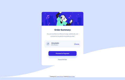
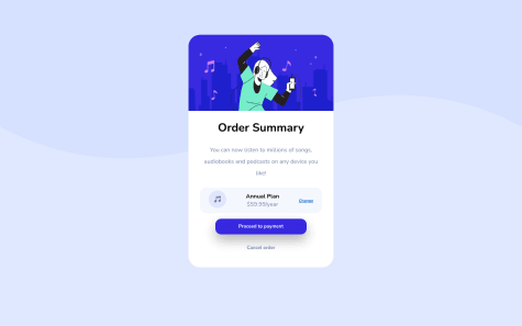
Hey congrats for finishing your first challenge 🎉 You mistakenly typed "%" instead of "$" in pricing text. Fix that😉
- @AlekseiK412@anmolkapil
-
You can just make the colour lighter in hover state. We are given hsl color values from frontendmentor. (h=hue, s=saturation, l=lightness) Decrease the "l" value a little and done :)
-
I see you are using "display: flex" on your component. To get proper height of image in "row-direction: column". You should insert image in HTML instead of applying "background-image" in CSS.
-
- @AdaezeIkemefuna@anmolkapil
It looks good. Just fix your button width and text alignment as suggested by Ahmed Faisal
Marked as helpful - @danieldudu@anmolkapil
Wow. It looks perfect ❤️ But there is a subtle suggestion (UI/UX) you shouldn't apply clicking animation on links ("Change" and "Cancel Order"). Animation on a button gives a visual haptic of clicking. But same effect on links is distracting in my opinion.
Marked as helpful - @Jordan-Rob@anmolkapil
Congratulations for finishing your project. �🎉 Functionality works fine in your website.
But I noticed few things that you can try to fix.
-
When all items are expanded it overflows your main container. It would be better if you don't define a fixed height for the container.
-
Add some media queries to make it responsive
Marked as helpful -


