
@VishwajeetBarve

Anton
@antaryaAll comments
- @antarya
Hi 👋,
Good work on ChartJS usage 🚀.
I have a couple of suggestions/improvements:
HTML
[1. Any reason you load
bootstrap.grid.cssand a bunch of fonts that are not used anywhere?[2. I think headings are misused. For inspiration, look at other solutions, e.g. https://www.frontendmentor.io/solutions/responsive-bar-chart-component-with-json-data-fetching-b2LJ5eTGIX.
[3. There is a typo on line:
<div class="container" width="100px" ,height="100px">you need to remove comma. Also, I do not think setting width and height is valid; you can specify it as style but not attribute.JS
[4. You have a typo on this line
events: ["mousmove", "click"],, it should bemousemove; otherwise hover effect does not work. Do you have any specific reason to limit events?[5. To match the design, you can remove the horizontal line below the bar element:
  x: {
    grid: {
      display: false,
      // Add this line to remove the bottom line
      drawBorder: false,
    },
  }
[6. The y-axis configuration is set twice, which means only a second try will be preserved.
{
  scales: {
    ...
    y: { // this will be lost
      grid: {
        display:false
      }
    },
    y: { // this will stay
      display :false
    }
  }
}
You can specify all options like this:
  y: {
    display :false,
    grid: {
      display:false,
    }
  },
[7. To make sure border-radius is set everywhere, you can use the
borderSkippedoption:options: { borderSkipped: false, ... }Check API how it works https://www.chartjs.org/docs/latest/charts/bar.html#borderskipped
General
[8. To name your classes consistently, check BEM, and to structure it in a reusable way, take a look at CUBE CSS. Check these resources for additional information:
[9. Use CSS reset to have a good starting point, e.g. https://piccalil.li/blog/a-modern-css-reset/.
I hope this will be helpful.
Keep up the good work 🚀. Cheers!
Marked as helpful - @damiandev22@antarya
Hi 👋,
Good work on this challenge 🚀.
I have a couple of suggestions/improvements:
HTML
[1. The anchor element cannot have another anchor element as a child.
- Check "Permitted content" paragraph https://developer.mozilla.org/en-US/docs/Web/HTML/Element/a#properties
CSS
[2. As
.overlayhas already correct position and size, one way to center child elements would be:.overlay { display: flex; justify-content: center; align-items: center; }The icon itself does not need any styling in this case except the colour.
[3. While the solution for centering above is different, it would be helpful to understand the cause of the previous issue.
The child anchor element's height is calculated using
font,font-sizeandline-height, and thenimgis placed on the text baseline. You can try to changevertical-alignon the image to see how it changes the position. The height is huge compared to the image, and the image is placed similar to how the text would be placed. You can, for example, fix that by settingfont-size: 0on the anchor element, but in your case, you just remove the child anchor element. Here is related material:- First two paragraphs explain how the image is placed and what are default values - https://developer.mozilla.org/en-US/docs/Web/HTML/Element/img#styling_with_css
- Useful technic to deal with space under image - https://stackoverflow.com/questions/31444891/mystery-white-space-underneath-image-tag/31445364#31445364
- line-height and default value - https://developer.mozilla.org/en-US/docs/Web/CSS/line-height#values
- Deep dive CSS: font metrics, line-height and vertical-align - https://iamvdo.me/en/blog/css-font-metrics-line-height-and-vertical-align
[4. When the viewport height is small, the card is only partially visible, and there is no scrollbar. You can change the body element
heightstyle tomin-height. Also, a bit of padding applied to themainelement will add space otherwise on smaller screens it is on the edge of the viewport.General
[5. Use css reset to have a good starting point, e.g. https://piccalil.li/blog/a-modern-css-reset/.
I hope this will be helpful.
Keep up the good work 🚀. Cheers!
Marked as helpful - @AryanTy20
React-Vite-Typescript Scss flexbox grid framer-motion redux-toolkit
#react#sass/scss#typescript#vite#redux-toolkit@antaryaHi 👋,
Nice job 🚀. I noticed a couple of things that can be improved.
HTML
[1. Use button tag instead of div tag for icon buttons, and do not forget to add
aria-labelfor buttons with no text.[2. Usually, the logo is a link to the home page with an alt property set to the app name.
[3. Check responsiveness on screen size e.g. 692px.
JS/React/Typescript
[4. Typescript looks good; when possible, create reusable types, e.g.:
interface Image {
  poster: string;
  thumbnail: string;
}
And use it whenever this type is used.
[5. If you use hard-coded data, move it out of the component, nothing is happening with it while rendering. A better approach would be to imitate fetch using a slight delay with a loading indicator to mimic the real application.
[6. The first parameter of the array splice method is the index at which to start changing the array. Using id to remove the item from the cart as the first parameter of splice will not work correctly.
[7. You can skip
<>...<>as the root element when there is only one child element.[8. Use the
headertag as a root element of theHeadercomponent instead of wrapping theHeadercomponent inApp.[9. In
Cartcomponent you check if cart is empty several times, it is a good candidate to have it in a variable e.g.const isPresent = data?.length > 0.[10.
useState<boolean>(false)you can skip type here if you expect the value to be only boolean as typescript will know.[11. NavLinks will probably be reused in other places .e.g in the footer, so keep it outside the component and/or move it to its file.
General
[12. Use reset to have a good starting point, e.g. https://piccalil.li/blog/a-modern-css-reset/.
[13. For commit messages, it will help others if you add a descriptive message and follow a specific format, so all is consistent https://www.conventionalcommits.org/en/v1.0.0/. You can even make a check before committing if you follow those rules by using a tool like commitlint - https://commitlint.js.org/#/
Let me know if you have questions. I hope this will be helpful.
Keep up the good work 🚀. Cheers!
Marked as helpful - @Andrusik1@antarya
Hi 👋,
Nice job 🚀. I noticed a couple of things that can be improved.
HTML
[1. Do not use
maintag as a wrapper of card, instead add parent div or section tag for your card<main><div class='panel'>...</div></main>as a child of main tag.maintag specifies the main content of a document https://www.w3schools.com/html/html5_semantic_elements.asp[2. Rate-related elements with submit button can be recreated and wrapped with the form, which is a better way to handle this case. Instead of a button for each rate, you can use radio input as it matches the required logic
choosing one from several. You will learn a lot by checking other solutions after your attempt, e.g. check the solution for the same challenge of @Elaine https://www.frontendmentor.io/solutions/responsive-interactive-rating-component-SeBo-aR4gB it is implemented using form and radio inputs; it has consistent names and implemented well.CSS
[3. The
maintag used as a card wrapper has awidth: 25vwwithout restriction on huge screens; your card will be pretty wide. Instead, you can set the width to 100%, but restrict it not to be greater than 400px usingmax-width: 400px.[4. It looks like you are using BEM for naming classes; if yes, I think it is not used correctly. For example
.Card__starbox--img- img is not a modifier but an element, instead you can use something likecard__sticker, same for.Card__Submitbox--submit..Card__Rating---ratehas three dashes, and.second-imageis not part of the card - consistency will make your code easy to read and maintain.- BEM - https://getbem.com/naming/
- CUBE CSS - https://cube.fyi/
- challenge created following CUBE CSS - https://www.youtube.com/watch?v=NanhQvnvbR8
JS
[5. You don't need to apply styles from javascript in this case. Define them in CSS and use the class name to reference those styles.
[6. For a map of a similar key/value in the
getRatefunction, why not useAmountdirectly?[7. While there is nothing wrong with string concatenation, you can also check template literals.
[8. Getting the
answervalue can be moved into submit click listener, as it is needed only on submit, not before.General
[9. Use reset to have a good starting point, e.g. https://piccalil.li/blog/a-modern-css-reset/.
[10. There is only one commit which might be fine for a small project, but even on a small project, train yourself and commit often with a meaningful message when specific work is completed. For a consistent format of commit messages, you can use (https://www.conventionalcommits.org/en/v1.0.0/).
Let me know if you have questions. I hope this will be helpful.
Keep up the good work 🚀. Cheers!
- @tossik8@antarya
Hi 👋,
Good work on this challenge 🚀.
CSS
[1. Regarding your question. You have
width: 50%onbody main .elementswhich sets elements width to50%. The grid works as expected; it is not an extra column but one with elements width set to50%. In Chrome, there is agridbadge/toggle under theElementstab of DevTools for the elements withdisplay: grid; by toggling it, you will see the outline and additional info about the grid.[2. Use CSS reset to have a good starting point, for example:
[3. You will have issues if you customize styles for specific text lengths. You need to make a layout adaptable to any text length, as the length of the text is unpredictable. Start by removing fixed widths, allow elements to grow and restrict using (max|min)-(width|height) when needed; remove unnecessary margins.
HTML
[4. Do not use
maintag as a wrapper of your panel, instead add div tag for your panel<main><div class='panel'>...</div></main>as a child of main tag.General
[5. Take a look at a different approach where you first define default styles for narrow screens and add features for wider screens.
[6. To name your classes consistently, check
BEM, and to structure it in a reusable way, take a look atCUBE CSS. It will allow to reuse styles or make them easily customizable without deep nesting. Imagine a situation where you need to inject another element beforebody main .elements:nth-of-type(2) button {this will require changes that are not straightforward, compared to if you had.panel__subscribe button, or even better to style.buttonso it can be reused. Check these resources for additional information:I hope this will be helpful.
Keep up the good work 🚀. Cheers!
Marked as helpful - @mujpao@antarya
Hi 👋,
Excellent work on this challenge 🚀. It looks fantastic on different screen sizes.
[1. Regarding your question. You can use a label on top of the input, and when the input is focused, either hide or move the label to a different place. You can check the real example here https://mui.com/material-ui/react-text-field/#basic-textfield; inspect input to see all elements.
[2. While using the screen reader, the input error is read only once. Later, if you focus on input with an error, there is no indication that the input is invalid. Using
aria-invalidandaria-errormessageoraria-describedbymight help with it https://developer.mozilla.org/en-US/docs/Web/Accessibility/ARIA/Attributes/aria-errormessage.[3. Submit event listener is added for each input; is it intentional?
[4. When input text is long, and the error icon is visible, the text overlaps with the icon. Increasing padding on the right side will help to fix it.
I hope this will be helpful.
Keep up the good work 🚀. Cheers!
Marked as helpful - @alexanderbonney@antarya
Hi 👋,
Nice job 🚀. Noticed a couple of things that can be improved.
CSS
[1. The header is not showing all links in some cases:
- 1000px width - Login link is hidden (no mobile toggle)
- 550px-880px width - Login and navigation links are hidden (no mobile toggle)
[2. When the mobile modal is open, navigation links do not expand to show inner child elements.
[3. Element with
.topclass hasmin-height: 80vh, on bigger screens text in the hero section is not centred vertically. Also at some point, if you start decreasing height, the login button of the hero section will be partially invisible. I think removingmin-heightand adding bottom padding will do the trick.[4.
Start for Freelike buttons have no pointer cursor and lack the animation you have on theLoginbutton.[5.
main section.content .contentBox .content_right .imgBox.image-leftis a bit long and redundant, you might benefit from using BEM https://getbem.com/naming/ e.g.info-section__imageand.info-section__image--left.[6. Spaces/sizes are a bit off; if you use a slider on the solution page, you can see the difference.
I hope this will be helpful.
Keep up the good work 🚀. Cheers!
Marked as helpful - @fawzab@antarya
Hi ,
Great job, it looks good.
I have a couple of suggestions:
CSS
[1. All elements inside
.wholehavemargin-left: 40px. To achieve the same but to have only one style, you can define padding on the.wholeelement. It will be easier in the future to change it instead of specifying it for each child element./* remove all margin-left: 40px on all child elements and add one padding to parent */ .whole { padding: 17px 40px; }[2. The content inside the
Add to Cartbutton is not aligned vertically; it looks like the fixed height is redundant..whole .fa { /* width: 50px; */ /* height: 100px; */ margin-right: 20px; }[3. You have fixed
widthandheightwhich works in this case, but you cannot depend on text length; in real applications, you never know the size of the length, so you need to make your layout adapt to whatever length it will have. You can check it by typing longer text for an item description. Allow elements to grow without fixed width/height, and when you want to restrict, usemax-width/max-heightormin-width/min-height;[4. On smaller screens, e.g.
320px, the page doesn't look like in mock. You might need to use media queries, so it looks good on smaller screens.- https://developer.mozilla.org/en-US/docs/Web/CSS/Media_Queries/Using_media_queries,
- https://developer.mozilla.org/en-US/docs/Web/Progressive_web_apps/Responsive/Mobile_first
And for arranging items, try using flexbox or grid as it is easier to use and has more features.
- https://css-tricks.com/snippets/css/a-guide-to-flexbox/
- https://www.frontendmentor.io/resources search for flexbox and grid for useful learning material.
Using a mobile-first approach and media queries, you will change styles to:
.container { /* A B */ display: flex; flex-direction: column; /* you can set radius on parent element instead of each child element */ border-radius: 10px; overflow: hidden; } @media (min-width: 900px) { .container { /* A B */ /* display: flex; */ flex-direction: row; } }[5. You can set
display: blockon the image to remove white space under the image. For details, check:HTML
[6. Wrap your card container with the
maintag instead of using themaintag as your card parent tag; this would be semantically correct.- https://learn-the-web.algonquindesign.ca/topics/html-semantics-cheat-sheet/
- https://www.w3schools.com/html/html5_semantic_elements.asp
Let me know if you have questions. I hope this will be helpful.
Keep up the good work . Cheers!
Marked as helpful - @debadutta98@antarya
Hi 👋,
Great job, it looks really good.
I have a couple of suggestions/improvements, though:
HTML/CSS
[1. Country flag images look distorted on the main and the details page. On the main page, you can remove
heightso it can grow based onwidth. And the details page, instead of specifyingheight, you can remove theheightattribute and limitmax-widthto a value of 400px, for example.[2. The class names are a bit long; it will be hard to work with them in the future. As you are already using BEM (http://getbem.com/naming/), instead of
country-details__content__details__informationyou can havecountry-details__infocountry-details__content__details__information__container-1country-details__info-maincountry-details__content__details__information__container-2-country-details__info-secondary
[3. As far as I understood, the border country elements on details pages should be a link to a country itself.
JS/REACT
[4. For HTML Validations error that can be seen in the report, I think all is related to illegal characters in
href, which you can fix by wrapping URL params inencodeURI. (https://developer.mozilla.org/en-US/docs/Web/JavaScript/Reference/Global_Objects/encodeURI, https://stackoverflow.com/questions/332872/encode-url-in-javascript)[5. For numbers to be user-friendly, format them so that instead of
35000322, you will have35,000,322. (https://developer.mozilla.org/en-US/docs/Web/JavaScript/Reference/Global_Objects/Intl/NumberFormat)[6. When you search for a country, and the result is empty, it shows the last result. Should not it be an empty list?
[7. It is better to be consistent and use one format for variable names. For example, you have
filterref,searchRef, andcountry_results. (https://javascript.info/variables#variable-naming)[8. Using constant for API URL or helper method will allow to change it quickly, and it will not be hardcoded in multiple places.
const API_URL = "https://restcountries.com/v2/";

fetch(`${API_URL}/name/${param.countryname}?fullText=true`);
[9. The value of
modeis passed to each component that needs it. There is a term for itprop drilling, which is okay in some cases, but as this value is shared across all application components, you can useProvider Pattern(https://www.patterns.dev/posts/provider-pattern/) instead, which is usingContext(https://reactjs.org/docs/context.html). Using this pattern will remove unnecessary duplication and be more maintainable.styled-componentshas a helper component to do precisely that - https://styled-components.com/docs/advanced#theming.[10. Regarding variable name
mode- it is hard to understand the meaning without reading the code; instead, you can name itisDark|isLight|themeif it has 'dark', 'light' values.[11. In
MainContent, you are using ref for input. Why not directly use useState (https://www.w3schools.com/react/react_forms.asp)?[12. For the
selectfield, you will benefit from using libraries like https://react-select.com/home as it is flexible and follows best practices.[13. You can use
useMemoto avoid unnecessary processing/calculations and be more performant. It will only recalculate the value offilteredCountriesonfilterorcountry_resultschange. Example:// https://reactjs.org/docs/hooks-reference.html#usememo const filteredCountries = useMemo(() => { if (filter) { const filterValue = filter.toLowerCase(); /* You can also prepare lowercase region name on the cleaning stage, so it is done only once and not on each call of useMemo */ return country_results.filter((value) => value.region.toLowerCase() === filterValue); } return country_results; }, [filter, country_results]); ... <Grid className="grid"> {filteredCountries.length > 0 && filteredCountries.map((country, countryIndex) => <GridCard result={country} key={countryIndex} mode={props.mode} /> )} </Grid>[14. I noticed that data is fetched every time user navigates to
country-api. What do you think of getting all data once and then reusing it?GENERAL
[15. For some reason, when you reload the detail page, it shows a 404 error.
[16. You can use prettier, which can format your code automatically on save, so code formatting is consistent. For example, you will not have two different formats:
const CountryInDetails = ({ mode }) => {
const NavBar=(props)=>{
https://create-react-app.dev/docs/setting-up-your-editor/#formatting-code-automatically
[17. For commit messages, it will help others if you add a descriptive message and follow a specific format, so all is consistent (https://www.conventionalcommits.org/en/v1.0.0/). You can even make a check before committing if you follow those rules by using a tool like commitlint - https://commitlint.js.org/#/
Let me know if you have questions. I hope this will be helpful.
Keep up the good work 🚀. Cheers!
Marked as helpful - @leoenter@antarya
Hi 👋,
Great job, it looks really good.
I have a couple of suggestions/improvements, though:
HTML
[1. Wrap your content with the
maintag. That way browser will know where to find primary content. Also, it will fix some accessibility issues. Here is a resource with examples related to semantic tags.[2. Add
altattribute toimgtag. It can be empty or should describe what is on the image. Screen reader users should have an idea of what is on the image based on the alt text. Here are some resources: mdn alt, great-alt-text.[3. HTML and CSS files are not formatted properly. It will make your code more readable if you use an editor extension that can format on each save for you. For example, if you are using vscode try prettier, for different editor search for
editor-name prettier.CSS
[4. Consider more universal approach for
box-sizingusing this method.[5. Take a look at this thread regarding different ways to name CSS colour variables, so it is easier to use while styling your app. slack discussion.
[6. You are using
:nth-of-type(N)pseudo-class a lot, which looks not very efficient. Next time you want to insert another card in the middle, you will have to change the rest; instead, you can create.card--bg-pinkor.bg-pinkand apply where necessary. Another example would be to have modifier.card--with-quote-bg, which will add quote background. That way, you make your code easier to read; and easier to apply changes. Here is a resource on how to structure your CSS using [BEM methodology] (http://getbem.com/introduction/), also later, you might be interested in this scss and this tailwindcss.[7. Where possible, try not to use fixed width and height so your elements can adapt to different screen sizes, limit using max-, min- version of width and height where required but allow to adapt. Also, it feels like not the best choice to use
em, unless that was the intention to bond width to font size. One of the possible solutions usinggridbut without fixed width/height would be to remove all width/height except on containers and then have something like this:/* For this to work first in HTML, move current card#5 to be card#3 so it is ordered the way they appear. */ .card { height: 100%; } @media(min-width: 1200px) { .container { padding: 20px; } .grid-wrapper { display: grid; grid-template-columns: repeat(4, 1fr); grid-gap: 20px; } .card:nth-of-type(1) { grid-column: 1 / 3; grid-row: 1; } .card:nth-of-type(2) { grid-column: 3; grid-row: 1; } .card:nth-of-type(3) { grid-column: 4; grid-row: 1 / 3; } .card:nth-of-type(4) { grid-column: 1; grid-row: 2; } .card:nth-of-type(5) { grid-column: 2 / 4; grid-row: 2; } }There are other ways to achieve this, e.g. using grid-template-areas.
[8. It would look better if you move
background-colorto thebodytag, so all area is filled with background.[9. Avatar size is not equal as it has
width: 12%, so it depends on the size of the container. In this case, you might benefit from using fixed sizes as you know it should have the same size on all cards..img-div { width: 45px; height: 45px; }Let me know if you have questions. I hope this will be helpful.
Keep up the good work 🚀. Cheers!
Marked as helpful - @carlwicker@antarya
Hello Carl,
Great job, it looks really good.
Couple ideas/suggestions/improvements for your implementation:
JS
[1. The if/else check of
window.innerWidthlooks redundant you may simplify by:// original code if (window.innerWidth > 1439) { setIsMaxWidth(true); } else if (window.innerWidth <= 1439) { setIsMaxWidth(false); } // instead you can write this setIsMaxWidth(window.innerWidth > 1439)[2. From the code, it looks like
menuHidden,isMaxWidth,tabsis only used inside specific components, so why have them outside then? My rule is to put things as close as possible where they are needed. Also, moving thetabsvariable outside the component will not recreate it on each re-render; it is static data that does not depend on anything.The same goes for
desktopHerosand mobilemobileHeros. Put it outside of the components. Also, there is no need for those variables as the only thing that is changing is the number that you can get from the slide number.HTML
[3. Where possible, use existing elements, e.g. instead of div to mimic buttons, use the
buttontag and restyle it as you need. That way, it will retain native browser behaviour. For lists, use ul/li; other elements that can be used areheader,nav; take a look at semantic elements and why they are used html-semantics-cheat-sheet.CSS
[4. Regarding responsiveness, it looks strange to see one small column on the desktop when the screen is 1400px in width. You are heavily using fixed width and heights maybe using
imgtags and max-, min- versions of width/height may help to make it adaptable to other screen sizes.[5. While there is nothing wrong with using BEM and CSS modules together, it looks redundant to me. With CSS modules, there is no need to scope class names as they will be already unique. That is, the whole point
css.buttonin one component is different thancss.buttonin another component. Also, you may use some nesting like.about h2 {}. You will get rid of thecss['']style as you can easily find simple/short names for all scoped elements. Take a look at other examples css-modules-examples.If you find yourself using a lot of conditions inside className, you may take a look at this library clsx, or classnames.
React
[6. As the project's design suggests, there should be other pages; having this in mind even for small projects will help later. For example, having a
pagesfolder with theLandingPagecomponent and moving all related components inside. Or building a general Layout component and using it inside LandingPage as the wrapper.[7. In
Appcomponentwindow.addEventListener("resize", will be called on every render, which means you are adding more event listeners on each re-render which I guess was not your intention. If you move that code intouseEffect(..., []), this will be called only once on the mount, also inuseEffect, you can remove the event listener on component unmount using the return method. For inspiration, you may check this library of hooks and particularly react-use which does the same thing as you want.[8. In the
TopBarcomponent, instead of className conditions everywhere, you may set className on the parent like...--desktop, and for all that need the same check, use that like...--desktop .topbar__nav-itemsinside CSS.[9. As
HeroImageandPageContentshare state and data (as each slider image has different text), you might combine them inside the wrapper component.===
I hope this will be helpful.
Keep up the good work!
Marked as helpful - @Da-vi-de@antarya
Hello Davide,
Great start with React 🚀.
I like the idea of the load-more button that you added 👍. Couple ideas/suggestions/improvements for your implementation:
Issues
[1. If you search for a country that is not yet visible, the list will be empty. It is happening because there is a
sliceof data before filtering. Changing the order ofsliceandfiltershould do the trick.[2. When country
bordersis not defined single-country page raises an error. For starters, you can assign an empty array, so it is working.const { alpha2Code, ... // if borders is undefined it will set it to empty array borders = [] } = country;Take a look at Destructuring search for "Default values" for an object.
[3. The load more button stays on the page, even when filtered data has less data than the
visibleCardsamount. A simple condition will fix that.[4. If you reload the single-country page or navigate to it directly, there is an error in the console. That is caused because at this point country list is not loaded yet.
React
[5. Countries page is calculating
countriesvariable every time it renders. The trigger of render might be something other than search/filter/visibleCard change. One of the ways to eliminate unnecessary calculation is to use useEffect({...setFilteredCountries(...filtered countries) }, [query, fitler, visibleCards]). And inside component return {filteredCountries.map((c) => <Card ... />)}.[6. As far as I can see, the API does not support pagination, but it supports fetching specific country/countries. For the single-country page, there is no need to know about all countries. You might load specific country data directly and after it border countries; even better before that, checking context if all countries are already loaded and if yes, get it from there instead. What I am saying is that fetching all countries on the single-country page is redundant.
[7. Currently, a global context has data related to the theme, country list, query, and filter. If we check the usage of those, it would be: theme: whole application country list: countries page/maybe single country page query: only countries page filterData: only countries page
It looks like only theme/maybe countries should be accessible by the whole app, and the rest can be moved to a specific page. If you keep adding new pages to your app, those pages will probably not need to fetch
allCountries, and they do not need to have query/filterData. The simplest solution would be to move query/filterData state to Countries page, and trigger fetching all countries from Countries page but save it in context as you have it right now. And for the single-country page to check if allCountries is already loaded, use that if not - fetch single country data.[8. It would be nice to have a loading indicator while filtering/loading more and fetching single country data.
[9. You might reset
visibleCardsto the initial value every time you use a query or filter.[10. On the
Countriespage, the same logic is executed for country filtering. You can combine those:if (item.region === filterData) { ...same } else if (filterData === "All") { ...same } // instead you can do if (filterData === 'All' || item.region === filterData) { ...same } }Also, you can improve it by checking query value. There is no need to use a query if it is an empty string.
[11.
maintag element and `back-to-top' are excellent candidates to move to separate component and reuse on all pages or move it to the app component. e.g.:const Layout = ({children}) => ( <main className="main-content">{children}</main> <BackToTop /> )[12.
const [search] = useState(["name"]);- there is no need to have it as a state you can have it as a const out of the component. e.g.:const searchFields = ['name'];[13. There are both versions in code; I suggest sticking to the last one as you are not repeating yourself.
<i className=  {darkMode ? "fa fa-search icon darkmode" : "fa fa-search icon"}></i>
<i className={`fa fa-search icon${darkMode ? "darkmode" : ""}}></i>
If you find yourself using a lot of conditions inside className, you may take a look at this libraries clsx, classnames
JS
[14. Instead of
classList.add()andclassList.remove()you can useclassList.toggle("className", flag)[15. Things like the number of items per page are a good candidate to move to a constant and out of component to be reused, e.g.
const COUNTRIES_PER_PAGE=49.[16. There is no need to call
query.toLowerCase()each time you check if it is part of the country name. Asqueryis not changing, set a variable before filtering and use it instead. It might be fast now, but there can be some heavy calculation involved in the called method in other applications.HTML
[17. Currently, users need to guess that card is clickable unless the user hovers the image. If you make the whole card clickable, it might be better for the user experience.
[18. The usage of semantic elements like
footerandarticleis misleading. I would make a footer child of body and place content inside, and the article will contain all country info.[19. Instead of
alt="Country flag route", you can change it to include country name so that the screen reader will read to which country user will be navigated.[20. Change theme switch label when changing theme for better user experience Light Mode/Dark Mode.
[21. To write less instead of writing lists by hand:
  <option value="All">Filter by Region</option>
  <option value="Africa">Africa</option>
  <option value="Americas">America</option>
  ...

  // you can create an array of regions
  const regions = ['All', 'Africa', 'Americas' ...];

  // and later output
  {regions.map((region) => (<option key={region} value={region}>{region}</option>)}

  // cleaner code, easier to update, you can later use API to get all regions
CSS
[22. The issue with the select input arrow icon can be fixed by removing
background-image: inherit;from.select-dark, andlinear-gradientfrom:select, .select-dark { /* replace this */ background-image: url('data:image/svg+xml;...'), linear-gradient(to bottom, #ffffff 0%,#fff 100%); /* with this */ background-image: url('data:image/svg+xml;...'); }That should do the trick. In general, it is hard to style select input. Design of select input is much more difficult most of the time, so you will be forced to use an external library. Here are examples of libraries that you can use instead: For react react-select For js select2
[23. You are already using the theme class on the body tag instead of having theme-related classes on each element. You can reuse parts of element styles that are shared and apply only differences based on body theme class.
.btn {
  /*
    all shared styles
    and one for the light theme
  */
}
.dark .btn {
  /*
    specific to dark theme
  */
}
By doing that you can remove code like
<div className= {darkMode ? "country-info-dark" : "country-info"}>as you will just have<div className="country-info">and body theme class will trigger theme specific overwrites.[24. There are minor differences when switching from light to dark:
- Country flag image height is changing. It would also be nice to have a fixed height for the image, so it is consistent.
.country-detail > pfont-weightis changing to lighter for some reason.
Resources
-
To format code and be consistent, you can use Prettier. Also, you can add configuration so every time you commit, it formats it CRA-Formatting Code Automatically
-
Take a look at another style for className naming format BEM
As I said only have a couple of suggestions 😬😅. I hope it is not overwhelming and will be helpful.
Keep up the good work! Cheers!
Marked as helpful - @shivjoshi1996@antarya
Hello Shivam,
The app and code look neat. Excellent job 👍.
[1. One way of doing it is, as you suggested, to have a state for
selectedTipin theTipSelectioncomponent, but that should not be a number as you will have no ability to distinguish between a button tip and a custom tip. Later based on the selected tip, you can check for each button/input if it is active and style it accordingly. It would also be good to switch to custom value every time custom input is clicked/chosen.Here is a snippet with the initial code:
const tips = [5, 10, 15, 25, 50];
export default function TipSelection({ handleTipInput }) {
  // make sure you preselect tipAmount in Calculator
  const [selectedTip, setSelectedTip] = useState(`tip-${tips[0]}`);

  const handleCustomFieldChange = ({ target }) => {
    const { value } = target;
    setSelectedTip('custom');
    handleTipInput(value);
  };

  const handleTipChange = (value) => {
    setSelectedTip(`tip-${value}`);
    handleTipInput(value);
  };

  return (
    <StyledTipGrid>
      {tips.map((tip) => (
        <TipButton
          active={selectedTip === `tip-${tip}`}
          handleTipInput={handleTipChange}
          amount={tip}
        />
      ))}
      <input
        onChange={handleCustomFieldChange}
        onClick={handleCustomFieldChange}
        type="number"
        placeholder="Custom"
        className={selectedTip === 'custom' ? 'active' : null}
      />
    </StyledTipGrid>
  );
}
[2. The only idea that comes to my mind regarding the code organization is to move the input section and output sections into separate components; other than that, it looks clean. Regarding styles, it is a necessary mess.
[3. I guess it complains because on each render
handleTipInputfunction will be brand new, so you need to wrap it withuseCallbackand add dependencies; that way, on each render same function(reference) will be used.const handleTipInput = useCallback( function (tip) { const calculatedTip = tip / 100; setTipAmount(calculatedTip); }, [setTipAmount] );If you updated your code with the above change, wrapping your
TipButtonin thememowill render the component only when props change. jsx-no-bind memo
Regarding other Eslint errors; instead of writing
{
  // eslint-disable-next-line
}<label htmlFor="tip"> Select Tip %</label>
you can write it using JSX comment instead of javascript
{/* eslint-disable-next-line  */ }
<label htmlFor="people">Number Of People</label>
But better to fix using one of the ways as suggested label-has-associated-control
And for tip label, you may use aria-labelledby
[4. I guess the way you handle it depends on what is your end goal. Should it show one global message or for each input, or each input will have different errors based on different validations.
Here are some resources for more complex form validations/helpers yup and for form wrapper formik.
===
One other suggestion related to performance; There is no need for two effects that do almost the same job; why not combine into one and calculate both values there? I guess you can also combine results in one state. Otherwise, your code will be making extra render after the first run, e.g. it calls A, B(with the wrong tipAmountPerPerson) and then again B.
I hope this will be helpful.
Keep up the good work!
Marked as helpful - @Badr281@antarya
Hi Badr,
Great start. Nice job.
I have a couple of suggestions, though:
HTML
- It is better to separate CSS styles into their own file. For starters, it will be more organized. Later you may switch to scss and/or use tools like postcss which will generate CSS files for you, and you will be working with separate CSS files. Three methods of applying CSS to a document.
CSS
-
While your class names are pretty good, you might also want to know about another often used format called BEM.
-
It is a bad practice to use id for styling; the reason is that you cannot reuse it later in your code.
idis used to identify elements uniquely. In more complex applications, you will have elements that will look the same so that you can apply the same class, e.g.btn. -
Take a look at the mobile-first approach. The basic idea is first to take care of mobile-related styles and overwrite desktop styles using media queries. Mobile First.
-
Try not to use fixed width and height, instead use alternatives
min-width,max-width,min-height,max-height. That way, you do not restrict your element, and it can adapt to content. In a real application, you do not control the size of the text; it will be dynamic. So it would be best if you create styles that can adapt to the content.For example, you have
height: 90vhon.checkout-card, if you start changing the viewport's height, you will notice that your content will be outside of your container at some point. Give elements to breathe and adapt, and when required, limit visually usingmax,minversions. -
I noticed that you are using
floatandpositionto position elements of the#changeParent. I think you can do it much easier using flexbox. Here are some resources: Flexbox Game MDN Flexbox CSS tricks can be used as cheatsheet -
On the solutions page, you have the ability to compare results with the initial design; play with it and check things like
font-family,font-color,font-size,line-height, space between elements,padding,border-radius, shadow. Eventually, you will train your eye to notice differences. -
If you want the background not to repeat itself, you can use the
no-repeatvalue on background-repeat. -
For more resources, also check frontendmentor resources page.
I hope this will be helpful.
Keep up the good work! Cheers!
- @mastertope@antarya
Hi Tope,
Great job, it looks good.
I have a couple of suggestions/improvements, though:
HTML
-
Wrap your content with the
maintag. That way browser will know where to find primary content. Also, it will fix some accessibility issues. Here is a resource with examples related to semantic tags. -
Any benefit of using the
inputtag to output data? What do you think of using theoutputtag or simplyptag? -
If you click in the space between tips, the tip % is reset to 0, is that planned behaviour.
-
It might not be the best idea to use the
nameattribute to save tip value. If you want to save data on an element, you can use the data attribute, e.g.:data-tip="5". Here is a link that might be helpful Data attributes. -
I think the custom tip is supposed to be input where you can enter any value.
-
For better user experience, highlight the currently selected tip.
-
For tip buttons, you might find it easier to use
<input type="radio" />, as it is natively close to what you want to achieve for a group of buttons. Here is a link that might be helpful Radio Input.
CSS
-
Instead of using
positionto position some elements, would not it be easier to do it using flexbox? -
For input icon, you can set
pointer-events: none;so on click input will be focused. pointer-events -
Take a look at the mobile-first approach. The basic idea is that you first take care of mobile-related styles and overwrite desktop styles using media queries. Mobile First.
JS
- You may improve the below code:
// instead of bill_val = parseFloat(bill.value) && parseFloat(bill.value) !== undefined && parseFloat(bill.value) !== NaN ? parseFloat(bill.value) : 0.00; // get value once and then reuse it newValue = parseFloat(bill.value) bill_val = newValue && newValue !== undefined && newValue !== NaN ? newValue : 0.00; // check also is a good candidate to move as a separate function-
Move formatting logic to separate function so you can reuse it.
-
For consistency use one naming format e.g.
tipPerPerson_valortipTotalPerPerson. -
Next step to improve application can be to validate input so user can only enter numbers or instead use
<input type="number">so you have some browser-based validation Number Input.
I hope this will be helpful.
Keep up the good work! Cheers!
Marked as helpful -
- @JoseVSeb@antarya
Hi,
Great start. It looks really good.
I have a couple of suggestions, though:
HTML
-
Wrap your content with the
maintag. That way browser will know where to find primary content. Also, it will fix some accessibility issues. Here is a resource with examples related to semantic tags https://learn-the-web.algonquindesign.ca/topics/html-semantics-cheat-sheet/; -
altattribute should describe what is on the image. Screen reader users should have an idea of what is on the image based on the alt text. Here are some resources: https://developer.mozilla.org/en-US/docs/Web/API/HTMLImageElement/alt https://jakearchibald.com/2021/great-alt-text/ -
While your class names are pretty good, you might also want to know about another often used format called BEM. Here is a link to the BEM idea http://getbem.com/introduction/.
CSS
-
I noticed that you are using float to position elements of the plan. I think you can do it much easier using flexbox. Here are some resources: http://flexboxfroggy.com/ https://developer.mozilla.org/en-US/docs/Web/CSS/CSS_Flexible_Box_Layout https://css-tricks.com/snippets/css/a-guide-to-flexbox/ https://www.frontendmentor.io/resources under Interactive Tutorials
-
Try not to use fixed width and height, instead use alternatives min-width, max-width, min-height, max-height. That way, you do not restrict your element, and it can adapt to content.
For example, if you update text inside
.summary-plan -> .plan-titleand make it bigger, you will notice that at some point, the text will shift down and will be outside of the visual box. You can easily fix it by removing fixed height from.summary-planand converting all to use flexbox. So, in this case, just removing would be enough.For
.summary-maininstead of fixed width which will ruin your layout on screen less than < 370px you can usemax-width: 370px;which will grow or shrink but will never be more than 370px;In a real application, you do not control the size of the text; it will be dynamic. So it would be best if you create styles that can adapt to the content.
-
You use the
brtag to separate different elements. You will have more control if you use padding/margin on elements. Here is a good resource about margins that will be useful to know: https://www.joshwcomeau.com/css/rules-of-margin-collapse/ -
You may skip
.hero-imgborder-radiuses if you addoverflow: hidden;to.summary-mainclass. -
You are using
align-self, which do nothing in this case. This property is used with flex or grid. https://developer.mozilla.org/en-US/docs/Web/CSS/align-self -
If you wonder how to remove extra space at the bottom of the image, apply
display: blockto the image.
I hope this will be helpful.
Keep up the good work! Cheers!
Marked as helpful -
- @filip65@antarya
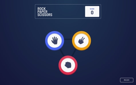
Hi Filip,
It is really good, and the animation is nicely done 👍
I would suggest a couple of refactoring/improvements that might clean the code a little bit and will point to the topic that might save you a day of debugging on another project.
Good to know:
-
In your code you have
setScore(score + 1);which should work as expected in this case but it is a safer way to do it using functional updatessetScore((prevScore) => prevScore + 1). In this case, you can removescorefrom props, and make it safer for async cases, which is very well explained in this article https://kentcdodds.com/blog/use-state-lazy-initialization-and-function-updates#dispatch-function-updates. Resource regarding functional updates https://reactjs.org/docs/hooks-reference.html#functional-updates. -
You might also consider useful this post that compares custom prop ref and ref using
forwardRefhttps://stackoverflow.com/questions/58578570/value-of-using-react-forwardref-vs-custom-ref-prop.
Refactoring/improvements:
-
In
Choosingcomponent you passsetIsChoosingwhich is used withhandleUserChoice, why not to movesetIsChoosing(false)tohandleUserChoice? -
In the
Choosingcomponent, if you update according to the previous suggestion, there is no need to havehandleClick; you can directly passhandleUserChoicetoButton. -
Three-button in
Choosingcomponent looks like a good candidate to generate them on the fly:
const icons = { paper: iconPaper, scissors: iconScissors, rock: iconRock, }; const choices = ['paper', 'scissors', 'rock']; function Choosing ... { ... choices.map((choice) => <Button image={icons[choice]} type={choice} handleClick={handleUserChoice} text={`${choice} button`} /> ) ... }- The icons list can be reused in the
Resultcomponent, which will make your code cleaner.
// instead of this image={ houseChoise === "paper" ? iconPaper : houseChoise === "rock" ? iconRock : iconScissors } // you can now write this image={icons[houseChoise]}-
For accessibility, add alt on the Rules close button.
-
Try to stick to one className format (score__text, house-btn, playAgainBtn) and do not use id for styling. Check this formatting rules http://getbem.com/introduction/.
-
I also noticed that when height is small, elements are on top of each other.
It is awesome that you added PWA support 🚀
I hope this will be helpful.
See you on the coding trail.
Marked as helpful -
- @nickcarlisi@antarya
Hi Nick,
Great start. It looks really good.
Regarding your question: you can fix it by removing the
overflow: hidden;on thebodytag. Also, usemin-heightinstead ofheightto allowbodyto grow when needed. The current solution withoverflow: hidden;disables the scrollbar when needed. Check the description of hidden https://developer.mozilla.org/en-US/docs/Web/CSS/overflow.Also a couple of suggestions:
-
You may skip
.hero-imgborder-radiuses if you addoverflow: hidden;to.cardclass. -
Check accessibility issues. It can be easily fixed by wrapping your content in the
maintag. https://learn-the-web.algonquindesign.ca/topics/html-semantics-cheat-sheet/ -
Minor differences compared to design - the background has a missing bottom wave and no shadow on the button.
I hope this will be helpful.
Keep up the good work!
-