@Sparkhand

Arun Kumar Singh
@arunsingh009All comments
- @arunsingh009
<html lang="en">This issue can be resolved by using one h1 tag in your design.Marked as helpful - @catherineisonline@arunsingh009
Box-shadow is missing and a few changes are required for font-weight I guess, otherwise your Overall solution is perfect.
Marked as helpful - @krtksharma@arunsingh009
@krtksharma I studied your code and found no such big issues in that your code is good but you can enhance it in your future challenges. All the best😊
Marked as helpful - @peterkariola@arunsingh009
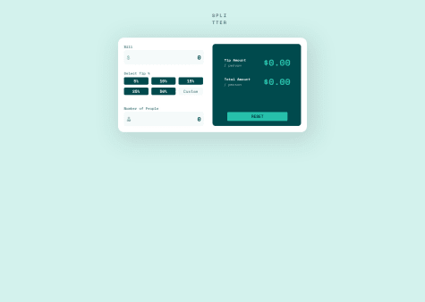
Ok, @PeterScope your design looks cool I also have tried the same challenge but was unable to put that dolor logo and person logo in the input field in my challenge. Now, coming to your problem of the total amount, for total amount logic is very easy. First, calculate the total amount of tip which has to be divided into the number of people then add it to the bill amount and then divide the total amount by a number of people.
For your reference. Suppose Bill amount is 100 and you are selecting 5% tip then the total tip amount will be equal to 5 and suppose 5 people are sharing the amount then,
- total amount = 105.
- total tip amount = 5
- tip/person=5/5=1
- total amount/person = 105/5=21.
I hope this explanation helps I tried my best to make things clear for you.
Marked as helpful - @Zaclobsterboy@arunsingh009
hey @Zaclobsterboy, nice attempt. try this, uncomment the HTML part for the image and try this in your CSS, I hope this will surely work in your case.
.column2{ background-color: purple; /*for eg */ }` .column2 img{ mix-blend-mode: multiply; }`Marked as helpful