


@majdiachour1
Latest solutions
📝 Todo App (MERN stack + Tanstack Query + Clerk)
#express#mongodb#react#tailwind-css#nodeSubmitted over 1 year ago🔖 Bookmark Landing Page (React + Tailwind + Framer Motion) 🚀
#accessibility#animation#framer-motion#react#tailwind-cssSubmitted over 1 year agoSpace tourism multi-page website (React + Tailwind + Framer Motion)
#react#tailwind-css#animationSubmitted over 1 year agoURL Shortening built with React, TailwindCSS, Vite
#react#tailwind-css#viteSubmitted almost 2 years ago
Latest comments
- @atmahana
Hi there, congrats on starting the journey on this field. For each summary category I would suggest to use flexbox for layouting. Here's how:
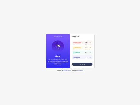
<div class="reaction"
  style="
          display: flex;
          justify-content: space-between;
          align-items: center
   ">
    <div style="display: flex;">
        <img src="URL">
        <p>Reaction</p>
    </div>
    <div>
        <div class="test-score"> 80 </div>
        <div class="test-percent"> / 100 </div>
    </div>
</div>
I divide the
reactionchildren into 2 main elements and usingdisplay: flexandjustify-content: space-betweenwe would get a horizontally align elements with a space in-between. You can learn more about flexbox here.Also, the icons is not showing up because you don't have it in the project repository. For typical scenario, we would create a folder called
publicorassetsfor storing images of any kind.- /root <- project root directory - /assets - /images <- store the images here - index.htmlThen you can use the image like this:
<img src="/assets/images/some-icon.svg">If you have any other questions, feel free to ask. I would be glad to help :)
- P@suryathink@atmahana
Hi there. I noticed that the container does not have the same height as the image hence why the extra portion you see when hovering on the image. The workaround I would try to fix this is as following:
.container { max-width: 250px; aspect-ratio: 1 / 1; overflow: hidden; } .child { width: 100% }-
max-width: 250px;: This property sets the maximum width of the .container element to 250 pixels. This means that the container will not exceed this width, even if the content inside it is wider. -
aspect-ratio: 1 / 1;: This CSS property sets the aspect ratio of the .container. An aspect ratio of 1/1 means that the container will have a square aspect ratio. This is achieved by making the height of the container equal to its width, which maintains a square shape. -
overflow: hidden;: This property hides any content that overflows the boundaries of the container. In this case, since the container is set to a fixed width and a square aspect ratio, if the content inside it is larger, it will be clipped and not visible. -
width: 100%;: This property sets the width of the .child element to 100% of its parent container's width. In this case, since the .container has a maximum width of 250 pixels, the child element will take up the full width of the container.
I hope this clears some things. Cheers mate.
Marked as helpful -
- @Bahbah89@atmahana
Hi there. Good job on finishing the project.
I'd suggest you to use the mobile-first approach. You can find this topic being discussed on Google and YouTube. Example below 👇
/* Write your mobile styling here */

@media (min-width: 640px) {
  /* Write your desktop styling here */
}
Also, since you initially specified a fixed width for the card, it won't adapt well to smaller screens. To make it responsive, consider replacing the fixed width with a max-width and set the width to 100%.
.card {
  max-width: 500px;
  width: 100%;
}
This approach ensures that the content adapts to different screen sizes and devices while providing a maximum width to prevent it from becoming excessively wide on larger screens. Hope this is helpful.
Marked as helpful - @TomasPereira-Dev@atmahana
Hello there. The
borderproperty will always take up space. Since you have defined the fixed width for theimgelement,borderwill take up space within the element's dimension.I would suggest using
outlineto fix the issue since outline is rendered outside the element's content and won't affect the layout.You can learn more about these two property here:
borderandoutlineI do also noticed that you are using
position: absoluteon thenotification-pictureclass but you already have these on the parent elementdisplay: flex; justify-content: space-between;If you want to adjust the position of the image, you can just use
marginorpaddinginstead of absolute positioning.Marked as helpful - @FrancisMbroh@atmahana
Hello there. To set different transition behaviour for different states, you can set its own transition property. See the following 👇
button:hover { background-color: hsla(224, 30%, 27%, 0.5); transition: background-color .4s ease-in-out; } button:active { background-color: red; transition: background-color .1s ease-in-out; } - @jvssvj@atmahana
Hi there.
To reduce the repetition I would suggest the following:
Iterate through all the tip selection
Create a same class so you you can select all of them using JavaScript
<input class="tip-percent" id="five" type="button" value="0.05"> // change tip value from using "%" to this
<input class="tip-percent" id="ten" type="button" value="0.1">
// the rest of the tip selection input
const tipsPercent = document.querySelectorAll(".tip-percent"); tipsPercent.forEach((tip) => { const tipValue = tip.value; // get the tip value from the input tip.addEventListener('click', () => { // the calculation goes here // you can use the value dynamically here let calculate = (billInput * tipValue) }) })If you want to further simplify you code you can implement encapsulations. You can find the topic on Google or YouTube. Hope this helps!
Marked as helpful