Not Found
Not Found
Not Found
Not Found
Not Found
Not Found
Not Found
Not Found
Not Found
Not Found
Not Found
Not Found
Not Found
Not Found
Not Found
Not Found
Not Found
Not Found
Not Found
Not Found

All comments

  • P

    @Miculino

    Submitted

    Hey guys! Hope you're having a great time here on Frontend Mentor!

    I'm back with another awesome Frontend Mentor challenge - the Project Tracking Intro Component.

    I always enjoy building these projects, but I enjoyed building this one even more because it was the first project in which I've used Svelte, Typescript, SCSS, GSAP, and Vite all in one place. All I can say is that I'm in awe at how fast the development has become thanks to Vite and it's really a powerful match coupled with Svelte.

    Since most of the project was mainly focused on the design and not any heavy data structures/logic, I'm naturally interested in the feedback regarding the SCSS I wrote for this project and what improvements I could make for the responsive design. I struggled in those regards mainly because of the background shape and devices illustration.

    Let me know what you guys think about the project.

    Thanks for taking the time to check out my project and see you in the next challenge! :)

    @ayoam

    Posted

    Well done! I found an issue , the navbar isn't showing in the desktop view , it works only mobile view .

    Marked as helpful

    0
  • @ayoam

    Posted

    Well done! to make it look like the original , adjust the width of image drawer container to something like 40% or 45% , and also change the color of the social preview popup triangle to match the color of it parent element in desktop view.

    hope this feedback helps.

    Marked as helpful

    0
  • @ayoam

    Posted

    Well done! it looks sick .
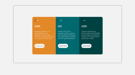
    1
  • Rohit 330

    @Rohitgour03

    Submitted

    Here is my solution to this challenge. 🔥 I am facing a problem that I have stopped the form from submitting using e.preventDefault() but when all the entries are correctly filled, the form is not submitted, what should I add so that it gets submitted after filling in the correct inputs and the form will then be completely empty to fill the entries again??? And what about other things on which I can improve ? Please provide your valuable suggestion. 🙏

    @ayoam

    Posted

    Hey , well done!

    to fix the issue , add a boolean variable that equals false after each setError(), then at the bottom of the function check if all input are valid then add form.submit().

    function validateInputs(){

        let allValid = true;
    
         if (firstNameValue.length === 0) {
    
                    setError(firstName, "First Name cannot be empty");
    
                    allValid = false;
    
    	     } else {
    
                    setSuccess(firstName)
    
    	}
    
    ...
    
    if(allVAlid==true){form.submit();}	
    

    }

    hope this feedback helps.

    Marked as helpful

    1
  • @ayoam

    Posted

    Well done! i found an issue , when i open all questions , i can only see first 3 of them , the rest disappears because of the hidden overflow .

    You can fix that by adjusting javascript so that when you open a question all other question should automatically close (you can check my solution), or you can make the questions container scrollable by adding "overflow-y: scroll" to it.

    hope this feedback helps.

    Marked as helpful

    0
  • @ayoam

    Posted

    Well done! in addition to @Remus432 feedback , the share preview is missing the triangle , you can create it by making the preview container relative and add ::after to it like this:

    .preview-conatiner{

    ...
    
    position :relative
    

    }

    .preview-conatiner::after {

      content: "";
    
      position: absolute;
    
      left: 50%;
    
      transform: translate(-50%, 0);
    
      width: 0;
    
      height: 0;
    
      border-left: 12px solid transparent;
    
      border-right: 12px solid transparent;
    
      border-top: 13px solid #48556a;
    

    }

    you can see the solution on my profile to understand it better.

    hope this feedback helps.

    Marked as helpful

    2
  • @ayoam

    Posted

    well done! it looks good , i found that your navbar items behave like text on hover , you can fix that by adding cursor:pointer to them.

    hope this feedback helps.

    Marked as helpful

    0
  • @ayoam

    Posted

    thank you mate , i appreciate your feedback :)

    0
  • @ayoam

    Posted

    thank you i appreciate it :)

    1
  • P
    David Turner 4,110

    @brodiewebdt

    Submitted

    I didn't do the changed state of the share button when active. I didn't want to spend the time using filters or changing the color of the arrow.svg. Any suggestions would be appreciated.

    Update: Fixed missing background color and incomplete Google font link info.

    @ayoam

    Posted

    if you are using <svg> tag , you can change it's color in css :

    svg path{fill:white}

    hope this feedback helps.

    Marked as helpful

    1
  • @ayoam

    Posted

    good job keep it going!

    0
  • @ayoam

    Posted

    you can tweak the js code so the autor div (.visible) doesn't disappear when clicking on share button on desktop view .

    hope this feedback helps.

    Marked as helpful

    1
  • @ayoam

    Posted

    if you are using <svg> tag , you can fill color in css :

    svg path{fill:$color}

    hope this feedback helps. Happy coding

    Marked as helpful

    0
  • chief 220

    @cujothechief

    Submitted

    this is my solution to the 3-column preview card challenge. feel free to point out any errors you see in my code. thank you! <3

    @ayoam

    Posted

    there is an issue with the shadow , remove box-shadow from #backgroud and add it to #cards , also just remove #backgroud div , use body in css instead.

    Marked as helpful

    0
  • @ayoam

    Posted

    you can make it work using flexbox :

    <div id="plan-container"> <!--here you put the music logo and text inside a container-> <!--here you put the change button> </div>

    #plan-container{ display:flex; flex-direction:row; justify-content:space-between; align-items:center; }

    0
  • iskrin 30

    @iskrin

    Submitted

    On the image with the solution previev, card seems to have 2 shadows, one bigger tahn another. Anybody has a solution fot that? box-shadow and filter: drop-shadow() seems not to work, because shadows are bigger than the card itself.

    @ayoam

    Posted

    to get this effect you can comma-separate shadows : box-shadow: 0px 0px 17px 8px rgba(254,255,86,0.61), 0px 0px 17px 19px rgba(0,0,0,0.61);

    1