Skip to content
  • Unlock Pro
  • Log in with GitHub
Profile
OverviewSolutions
2
Comments
5

Brett

@blpetersPlano, TX80 points

I’m a mysterious individual who has yet to fill out my bio. One thing’s for certain: I love writing front-end code!

I’m currently learning...

CSS, JavaScript

Latest solutions

  • Responsive stat card with flexbox and media queries


    Brett•80
    Submitted almost 4 years ago

    2 comments
  • Order Summary Card with only basic html and CSS


    Brett•80
    Submitted almost 4 years ago

    1 comment

Latest comments

  • Jp•40
    @yohannesburp
    Submitted almost 4 years ago

    3-column preview card component using flexbox

    1
    Brett•80
    @blpeters
    Posted almost 4 years ago

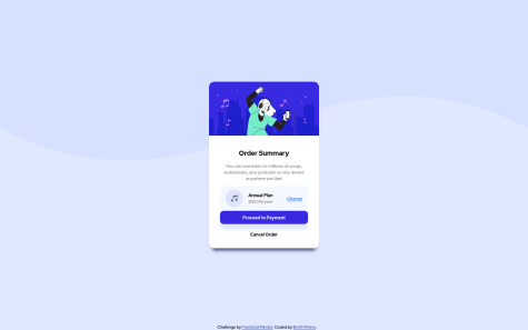
    Hey - The visuals look perfect, great job. I would think about adjusting your media query pixel cutoffs. Unless I zoomed out in the browser, I was unable to see the desktop version on my medium-sized laptop screen, which is around 1200px wide. Also, If I change the screen to less than 375px, it reverts back to a horizontal layout that is not optimal for a mobile screen.

    Marked as helpful
  • Marvin Ngugi•200
    @phoenix-mkay
    Submitted almost 4 years ago

    Responsive Page built with HTML CSS flex and Sass

    1
    Brett•80
    @blpeters
    Posted almost 4 years ago

    Great job - the spacing on all the content looks really nice. The only things I would note: -The card is showing up too tall on my desktop fullscreen browser view. I had to zoom out on the browser view to see the entire thing. -Missing a border radius on the bottom two corners - You can add that to the .text-content section. -I would add box-shadow to the .blue-btn and .center-content classes to add some depth to the card.

    Marked as helpful
  • Naveen kumar A M•95
    @naveen570
    Submitted almost 4 years ago

    used flexbox for responsive layout and grid for centering items

    1
    Brett•80
    @blpeters
    Posted almost 4 years ago

    I really love the transition animation on the accordion and the fact that it matches up with the arrow turning to flip upside down - that looks really good.

    I did have some issues with my display on Firefox and Chrome where the card is extending too far past the bottom of the purple container background. I had to zoom out to 80% to get the display correct, so you may want to look at those settings.

    Marked as helpful
  • Pablo Páez•30
    @Bestobuddo
    Submitted almost 4 years ago

    3-column card component challenge hub with responsive design

    2
    Brett•80
    @blpeters
    Posted almost 4 years ago

    Great looking solution! I was testing out the responsiveness for the mobile version in Firefox, and I noticed that the media query cutoff of (max-width: 375px) was too low to trigger the mobile versions for many mobile phone screens. I would suggest possibly adjusting the max-width in the media query to work for a larger number of devices.

  • mcclellangg•30
    @mcclellangg
    Submitted almost 4 years ago

    Profile card using HTML and CSS

    2
    Brett•80
    @blpeters
    Posted almost 4 years ago

    It looks like you may need to apply a background-color to your .main class in CSS. This should add a solid layer of color on top of the .svg image on the background and should "darken" the background. The correct color should be listed in the style guide. I hope this helps

Stay up to datewith new challenges, featured solutions, selected articles, and our latest news

Frontend Mentor

  • Unlock Pro
  • Contact us
  • FAQs
  • Become a partner

Explore

  • Learning paths
  • Challenges
  • Solutions
  • Articles

Community

  • Discord
  • Guidelines

For companies

  • Hire developers
  • Train developers
© Frontend Mentor 2019 - 2025
  • Terms
  • Cookie Policy
  • Privacy Policy
  • License

Oops! 😬

You need to be logged in before you can do that.

Log in with GitHub

Oops! 😬

You need to be logged in before you can do that.

Log in with GitHub

Oops! 😬

You need to be logged in before you can do that.

Log in with GitHub

Oops! 😬

You need to be logged in before you can do that.

Log in with GitHub

Oops! 😬

You need to be logged in before you can do that.

Log in with GitHub

Oops! 😬

You need to be logged in before you can do that.

Log in with GitHub

Oops! 😬

You need to be logged in before you can do that.

Log in with GitHub

Oops! 😬

You need to be logged in before you can do that.

Log in with GitHub

Oops! 😬

You need to be logged in before you can do that.

Log in with GitHub

Oops! 😬

You need to be logged in before you can do that.

Log in with GitHub

Oops! 😬

You need to be logged in before you can do that.

Log in with GitHub

Oops! 😬

You need to be logged in before you can do that.

Log in with GitHub

Oops! 😬

You need to be logged in before you can do that.

Log in with GitHub

Oops! 😬

You need to be logged in before you can do that.

Log in with GitHub

Oops! 😬

You need to be logged in before you can do that.

Log in with GitHub

Oops! 😬

You need to be logged in before you can do that.

Log in with GitHub

Oops! 😬

You need to be logged in before you can do that.

Log in with GitHub

Oops! 😬

You need to be logged in before you can do that.

Log in with GitHub

Oops! 😬

You need to be logged in before you can do that.

Log in with GitHub

Oops! 😬

You need to be logged in before you can do that.

Log in with GitHub