@nowshadjaman21
What challenges did you encounter, and how did you overcome them?
fixing height seems challenging to me

fixing height seems challenging to me
Hi @nowshadjaman21, good job for this one. However I think you should check the style-guide.md so that you can build more precise with the design.
Also it's a good trick for me to know that tailwind can use from cdn. thanks.
Have a good day!
Hi @ShakilMaria, I think everything is fine. But I have a few suggestions.
My Suggestions and Feedback
your qr code project is not found, I can't review it
Hello Alfi, Good job on this one!
I think you should take a look at your media query and remove (min-width: 375px ) so it will behave one column on mobile whatever the device's width and will behave one row on desktop
Good effort Abraham. I think you should change height properties of .container from 150vh to 100vh and position: auto to position: relative. Then try to change bottom or left properties from bg-ballon-bottom. It should help
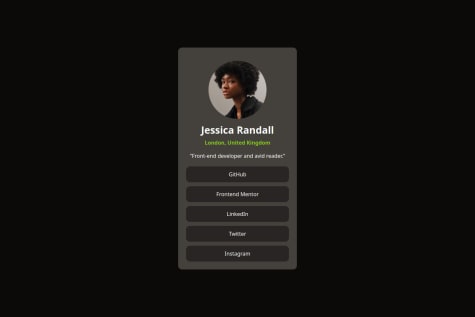
Good work Vincent. I've check your solution, it seems like because of bottom circle overflowing so the profile card position is on the left of screen and unfortunately I don't know how to fix that, sorry. But I want to recommend you to using bg-pattern-top, bg-pattern-bottom and bg-pattern-card as backgrounds instead of images so they will not overflowing from their element. There are many background properties like background-image, background-size, background-attachment, background-position that can be useful to make them more responsive. You can check my solution here and give a feedback too. Keep Coding!
Great work Afolabi. I think your HTML structure is easier to read and your CSS is more efficient than mine. Also, you should check the font color in the style-guide.md so your solution can be looking as close to the design. I learn a few things from your solution, thank you again. And can I approach you in slack? so we can learn together if you interest please kindly reply to this feedback