@Chiku100

Davide Di Francesco
@davdifrAll comments
- @davdifr
Hey, great job, it works well and the template perfectly reflects the preset goal.
The only thing, which is probably just a mistake, is that the sentences should have text-align center. Basically it's really simple for you to fix!
Otherwise, nothing to say! Happy coding!
- @lwrncgmbn@davdifr
The work is well done and is very similar to the preview, congratulations! The only thing I would suggest adding is a slight shadow to the card, which is present in the example template. I am confident that with your skills it will not be difficult to complete this step as well! Best regards.
- @dhan5a@davdifr
Hey, nice job!
First, I would like to tell you that you used the declarations in :root correctly, but then you didn't use them. Personally, I don't understand why. To use white for example, you just need to use var(--white) where necessary.
In addition, as you can see, the platform suggests using alt in images, for example: <img src="background.png" alt="background">.
These improvements are very simple and I'm sure that with your skills they won't be a problem!
Otherwise, the work is well done!
Marked as helpful - @for-dev9@davdifr
Hey, first of all, great job! Your work is very similar to the original!
I have two tips for you:
- For the border-radius of the card, use a pixel size, in this case 10 should be enough. As you can see from your result, the edges have a "strange" shape because you used a % size that is usually used to obtain a circle if you have a div with equal height and width.
- As you can see from the preview image, there is a slight shadow behind the card, it should not be difficult with your skills to add it without problems!
That said, once again great job and good coding!
Marked as helpful - @GustavoSDS@davdifr
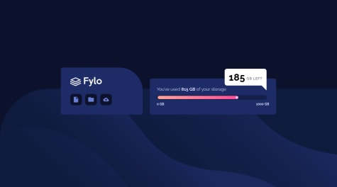
Hi! First of all, great job! There are no differences in the comparison slide and this is fantastic!
There are two things that I think you could easily fix with your skill:
- The background should be placed in the bottom right instead of floating in full screen;
- "185" and "GB LEFT" should be centered.
Nothing else to add! Keep up the good work!
Marked as helpful - @davdifr@davdifr
Icon issue fixed.
- @RibeiroPorto@davdifr
Good job! I really appreciate your organisation in the project folder. And your solution for the view part! Nothing to say here 🔥
Maybe you should just find a way to make the hr view fit the preview... But this is just a small point!
- @zouvier@davdifr
Hello! First of all good job 🥳
Then I would like to point out to you that the color of the h1 does not meet the requirements (you should use the dark blue specified in the style file), and the padding of the card should be a little bigger!
In my opinion, you have achieved the goal well, and this small correction will be easy for you. Have a nice day!
An other hint, to fix this: `All page content should be contained by landmarks
<div class="card">` change div into main tag 👍Marked as helpful