Skip to content
  • Unlock Pro
  • Log in with GitHub
Profile
OverviewSolutions
7
Comments
8
P
David Blackman
@defenstration

All comments

  • thaArcadeGuy•120
    @thaArcadeGuy
    Submitted 12 months ago
    What are you most proud of, and what would you do differently next time?

    I am proud of my growth with every challenge that I take on.

    What challenges did you encounter, and how did you overcome them?

    I did struggle with making the site responsive but through watching tutorials and researching I was able to get to the solution.

    What specific areas of your project would you like help with?

    Any feed back on standard HTML and CSS best practices.

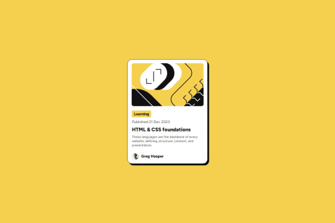
    Product preview card using CSS Grid

    2
    P
    David Blackman•140
    @defenstration
    Posted 6 months ago

    Wow, well done. I had to look up BEM to learn about your class names. I hadn't seen that done before, but I really like it. It makes it easy to see how your elements flow, and I could see it being very helpful when working with a bunch of style classes. Your HTML is well done semantically as well.

    The only thing I see that I would do different is in the CSS. I don't like having two selectors for the body as I think it makes it easier to miss something when reviewing code. That's completely a personal bias on my part though.

    Excellent job and stay awesome!

    Marked as helpful
  • ramiadi•190
    @ramiadi
    Submitted 11 months ago
    What are you most proud of, and what would you do differently next time?

    I did all of this alone even though it was hard to fix the github etc.. I managed to learn github and make a new website! Now i have learnt how to make a live-url!

    What challenges did you encounter, and how did you overcome them?

    To be fair i used a website called Flexbox Froggy. I had a problem with layouts, especially putting the layouts in the middle of the website. With the help of Flexbox Froggy, it went good!

    What specific areas of your project would you like help with?

    Im a new student taking a bachelor degree in technology. This is my first time making a website. I have few question to whoever who reads this message:

    1. is the structure good? is it easy to see and understand?
    2. do you have any recommendations to start making a website? i kinda got off on the start.
    3. where did i do bad? can you point everything out so that i can learn.
      Thank you!

    Im a newbie

    1
    P
    David Blackman•140
    @defenstration
    Posted 11 months ago

    Hi @ramiadi,

    I think you made a good rough draft, and just need to add some finishing touches.

    Just looking at the comparison, your sizing is a bit off and you should check your colors on the font. Mostly it's just playing with the padding.

    Going into your code, the first thing I would challenge you to do is to get comfortable using a css stylesheet. It is a best practice to separate out your styling to CSS. There is a concept called separation of concerns about having your HTML be the structure, CSS be styling, and JS be function. It's a good way to look at things as you are learning.

    You have an 'alt' on your image! Awesome! I totally forgot to do that for my first few projects. It's a key part of accessibility. Another part is using semantic HTML, and you are using HTML tags pretty well. The next step is to make sure you use header, footer, and main tags to organize the body of your code. Headers and footers are optional, but you should have a main (only 1) that contains the "main" part of your page.

    Don't be afraid to use header tags. I think you could improve the contents of your card by changing up your structure a bit. The first line "Improve your..." could be a "heading", with the paragraph following it being the "content". Having that heading as an h1 would also give screen readers a place to start.

    Quick tip - when you start adding these you can use grid to move the attribution to the bottom of the page easily. grid-template-columns: auto 1fr on your body if you only have a main and footer.

    Nothing you did was "bad." The whole point is to learn, which is what you are doing. As far as how to start building a site, I can only share my process. With these challenges I:

    • Setup a Github repo and clone into it on VS Code
    • Download the challenge and extract it into the cloned folder
    • Read through the readme, check the preview, and set up the sheets. I always add a styles.css and script.js (if needed)
    • I step back and start looking at the components and develop a plan for what classes I'll need, what tags I'll use, how to structure them, and what layout tools I use. I try to come up with a plan to tackle the project with and I write that on paper. I find this to be the most important part of the project
    • Structure the HTML and CSS
    • Start styling!

    All of this said, I am still learning too. I hope some of this helps. Stay awesome!

  • Omar Rafat•40
    @OmarRafat975
    Submitted 11 months ago
    What are you most proud of, and what would you do differently next time?

    learning how to deal with background images and proud that I didn't see any video or tutorial to help me out

    What challenges did you encounter, and how did you overcome them?

    how to CSS a photo in the SVG extension

    What specific areas of your project would you like help with?

    Focus more on CSS and Train more

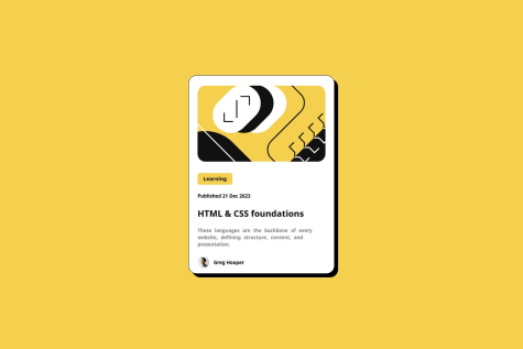
    Blog preview card

    3
    P
    David Blackman•140
    @defenstration
    Posted 11 months ago

    Hi Omar,

    Your blog preview card looks pretty good. There's only some minor differences in size and the typography on your date.

    There are a few things in your code you may want to look at. In your HTML, it's a good idea to use the HTML tags to maintain semantic HTML. You have a div class img and used a background URL, which has it's place in dynamic designs but isn't great for screen readers. Similarly, I don't see a main tag, which is also an accessibility thing.

    In your css, I like that you have the beginnings of a reset. After starting to use one myself, I have really liked how easy it made it. I might caution you against using the * selector for it, as it can do some funky stuff when your projects get bigger.

    Another thing to keep in mind when looking at larger projects is the size of your selectors. There is quite a bit going on in your selectors, and that can get difficult to manage on more complex projects. A lot of the content I look at is moving toward smaller, modular classes. Take a look at bootstrap and tailwind and you will see how they use selectors.

    Longer post than I meant it to be! You did a great job, stay awesome!

    Marked as helpful
  • P
    Michał•290
    @miedzygalaktycznygit
    Submitted 11 months ago
    What are you most proud of, and what would you do differently next time?

    I am mostly proud of my website because I manage to position every element in correct place

    What challenges did you encounter, and how did you overcome them?

    Positioning was the biggest challenge and i was just trying multiple times to find a solution

    What specific areas of your project would you like help with?

    I dont know if my method of positioning things like divs and text is correct because i mostly use padding to achieve height and then I am trying to move it left and right with centerings or text-align and this is only method that i know and it worked on my website

    html/css and i use rems to position elements

    3
    P
    David Blackman•140
    @defenstration
    Posted 11 months ago

    Your preview card looks pretty good. There are some small sizing differences, but overall it's close.

    There are some things in the code that you might want to look at.

    First, you want to get used to dropping your styling into a css file. It just makes it easier to review your code.

    It's awesome that you are focusing on using reactive units! I have not seen them used the way that you are using them. In my understanding the typical rem is 16px. When you use tenths of an rem you get some strange fractions. .1rem is 1.6px. I don't know what kind of effect that has, but I have always used eights to do rem, where .125rem = 2px. Maybe someone on here with more knowledge can speak to the effects.

    There are also some semantic HTML elements that I would look at. I use headings like the contents section in a book. H1 as the book title (this is also what screen readers look for to start the page), with h2 being the next level (sections) then h3 next (chapters) and so on. I'm still tweaking how I do this, but starting to think about them that way helped me start organizing my thought better about building.

    I hope this helps. Stay awesome!

    Marked as helpful
  • Nguyen Duc Tan•380
    @tannguyenk3
    Submitted about 1 year ago

    Css grid, responsive

    1
    P
    David Blackman•140
    @defenstration
    Posted about 1 year ago

    It looks pretty good. The only issues I see are with the color in your prep section and some minor spacing issues that make some text look a bit muddled. Pretty minor stuff.

    Keep up the good work and have fun!

  • Journey-Grinder•150
    @Journey-Grinder
    Submitted about 1 year ago

    CSS flex box , Positioning

    1
    P
    David Blackman•140
    @defenstration
    Posted about 1 year ago

    Your project looks great. I like that you added your own personal touches.

    You didn't use the flagposts (h1, main, etc) in your code. When you submitted did it give you an error?

    Good work and have fun on your next project?

  • Mateusz•440
    @MatPawluk
    Submitted about 1 year ago

    HTML and CSS

    1
    P
    David Blackman•140
    @defenstration
    Posted about 1 year ago

    Your solution looks great.

    I saw that you used a margin utility class. I hadn't thought of that, but it's a great idea for a layout like this.

    Is there a reason for using <div class = "main"> instead of <main>?

    Keep up the good work and have fun!

  • Memon Mohammed Rafiq•10
    @MohammadMemon
    Submitted about 1 year ago

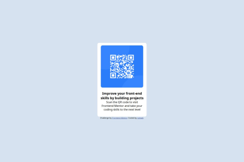
    QR Code clone using Flexbox

    1
    P
    David Blackman•140
    @defenstration
    Posted about 1 year ago

    @MohammadMemon

    Your project looks good. There is a little less whitespace than the original design, but otherwise good work.

    Would having the h1 following another element, the img, cause anything funny to happen with screen readers? I'm new to designing for them, so I'm not sure of the nuances, but I thought a lot of them skipped straight to the h1 when reading the page.

    Keep up the good work and have fun!

Stay up to datewith new challenges, featured solutions, selected articles, and our latest news

Frontend Mentor

  • Unlock Pro
  • Contact us
  • FAQs
  • Become a partner

Explore

  • Learning paths
  • Challenges
  • Solutions
  • Articles

Community

  • Discord
  • Guidelines

For companies

  • Hire developers
  • Train developers
© Frontend Mentor 2019 - 2025
  • Terms
  • Cookie Policy
  • Privacy Policy
  • License

Oops! 😬

You need to be logged in before you can do that.

Log in with GitHub

Oops! 😬

You need to be logged in before you can do that.

Log in with GitHub

Oops! 😬

You need to be logged in before you can do that.

Log in with GitHub

Oops! 😬

You need to be logged in before you can do that.

Log in with GitHub

Oops! 😬

You need to be logged in before you can do that.

Log in with GitHub

Oops! 😬

You need to be logged in before you can do that.

Log in with GitHub

Oops! 😬

You need to be logged in before you can do that.

Log in with GitHub

Oops! 😬

You need to be logged in before you can do that.

Log in with GitHub

Oops! 😬

You need to be logged in before you can do that.

Log in with GitHub

Oops! 😬

You need to be logged in before you can do that.

Log in with GitHub

Oops! 😬

You need to be logged in before you can do that.

Log in with GitHub

Oops! 😬

You need to be logged in before you can do that.

Log in with GitHub

Oops! 😬

You need to be logged in before you can do that.

Log in with GitHub

Oops! 😬

You need to be logged in before you can do that.

Log in with GitHub

Oops! 😬

You need to be logged in before you can do that.

Log in with GitHub

Oops! 😬

You need to be logged in before you can do that.

Log in with GitHub

Oops! 😬

You need to be logged in before you can do that.

Log in with GitHub

Oops! 😬

You need to be logged in before you can do that.

Log in with GitHub

Oops! 😬

You need to be logged in before you can do that.

Log in with GitHub

Oops! 😬

You need to be logged in before you can do that.

Log in with GitHub

Oops! 😬

You need to be logged in before you can do that.

Log in with GitHub

Oops! 😬

You need to be logged in before you can do that.

Log in with GitHub

Oops! 😬

You need to be logged in before you can do that.

Log in with GitHub

Oops! 😬

You need to be logged in before you can do that.

Log in with GitHub

Oops! 😬

You need to be logged in before you can do that.

Log in with GitHub