Skip to content
  • Unlock Pro
  • Log in with GitHub
Profile
OverviewSolutions
14
Comments
14
dolapobj
@dolapobj

All comments

  • Ejiofor John•490
    @echocode1
    Submitted 12 months ago
    What are you most proud of, and what would you do differently next time?

    i completted it thought with alot of flaws.

    What challenges did you encounter, and how did you overcome them?

    simplifying and writing reusable code . writting lesser javascript code.witting a lesser code has always been my plan before any project but trying to bring functionality to the arrow up and down was not difficult but space consuming and i would have love learning an even more shorter reusable code.

    What specific areas of your project would you like help with?

    please practical input is welcome on how to write simple reusable code. aside input and review are welcome on this challenge as it is my first attempt

    contact-form main

    2
    dolapobj•310
    @dolapobj
    Posted 12 months ago

    Design looks great, you nailed it.

    Looking at your JS some suggestions

    1. Use a CSS class for changing the color/border when displaying error messages. You can add this class to the element.
    2. Although it is clear (because I just completed my version of the project) it might be helpful to break your appendForm function down with helper functions that validate each section.
    Marked as helpful
  • jenniferyusiaa•50
    @jenniferyusiaa
    Submitted over 1 year ago

    FAQ accordion (react.js framework)

    #react#sass/scss
    1
    dolapobj•310
    @dolapobj
    Posted about 1 year ago

    Looks good. Only suggestion would be to add the dividers in the design using the <hr> element.

    Unfortunately, I have not yet learned React, so I can not give any suggestions on the code.

  • Brad King•80
    @Bradpresleyk
    Submitted about 1 year ago

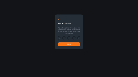
    Interactive-Rating-Component

    #sass/scss
    1
    dolapobj•310
    @dolapobj
    Posted about 1 year ago

    Well done, looks great! A few tips:

    1. Instead of writing out event listeners for each button, like this:
    numberOne.addEventListener("click",function(){
        selected = this.value;
        numberTwo.style.backgroundColor = "hsl(213, 19%, 18%)";
        numberThree.style.backgroundColor = "hsl(213, 19%, 18%)";
        numberFour.style.backgroundColor = "hsl(213, 19%, 18%)";
        numberFive.style.backgroundColor = "hsl(213, 19%, 18%)";
        this.style.backgroundColor = "hsl(217, 12%, 63%)";
        
    })
    
    numberTwo.addEventListener("click",function(){
        selected = this.value;
        numberOne.style.backgroundColor = "hsl(213, 19%, 18%)";
        numberThree.style.backgroundColor = "hsl(213, 19%, 18%)";
        numberFour.style.backgroundColor = "hsl(213, 19%, 18%)";
        numberFive.style.backgroundColor = "hsl(213, 19%, 18%)";
        this.style.backgroundColor = "hsl(217, 12%, 63%)";
    })
    

    you could instead apply a single function to all the buttons at once. This would handle changing the colors. For example, I had a class in my CSS that was "clicked". I had an event listener that I applied to all buttons, that applied an styleButton function, which added the "clicked" class to the selected button, and removed it from all other buttons. This way, you can make the code more reusable. Hope this helps!

    Marked as helpful
  • Murilo Matt•200
    @MuliroMatt
    Submitted about 1 year ago
    What are you most proud of, and what would you do differently next time?

    I'm proud that I created more functions

    What challenges did you encounter, and how did you overcome them?

    I didn't encouter any challenge

    What specific areas of your project would you like help with?

    I'm up to any suggestions

    Tip Calculator using SASS and JS

    #sass/scss
    1
    dolapobj•310
    @dolapobj
    Posted about 1 year ago

    Honestly, not much feedback to give. Your HTML is very clean, and you use semantics and reusable classes well.

    In terms of your Javascript, it is very well organized, and I like how you had separate sections for event listeners, functions, variables etc. It is very easy to follow.

    You use clear naming conventions, the code is organized logically, you use modular functions, and use validations and format checking.

    Awesome job!

    Marked as helpful
  • ijohnst•230
    @ijohnst
    Submitted about 1 year ago
    What are you most proud of, and what would you do differently next time?

    Getting this done. It started easy but then I ran into a bunch of challenges with the desktop design and some of the JS -- but I got through it all. I also learned some new JS things and about the HTML `` tag which I found handy for this project

    What challenges did you encounter, and how did you overcome them?

    I overcomplicated how to create the background and images above the card. A little internet research fixed the problem for me.

    What specific areas of your project would you like help with?

    I think I understand why frameworks make things easier. Doing this vanilla took a bit of work but I got there. Really the only thing I need help with is simplifying things in the future especially with the JS

    Time Tracking Dashboard - Vanilla HTML/CSS/JS

    2
    dolapobj•310
    @dolapobj
    Posted about 1 year ago

    I really like how you used the <template> tag to dynamically render the different cards. I used a different approach and had to write out all the HTML for each card in my js script.

    The only thing that really stood out to me to be improved is in how you define your grid.

    @media screen and (min-width: 56em) { .grid-container { grid-template-columns: repeat(4, minmax(0,1fr)); grid-template-rows: repeat(2, 1fr); grid-template-areas: "profile work play study" "profile work play study" "profile exercise social self-care"; } }

    Here you define two rows but in the template you have three? I think it was just a small typo.

    Othwerwise, incredible job! Well done!

    Marked as helpful
  • Maximilian Dybvik•200
    @RegexRiddler
    Submitted about 1 year ago
    What are you most proud of, and what would you do differently next time?

    I'm pleased with the outcome, and how close it it is to the design.

    What challenges did you encounter, and how did you overcome them?

    Setting a background color on the input field seems to place the background over the placeholder text. Had to make background color somewhat transparent instead.

    When adding the error class to my input field based on validation outcome, the field still inherited border color so I had to use !important, which I would prefer not to do.

    .error {
      border-color: var(--tomato) !important;
      background-color: var(--tomato-transparent);
      color: var(--tomato);
    
      &:active, &:focus, &:target {
        border: 1.5px solid var(--dark-slate-grey) !important;
      }
    
      &::placeholder {
        color: var(--tomato);
        opacity: 1;
      }
    }
    
    What specific areas of your project would you like help with?

    Any feedback is appreciated 😁

    I added "autocomplete="email" autofocus" to my input field and I am not sure if this is bad practice, both for security reasons and for accessibility.

    Secondly, whenever you type in an invalid email and try to submit, the button state gets "stuck" as active or focused, and I dont know how to prevent this.

    Newsletter Sign-Up

    #sass/scss
    1
    dolapobj•310
    @dolapobj
    Posted about 1 year ago

    Hi Maximilian. Thank you for your solution -- it looks great! Actually, looking through your code, is really inspiring me as someone who is just getting started in front-end dev. You also have a great eye for following the designs, which makes me want to follow them more precisely for my next project.

    Specifically, I like how you:

    • used the aside HTML tag for the success element
    • separated your Sass styling by color, typography,
    • used the destyle stylesheet for a clean reset

    I couldn't follow all the Sass notation as it seems quite, intricate, but your code is clearly commented and easy to follow. Your semantic HTML was also cleaner than mine -- I realize I had redundant containers. I will try to emulate your approach going forward.

  • Manu Joseph Shaji•430
    @ManuJosephShaji-project
    Submitted about 1 year ago

    article-preview-component-master

    1
    dolapobj•310
    @dolapobj
    Posted about 1 year ago

    Nice use of ::aafter decorators and you did a really good job of keeping your HTML clean as well as your CSS.

  • Niloy Das•250
    @NiloyDas07
    Submitted about 1 year ago
    What are you most proud of, and what would you do differently next time?

    I got comfortable with grid and will be able to use it much easier in the future.

    What challenges did you encounter, and how did you overcome them?

    It was simple.

    What specific areas of your project would you like help with?

    Can someone please check if I used the BEM methodology properly for my class names?

    Mobile First | Grid | Flexbox

    1
    dolapobj•310
    @dolapobj
    Posted about 1 year ago

    It looks like you have several sections for "body" in your CSS. You could consolidate this into just one scope.

    I really liked the way you used multiple utility classes. That makes your code much more modular, well done!

    And your BEM notation looks good. Nice!

    Marked as helpful
  • RehanKhaz•100
    @RehanKhaz
    Submitted about 1 year ago
    What are you most proud of, and what would you do differently next time?

    I am proud that completed this project with easiest code and it is also very good responsive.

    What challenges did you encounter, and how did you overcome them?

    About responsiveness but it overcome them easily.

    What specific areas of your project would you like help with?

    if someone know something easy that i do with complexity then feel free for feedback . Thanks

    Responsive Four card feature page using flex box

    1
    dolapobj•310
    @dolapobj
    Posted about 1 year ago

    Looks really good. I liked how you used a flex group for the team builder and karma cards, and then just used 3 columns. I did a different approach using grid, but I believe your solution is more simple. Looks great!

  • davidmoreau2•140
    @davidmoreau2
    Submitted about 1 year ago
    What are you most proud of, and what would you do differently next time?

    Figuring out all the media queries on my own through google searches and not looking at code that someone else has made for the same thing. also putting the prices into their own div and using flexbox to align them to eachother

    What challenges did you encounter, and how did you overcome them?

    how to get the image to switch on which size screen it was on. Also where exactly the cut off points for that would be.

    What specific areas of your project would you like help with?

    all of it. cleaning up my code

    product card page

    1
    dolapobj•310
    @dolapobj
    Posted about 1 year ago

    The link (https://github.com/davidmoreau2/product-preview-card-component-main) to access the code doesn't work. From the design though looks great! Well done 👏🏾

  • P
    Franklin Gomez•180
    @frankgomezdev
    Submitted over 1 year ago
    What are you most proud of, and what would you do differently next time?

    Not proud of much, very easy challenge. Wouldn't do anything differently.

    What challenges did you encounter, and how did you overcome them?

    Figuring out how to style the bullets, numbers on the unordered and ordered list. MDN docs helped me out.

    What specific areas of your project would you like help with?

    No specific areas. All feedback is welcome.

    Recipe page using Flexbox

    1
    dolapobj•310
    @dolapobj
    Posted over 1 year ago

    My only recommendation is to use more semantic HTML to make it easier for the browser and other developers to understand the structure of the page. For example, instead of using "divs" you could use a header for the introductory section, and then sections for each of the remaining sections. This would make the HTML layout of the page more understandable.

    Marked as helpful
  • Ardian Setiawan•140
    @ardians45
    Submitted over 1 year ago

    Frontend Mentor - Social links profile

    1
    dolapobj•310
    @dolapobj
    Posted over 1 year ago

    It looks really good! I like how you included hover functionality and the animation as well when hovering over the images and the text. One thing you might consider is using BEM notation to style your CSS.

    BEM (Block Element Modifier) is a methodology and naming convention for writing CSS in a way that makes CSS classes more readable, scalable, and easier to understand.

    The BEM syntax is straightforward: .block__element--modifier, where block is the name of the component, element is a child of the block that helps form the block as a whole, and modifier is a variant of the block or element. This structured approach helps in maintaining large codebases by reducing CSS specificity issues,

  • P
    FPPalmero•40
    @FPPalmero
    Submitted over 1 year ago
    What are you most proud of, and what would you do differently next time?

    I'm proud to have started from 0 a short time ago and realized that I'm improving every day.

    What challenges did you encounter, and how did you overcome them?

    is always being a challenge to make a responsive layout

    What specific areas of your project would you like help with?

    Needing to learn more about responsive using grid

    responsive landing page

    2
    dolapobj•310
    @dolapobj
    Posted over 1 year ago

    Really great work. Reviewing your code and comparing it to my solution I learned two things.

    One is to use the <span> HTML element for decorating a piece of text inline, and also using media queries to specific styles to elements on the page when the viewport width is a certain width. I didn't do this for my solution and will begin using them from here on out.

    I don't really have any suggestions other than to perhaps consider using SASS/SCSS to build CSS files. I've been using it because it allows you to define global variables that will then be used in the rest of your CSS file.

  • NatyAmare21•10
    @NatyAmare21
    Submitted over 1 year ago
    What are you most proud of, and what would you do differently next time?

    I am working on the QR code Project and working on HTML page I was trying to solve using the web

    What challenges did you encounter, and how did you overcome them?

    the CSS part of Media Control

    What specific areas of your project would you like help with?

    Part of Display

    QR Code Project

    1
    dolapobj•310
    @dolapobj
    Posted over 1 year ago

    Looks good, only thing I would recommend is using a stylesheet. Also, play around with fonts to see if you can better match the design. Nice job!

Frontend Mentor logo

Stay up to datewith new challenges, featured solutions, selected articles, and our latest news

Frontend Mentor

  • Unlock Pro
  • Contact us
  • FAQs
  • Become a partner

Explore

  • Learning paths
  • Challenges
  • Solutions
  • Articles

Community

  • Discord
  • Guidelines

For companies

  • Hire developers
  • Train developers
© Frontend Mentor 2019 - 2025
  • Terms
  • Cookie Policy
  • Privacy Policy
  • License

Oops! 😬

You need to be logged in before you can do that.

Log in with GitHub

Oops! 😬

You need to be logged in before you can do that.

Log in with GitHub

Oops! 😬

You need to be logged in before you can do that.

Log in with GitHub

Oops! 😬

You need to be logged in before you can do that.

Log in with GitHub

Oops! 😬

You need to be logged in before you can do that.

Log in with GitHub

Oops! 😬

You need to be logged in before you can do that.

Log in with GitHub

Oops! 😬

You need to be logged in before you can do that.

Log in with GitHub

Oops! 😬

You need to be logged in before you can do that.

Log in with GitHub

Oops! 😬

You need to be logged in before you can do that.

Log in with GitHub

Oops! 😬

You need to be logged in before you can do that.

Log in with GitHub

Oops! 😬

You need to be logged in before you can do that.

Log in with GitHub

Oops! 😬

You need to be logged in before you can do that.

Log in with GitHub

Oops! 😬

You need to be logged in before you can do that.

Log in with GitHub

Oops! 😬

You need to be logged in before you can do that.

Log in with GitHub

Oops! 😬

You need to be logged in before you can do that.

Log in with GitHub

Oops! 😬

You need to be logged in before you can do that.

Log in with GitHub

Oops! 😬

You need to be logged in before you can do that.

Log in with GitHub

Oops! 😬

You need to be logged in before you can do that.

Log in with GitHub

Oops! 😬

You need to be logged in before you can do that.

Log in with GitHub

Oops! 😬

You need to be logged in before you can do that.

Log in with GitHub

Oops! 😬

You need to be logged in before you can do that.

Log in with GitHub

Oops! 😬

You need to be logged in before you can do that.

Log in with GitHub

Oops! 😬

You need to be logged in before you can do that.

Log in with GitHub

Oops! 😬

You need to be logged in before you can do that.

Log in with GitHub

Oops! 😬

You need to be logged in before you can do that.

Log in with GitHub

Oops! 😬

You need to be logged in before you can do that.

Log in with GitHub

Oops! 😬

You need to be logged in before you can do that.

Log in with GitHub

Oops! 😬

You need to be logged in before you can do that.

Log in with GitHub

Oops! 😬

You need to be logged in before you can do that.

Log in with GitHub

Oops! 😬

You need to be logged in before you can do that.

Log in with GitHub

Oops! 😬

You need to be logged in before you can do that.

Log in with GitHub

Oops! 😬

You need to be logged in before you can do that.

Log in with GitHub

Oops! 😬

You need to be logged in before you can do that.

Log in with GitHub

Oops! 😬

You need to be logged in before you can do that.

Log in with GitHub

Oops! 😬

You need to be logged in before you can do that.

Log in with GitHub

Oops! 😬

You need to be logged in before you can do that.

Log in with GitHub

Oops! 😬

You need to be logged in before you can do that.

Log in with GitHub

Oops! 😬

You need to be logged in before you can do that.

Log in with GitHub

Oops! 😬

You need to be logged in before you can do that.

Log in with GitHub

Oops! 😬

You need to be logged in before you can do that.

Log in with GitHub

Oops! 😬

You need to be logged in before you can do that.

Log in with GitHub

Oops! 😬

You need to be logged in before you can do that.

Log in with GitHub

Oops! 😬

You need to be logged in before you can do that.

Log in with GitHub