I had trouble with background images, what's a better solution for them? I also noticed the testimonial cards are not responsive in production, I couldn't get them to automatically center with flexbox, any suggestions here?
I think that you used media queries to early. At those 375px there is no much space for content. Also I'm sure that soon you will learn some helpful techniques (like float, flexbox or css grid) that will make creating page layout much easier for you.
Anyway, congrats on completing this challange. Your final result looks good! I hope you will continue your journey.
You can use overflow:hidden on .image_sec and then make use of illustration-box-desktop.svg. Also you could add those two background patterns for example by creating two items with border and transforming them.
I think that at 500px window width img located in div with class four is to stretched. Also you could name your classes depending on content inside, it helps in understanding your code.
I think that you set breakpoint to early, at 500px content is really tight. Also you didn't add those background patterns. I belive that you can fix this.
Real beginner here, still struggling to center things and catch details with eyes only so it's far from perfect.
Any suggestions to remove bad practises I may have done on this first challenge ?
From 768px breakpoint to something like 1200px there is no space for all stars, so they collapse. Maybe you could fix this using min-width:120px; display:flex;align-items:center on .star-row.
This was a very fun challenge from which I learned to carefully think about how I markup things in HTML and position them in CSS. 🤔
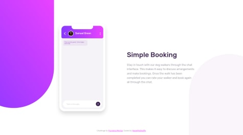
I borrowed some animations from Animate.css and played around with the animation-duration property to create a messaging animation in the phone (which I really think adds some life to the page). 🎉
I'm also rather pleased that my code didn't end up too messy or disorganized after attempting a CSS illustration like this. 😉
As always, feedback is on both my solution and my code is both welcome and greatly appreciated! 👍
First of all, I have coded for the dark-theme. after that noticed the instruction is given as switching from a light theme to a dark theme. I have coded opposite of given instruction
Hello! From around 770px width to 1000px cards are to tight for content and maybe you could add function that will change theme name depending on which one is chosen. Anyway, great job
Hi! I like your solution when third card is stretched. On the other hand I found some problems, for example at 870px width cards have different sizes and at 1050px there is no space for stars in second box. About naming conventions I think that BEM is pretty handy. Hope I could help you.
Hii, I hope this solution is the closest possible to the original challenge. I would lik to have maybe feedback on the organization of my html and scss (mostly on the class names because it seems kinda complicated to me..). Thanks in advance!
Hello. You used a lot of underscores. It makes your code hard to read. For example: instead of 'article-wrapper-text' you could use just "article-text" and instead of 'article-wrapper-footer' you could use 'footer' and then 'footer-avatar', 'footer-username'. Read some more about BEM, maybe you will find it useful. Hope I could help.
I start by developping on php, as this was the first time I used Vercel and I didn't think it would ever work !
So I migrated to JS and used as many objects as possible.
What do you think of the implementations of the rates and testimonies ?
Also, how can I make the website more responsive ?
My second Challenge. Javascript was very difficult for me as I could only find one solution for the scrolling to make the buttons work. I only understood about half of the javascript that I used. Anyways feedback to improve buttons to make a smooth scrolling at a 100% of the div would be great. Thanks! All feedback welcome!
I had difficulty understanding this part of my javascript file:
function sideScroll(element,direction,speed,distance,step) {}
Hello.
This function need 5 params. 'step' is responsible for smoothness, it's value in pixels that defines single movement, 'distance' defines overall scroll value in pixels. In your case it's 30 moves for one scroll (300px distance / 10 px for each step). Delay of each step is defined by 'speed' (read about setInterval). At the end of the scroll interval is getting cleared. 'element' and 'direction' are pretty straightforward I guess. I hope it helps
Hello!
On large sizes your project looks pretty well, but when I'm decreasing window's width elements start pushing each other and it destroys layout. You used 'position:relative' a lot of times, try to read about other types of positioning like 'position:absolute'. You could also use other type of creating layout, for example css grid,flexbox or floats that are just easier in use. Last thing - in real projects try to remember about adding alt attribute to imgs, it can help people that are using screen readers.
I had a problem with aligning the images on the bottom-right of each section. Tried using margin-right 0px, then relative positioning too, but didn't work. would like feedback on that part.

